Quantitive Research
Quantitative research consists of a research strategy for numbered answers. An example could be a survey, thinking of how much? or how many? I could incorporate this into my research work by making a survey and getting different female teenagers to answer a range of questions that are relevant, so it's a wide variety of results. Another example is opinion polls, asking 'which one is better?' and things that would give me percentages and numbers. I could incorporate this into my research work by asking my female friends this or that which would help me pave my way to what topics to research and investigate.
Qualitative Research
Qualitative research consists of a research strategy for worded answers. An example could be focus groups, wanting detailed, written answers in comparison to the numbered answers. I could incorporate this into my research work by taking a group of females with similar age, fashion types etc and asking them what? why? why not? Another example is books. I could read into fashion, makeup books or magazines published by high brands to get a more professional viewpoint on the magazine industry.


Primary Research
Primary research consists of raw data and information before it has been analysed. An example of primary research is questionnaires (online or mail). I could incorporate this into my work to get an idea from brands on what I should be looking out for, researching and how I can take on this idea. Another example of primary research is interviews, whether that's face to face or phone calls. I could use this in my work because it gives me a raw look on what females think of the age gap in the magazine industry, and if they have negative things or positive things to say about it.
Secondary Research
Secondary research consists of already existing data. This can be found within reports and textbooks. I could use this in my work when I need to find the specific answer for something like what's the most popular magazine topic and things similar. Another example of secondary research is auto biographies. This could be magazine creators, page designers and so on. I could use this in my work when I want a professional view and to investigate how they think and why they wrote what they wrote.


Possible Research Methods
| Methods | Examples |
|---|---|
| Similar Products | Vogue Marketing, Elle Production, Cosmopolitan Advertisement |
| Editing Techniques | Photoshop 2026, Indesign 2026, Mockups |
| Historical Research | Magazine progression, Womens magazine progression |
| Budgeting | Magazine printing from £22 |
| Equipment and Resources | Macbook, Printer, Camera, Adobe Creative Cloud Suite |
| Content of Product | User Generated Content, Out Of Home Advertising, Social Media Posts |
| Skills and Abilities | Software Skills, Photoshop Skills, Time Management |
| Types of Planning | Tatical - Development, Marketing / Operational - Identify strengths and weaknesses / Startegic - Discounts |
| Locations | Barnsley, College, Home |
| Audience Research | Females, Teenagers, Readers |
| Inspirations | Vogue, Elle, Cosmopolitan |
| Presentation of Work | Webador, Magazine, Instagram |
| Production Techniques | Trends, Relevant Designs |
| Industry Professionals | Models, Writers, Buisness Owners |
| Market Research | Age gap for teenage magazines, Some out of budget |
| Theories | Colour theory, Fashion theory, Layout Theory |
Similar Products


The magazine brand that I will be reviewing and researching is Vogue. Vogue was founded in 1982 by Arthur Baldwin Turnure as a ‘high society’ journal, aimed at New York City’s social elite. However, in 1909, Condé Montrose Nast bought Vogue and transformed it into a women’s fashion magazine concentrating on the topics such as beauty, fashion and women’s etiquette. The famous Anna Wintour became editor in 1988 and remodelled Vogue’s original covers that focused on featuring Hollywood actresses and celebrities instead of the traditional way of only using models. However, in recent events, Chloe Malle has become head of editorial content for Vogue in mid 2025 taking over from Anna Wintour herself. Vogue noted on their website that “Since the first issue of Vogue was published in 1892—its cover an illustration of an unnamed, beaming debutante by A.B. Wenzell—the title has defined itself as the world’s foremost fashion authority. Over the years, Vogue has evolved with the times, coming to encompass a wider world of culture, entertainment, beauty, politics and the arts, dedicating itself to a celebration of groundbreaking image-making, great journalism, and the discovery of new talent.” [Vogue.com, 2026]. Vogue has a look and feels defined by their high fashion standards and visual perfections with their photography.
From a personal opinion, I feel that when reading through the magazine it almost feels like a luxury to be reading it because of how it has been designed and brought up with its reputation. In spite of that, I would argue that the typography size for the general text can make it hard to read due to the amount of wording being used. Using @YouGov, I have had a look at the popularity statistics for Generation X and found that 1st of April 2025 to 1st of July 2025 has decreased by 12%. [You.gov.co.uk, 2025]. This tells me that 45-60 year olds have started creating a pattern for losing interest in the magazine for many reasons. It could be things such as outdated fashion trends or just their interests change in general. After doing further research on Vogue, I took notice to their presentation.
Things such as the typefaces that get used, leading and tracking and their colour pallet. The typefaces that vogue use are a customised version of the classic San serif typeface ‘Didot’ for its main iconic logo, and that gets paired with San serif fonts like ‘Franklin Gothic’ or a custom design of ‘Vogue AD’ for headlines and body text. What I do like about the logo is how it looks luxurious. It almost pulls consumers in because they want the chance to even say they own the magazine, giving them bragging rights. The San serif typeface is bold and right in your face and really recognisable. This is called brand recognition. Brand recognition means that the consumers have the ability to identify a brand through visual things for example, logos.
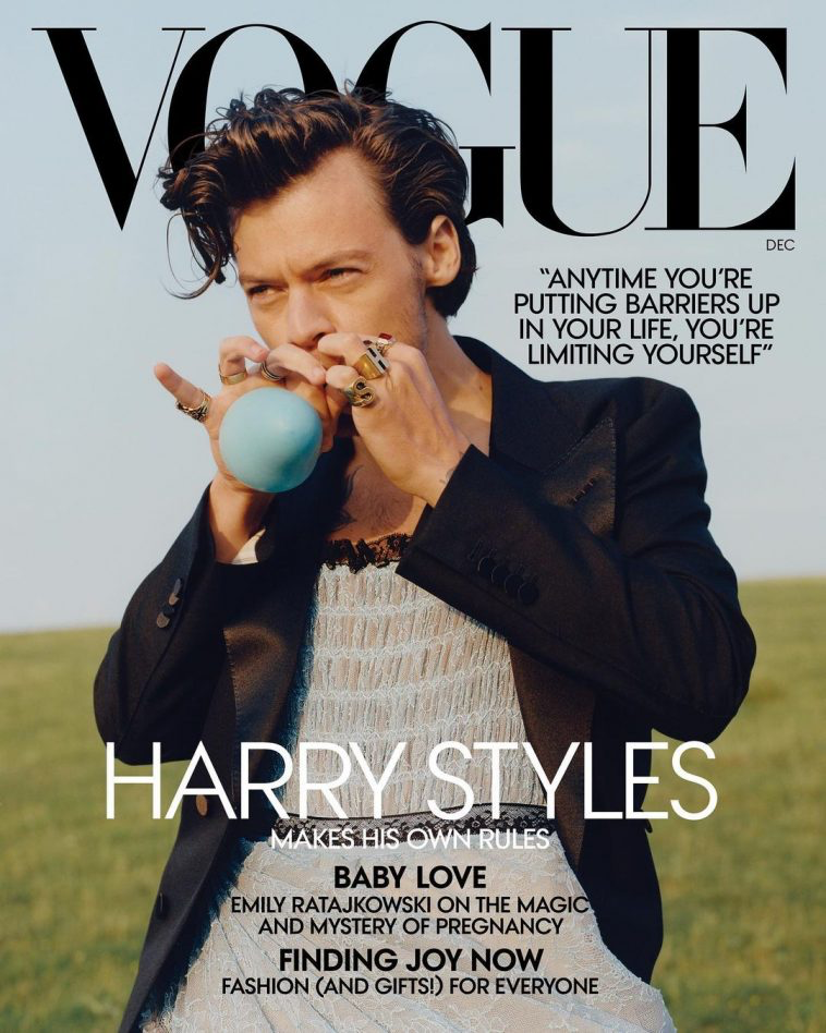
On the other hand, something that I don’t like is that the covers often prioritize recognisable faces over materiality faces. I don’t like how they use celebrities to be the main selling point, for example Harry Styles. The designer of the outfit is only mentioned in a smaller text, which goes against their idea of prioritizing fashion ideas. I can see why they use famous faces, because it brings consumers into the magazine and it can be a good thing yet still a bad thing. Sometimes celebrities bring a lot of controversy to Vogue itself because of their backgrounds with the press.
When discussing the layout side of the magazine, it is important to know the correct terminology. Vogues iconic ‘title’ is actually called a masthead, and just below that is the coverline where majority of the information to entice consumers in are placed. The front cover of the magazine is important because it’s almost like inviting somebody to come inside, making them want to read the magazine. The titles, the model all dictate whether or not people want to read the magazine based of first glance. So, it really enforces the idea that the cover is arguably the most important part of a magazine. ‘Make sure your content is evenly distributed over the page/spread. Don’t put too much in one part of the page/spread. Unbalanced layouts will feel uncomfortable and lose viewer’s interest.’ [yesimadesigner.com, 2020]. I will pre plan out each page by giving it titles and topics, so I don’t go off track of the theme, then it remains a balanced magazine. The logo is placed at the top of the magazine in a big typeface because they want to ensure publication is easily identified on newsstands whether they’re crowded or not.
Vogue often uses the colours black and white for their main colours of the masthead. Using the colour theory, “The color black is associated with a number of positive qualities and characteristics. For example, some common associations with the color black is associated include Authority, Elegance, Formality, Intelligence, Power, Prestige, Sophistication” [Verywellmind.com2026]. This piece of information tells me that Vogue associates itself as an opulent brand, which helps build status to being it more consumers.
Overall, Vogue takes part in being a massive inspiration for my brand because of the topics such as fashion and beauty and its ability to blend the topics together. I have mixed opinions on Vogue, but I will stand by them as using them as my muse.


The next magazine brand that I will be reviewing and researching is Elle. Elle is a women’s fashion magazine founded in France in 1945 by Pierre Lazareff and his wife Héléne Gordon, it gained the name from the French word for ‘she’. They cover articles on fashion, beauty, and style but also fitness, health, food, travel, art, music and books. Elle said “As the world’s largest fashion magazine and media brand, ELLE inspires women to explore and celebrate style in all aspects of their lives with content that is inclusive and innovative. ELLE is provocative, bold, and daring—a much-needed escape offering women an injection of joy, surprise, and positivity.” [elle.com, 2026]. Elle magazine emerged after WWII as a revolutionary publication, with their first issue being published on November 21st, 1945. They are known for their bold voice and modern style, rather than just being a fashion magazine. This will play a pivotal role when looking for inspiration with my magazine, as I am not wanting it to be soley about fashion but also uplifting girls and inspiring them with their role models.
From my personal opinion, when reading through the magazine articles it felt a sense of comfort because it didn’t have the feeling that they are a luxurious brand, in comparison to Vogue. I liked how it covers every topic with open views but also still being creative with how they display their pages and write about their topics. Using @YouGov, I have had a look at the popularity and fame statistics for Generation X and found that from the 1st of October 2025 to the 1st of January 2026 the magazine has decreased their popularity. The statistics being from 85% to 72%, meaning it has dropped popularity by 13% across 4 months. [Yougov.com2026]. This could be things such as topic taste has changed, or things like as their age progresses, their interest in social media does too. Social media can replace physical books and magazines causing the interest levels to drop. After continuing my research, I began to look inro their appearance side of things.
What surprised me the most about how ELLE magazine looks, is the use of high end celebrities, such as Selena Gomez. Their creative use of celebrities can pull in a bigger audience for the brand as a whole, which can lead into increasing their sales. It can be seen as a smart view but similar to what I said about vogue, I am personally not a fan of how they use big faces to increase sales. I will not be taking inspiration for this idea as I would to do UGC and create a place where models are recognised for their talent not for their fame. Talking about the typeface, for their masthead/logo they use the typeface Didot. Didot is a classic yet elegant serif typeface and for Elle, it specifically appears in all capitals. It gives the brand a modern and sophisticated look which enhances the brand appearance. After doing some research, I found that in 2017 Elle customised a specific typeface that is geometric sans-serif, designed by @APracticeForEverdayLife. Using the typeface theory, the serif typeface target audiences are surrounded by things such as luxury and traditional ways that seek authority. Elle has a specific target audience primarily aged 18-35 which fits perfectly to the age range that appeals to the serif typeface.
Elle uses a wide range of colours for their titles depending on the colour palette in the cover of the magazine. For example, on the Rachel Zegler cover from above, she has a bright feature of her red lipstick with grabs the reader’s attention, terminologically called the visual focus point. Elle designers then used this to colour their masthead, making it look aesthetically together. The logo is placed at the top of the magazine in a big typeface because they want to ensure publication is easily identified on newsstands whether they’re crowded or not. From a colour theory point of view, Elle do use a lot of red whether that’s the colouring of the typeface, or down to the clothes that the models are wearing. Red is a dynamic and intense colour which can be used to access opposite emotions of the reader. “Red is a colour that commands attention. It’s associated with passion, energy, and warmth. In colour phycology, red is known to stimulate the senses, increase heart rate, and create a sense of urgency.” [Houseof.com 2026]. I will incorporate the colour theory into my final major project as I want to use the phycology side to express my knowledge on the topic.
Overall, I would say that the magazine company ‘Elle Magazine’ is a big inspiration for my project, because of how expressive they are on their creative thinking and design side. I think it will improve my grade if I am inclusive to all different topics as it widens my target audience range.


The final magazine brand I will be reviewing is Cosmopolitan Magazine. Cosmopolitan magazine launched in 1886 as an original family literary magazine, featuring fiction, essays and reviews. Their early editions included work by ‘literary giants’ such as George Bernard Shaw. However, in 1905, William Randolph Hearst gained cosmopolitan in 1905 and turned the magazine into a ‘mass-market publication’. The era he joined is most recognisable for its Art Deco covers. Then in 1965, Helen Gurley Brown took over as editor in chief. She rebranded cosmopolitan into the go to magazine for single and independent women. This almost locked in cosmopolitans’ identity. Today, cosmopolitan is now a multi organisation that has channels across YouTube and podcasts with a huge following online as print has begun its downfall and beginning to decline. “The women’s magazine market was broadly in line with that performance, with the women’s lifestyle and fashion sector down 7% year on year to 2.3 million actively purchased copies and the women’s weeklies sector down 8% year on year (excluding the impact of Hearst UK's closure of Reveal in October 2018) to 2.8 million actively purchased copies.” [compaignlive.co.uk 2019].
From a personal opinion, I feel that when I first look at then magazine I like how ‘cluttered’ the front cover is. It gives me a wave of nostalgia of the 2000s aesthetic. The detailed article and cover lines give it the effect its full of gossip and drama. Some could argue that it looks ‘unprofessional’ and that it makes the magazine less desirable to read, but in my personal opinion I like it. I am also a fan of how they match the masthead colour to the colour palette of the model. For instance, if their clothes are a soft pink colour, it is most likely to be the main colour of the cover. I am most likely going to use this technique when designing my magazine cover as it gives the consumers an eye for the aesthetic of the magazine and the visual impact it has compared to other magazine on the shelves. It can show consumers that the brand is clean and tidy. “The choice of colour and font weight will connect to the genre and ideology of the magazine.” [media-studies.com 2026]. On the other hand, a thing I am not too sure about is the typography of the masthead.
The typeface of cosmopolitan magazine uses is Franklin Gothic Extra Condensed. This typeface fits into the sans-serif font family, known for its bold and functional appearance. It doesn’t give the brand a ‘luxurious’ feel in comparison to the elegant font that Vogue uses. The San serif font family brings audiences with a wide range of age. Such as 12-40 + year olds. This is because the typeface is often used in a lot of media things, like Instagram, google and just the basics. Mainly because it is the most readable typeface out of all the font families. What I do like about the logo is that it is bold and will stand out amongst competitor magazines on the shelf, especially with the pop of colour on the masthead matching the models clothing. It will make the brand look easier to recognise. This is called brand recognition. Brand recognition means that the consumers have the ability to identify a brand through visual things for example, logos.
After comparing the magazine edits, I found that Cosmopolitan mainly uses the colour pink for their covers. Things like masthead, model clothing or the subtitles. Using colour theory phycology, the colour pink symbolises nurture and compassion. Which is the effect cosmopolitan wants to give their readers. The idea that their minds can be quiet for 5-10 minutes whilst reading the magazine appeals to them so they will stick with that as their ‘branding’. I truly love this idea as a reader because it can be nice to just let your mind be quiet and to focus yourself on an ideal world that the magazine appeals. I will be taking that frame like idea into my project as it appeals to me massively and think it will get me a better audience.
Overall, Cosmopolitan has given me some ideas for my project like their colour usage but also has put me off using some of their ways like their typography use. I do like the magazine brand, but personally I wouldn’t reach for it on the shelf as it doesn’t appeal to me due to their layout and how everything likes squeezed together.
Marketing Review
After researching these three magazine brands, I realised that they each have different marketing techniques. An example is Vogue sometimes do a ‘limited edition’ notepad with a magazine edit which then gets advertised massively on social media platforms like TikTok and Instagram. This is such a good way to engage with their audience as it almost makes them become more desirable because who wouldn’t want a limited edition notebook from Vogue. Whereas I didn’t really notice a big marketing campaign for ELLE or Cosmopolitan, and as a teenage girl who loves magazines, the only way I would really see them is on social media. I think the two brands should invest in their social media and come out with engaging advertisements.
.
Editing Techniques
For my editing techniques, I will use photoshop, illustrator, and premiere pro if I end up doing a video advertisement. My personal preference is Photoshop because that is my strongest one out of the 3, I can also use my creativeness with what photoshop allows me to do. However, I will be doing some research to expand my knowledge when using the editing software's. After doing some research into editing, I found some YouTube tutorials that I will follow throughout production.
https://youtu.be/6l9jn6z1j_A?si=v9cFI41-CPg6UzUL - When following this video, I could incorporate it into my work by using it for a social media advert or a campaign. The video teaches typography type mask, showing how to easily make the text the same as what an image is. I liked this video because of how clear and easy it was. They also did it slower so its more understandable.
https://youtu.be/YFZUVhBO188?si=vnZOB5e1yoI94YqE - I chose this next video because it shows how to make a detailed design, using the slicing tool. I could use this when designing by creating a product like this using the water effect making it look more professional and appealing. I like this video because of the amount of detail it has and it has all the references in the description, so if I wanted to practice, I could use that as an example.
https://youtu.be/OFwSzMufiGw?si=wZxRIfMUWJFa_BzI - For this video, I chose it because it goes into detail on the clipping mask and how to make a text look metallic. I could incorporate these skills when making to make the typography look realistic and suitable for the design. I like this video because its detailed and has high skills on photoshop.
Another way of finding some editing techniques is by looking on Pinterest. Pinterest offers loads of little hacks, skills, and ideas for me to use when designing social media advertisements or OOH advertisements. Pinterest has quick and easy access, which means I wont loose time when trying to find them. I could also make a separate board so all the ideas I want to take inspiration from, are all together again making it easier for me. There's a range of skills from typography, editing tools, editing techniques, design skills, a lot of different features on photoshop. Using Pinterest inspiration could take my work to the next level, improving my overall grace for my FEP.

Budgeting
When looking into budgeting there are many factors you need to consider. Factors such as:
Employees- For a larger business it would be smart to gain some employees. However that comes at a cost. They will need reasonable wage to have a living for themselves, and for their family's if they're the main provider. They will also need staffroom, where they can have breaks, a staff car park and so on.
Software Subscriptions- The software that will be used are Photoshop, Premiere Pro, and Illustrator. Each having a subscription cost.


£66.49x12=£797.88
£66.49x12=£797.88
£66.49x12=£797.88
£797.88x3=£2393.64 - For all three for the year it will cost £575.28 for the year.
Packaging- For the packaging, Im using the website postal-packaging.

For the postage side, I will need to use book wraps to ship my magazine out, or I could do it in bulks in boxes. However, I would prefer if they were individually packages as it adds on extra protection and reduces the risk of damage during the shipping process. If I were to advance to using bigger boxes, I thought about PR, or just for orders in general. I found a website that's sustainable, as seen by the little green leaf with the S on it, to see the cost of the boxes based on the size of them. It's important that you have good quality packaging because some delivery company's chuck them over the fence or leave them out in the rain, which would ruin the package overall and the product inside. It's also important because that's how people will view your brand based on the packaging and the quality, especially after Rhode got called out for giving influencers tissue paper etc and consumers just the product and box.
Email Research

Vogue Magazine

Cosmopolitan Editor Chief

Elle Magazine

Women's Health Editor
I wanted to email some editors at magazine company's as part as my primary research. It will give me a better view on the industry as a whole and hopefully will improve my knowledge on what I could use and couldn't use, for example trends.
Equipment and Resources
When planning for a brand, there are many factors I need to consider when it comes to equipment and resources. Things like producing research, product designs, marketing are all important factors in this area. Let's investigate in more detail. One of the few equipment pieces that I will be using is computers. This would make it easier for me to do my product designing and package design, exporting and downloading my work. It would also give me easier access to photoshop and the Adobe Cloud. The next equipment piece is an iPhone. Using this item will make it so much easier and accessible when managing the Instagram account, this links to the social media side of my brand. Using an iPhone would also help me have better access to staff, and clients. As for resources I will need the Adobe Creative Cloud suite. This will let me gain access to photoshop, illustrator and premier pro which are my main sources of production. I will also be using the internet. This will allow my access to my own brands possible website but also competitors website. It will also help me research into possible models, as well as social media trends that are going on.
Locations
For location, I want to start being based in the London but then hopefully progress into the whole of the UK. Why? This is because London has a big reputation of their status for being independent publishing in high concentration of niche audiences. It also has different high streets with vibes and aesthetics, such as Charlotte Street. This would be ideal for targeting fashion and lifestyle audiences as it was the famous meeting place in the 1950s for artists, it gained a reputation. As well as that, London has a high population of different demographics and psychographics which would boost the magazine brand in many different ways.
Production Techniques

Photoshop will help me create my designs online and it will also be an important factor to my social media advertising. The will be when making I use mock-ups, and creating watermarks or the logo.

Adobe illustrator will help me be original when designing. It will allow me to create my own designs and let me be creative with no limits.

InDesign will help me format the magazine correctly so I can design it without the proportions being wrong. It will also help me have an easier process when printing physical copies as it's the right format.
Production techniques also include the production process for the publication side. I did some research on the process and found a website that said “This is where we sit, collating all the editorial and assets, using the flat plan to guide what needs to be done. Our role will include all communication, processing of images, sourcing others (which usually includes colour-balancing and cut-outs); preparing illustrations and infographics; processing and checking of advertisements; coming up with ideas, such as exploring themes; constructing pages, positioning and fitting elements; being creative with formatting and applying typography; preparing proofs and making amendments; managing surrounding production to ensure all remains on track; preparing, uploading and technically approving pages at prepress; and preparing files for digital applications.” [magazineproduction.com, 2022]. It is important to gain knowledge on the production side as it will help my business to be at the best ability it could be.
Presentation Of Work
For the presentation of my work, I have some aims I want to achieve when it comes to the presentation part. These aims consist of:
- Professionalism, this includes how I would word captions for Instagram posts or something like how I would react to a bad review, if there were to be one.
- Inform, this includes the kind of content I post on social media. People should be educated on what topics feature in the magazine, possible teenage mental health.
- Inspire, when inspiring people, you need a strong message to really get people's attention.
- Reputation, talking about reputation, it is key you have a good one as it effects consumer rates.

Types of Planning
To produce my final project, a lot of planning will have to go into it. It's important to plan because it means my results will come out more clean and neater; also saving me time. Things such as:
Colours- When considering colours, it's best to look at Joe Hallock's colour theory. According to his research, the colours that looks the most luxurious is black, by 42%. Originally, I wanted to use the colour black for a cover colour but after doing my research I will be using this colour. A colour I will avoid is orange. Hallock did some research on the cheapest looking colour and orange got voted the most and had 26% overall, second was yellow with 22%, and third was brown with 13%.
Brand Guidelines- When considering brand guidelines, it's factors such as brand overview, logo usage, colour palette, typography, imagery, brand elements, voice and tone, usage examples, legal and compliance, and contact information. Brand guidelines set of your brand as a company. It starts people's opinions but also gives you clear thoughts on the ideas I would want to use. This would overall help with my time management as I would've already planned things I would just need to add details to.
Typography- When considering typography, I need to consider typefaces that are eye-catching, memorable but also more importantly, easier to read. Fonts such as Times New Roman and Georgia are harder to read, and research say that San serif fonts are more difficult for dyslexic people to read. A company that has a memorable typeface is Nike; the font they have used is called Futura and Helvetica and they have been using that font since 1990s.
Concept Sketches- What are concept sketches? They are sketches of possible ideas I would want to incorporate in my project. I would want to do concept sketches as it gives me a chance to document my ideas wherever I am, and it also saves me time thinking of loads of ideas on the spot. I would do this on my iPad as I have an apple pen that would make it a lot easier for me to draw.
Contents of Products
For my product I will be focusing on OOH advertising, which stands for 'Out of home' advertising. This can consist of things like billboards, bus stop posters, or taxis. I'll also be showing how the brand is sustainable by having a few billboards showing what our brand does to society sustainability wise. By having a sustainable brand, it reduces our carbon footprint which gives good brand personality. My brand will create awareness for teenage girls who are ‘under pressure’ from society’s expectations and help them how to overcome it.


Theories
Colour theory:
According to the website of Chicago Library, colour theory began in the renaissance period where the theory of colours was a mixture of darkness and light of black and white. In the 17th century Isaac newton developed the first colour wheel called the mussel wheel, proving how colours could be organised systematically. This opened doors for modern day theorists to explore how colours could lead to resembling emotions and meanings. There are different concepts of colours, for example primary and secondary colours or tertiary and complimentary colours. Colour theory is essential for designers to understand because it allows them to create visually appealing and effective designs. Colours can be seen as messages or meanings; this means that by understanding what colour means what they can achieve the intended meaning of the design. Another reason why it’s essential is because of aesthetic appeal. This means the brand has a colour and they use it for everything and gets recognized by it, for example Starbucks is known for their logo being green and having the crowned woman. Warm colours are things that tend to remind people of warm things. For the final and last question, I asked what would make you buy men's skincare. This will help me design what products to make, what areas they could benefit. Most answers say cheap, effective and works, and recommendations. They all gave a detailed answer which shows there is a need for men's skincare, and they want specific things. like fire or sun. Cool things are things that remind

people of cooler things like ice and snow etc. Understanding the difference between them is important for designers as they can use the categories to express emotions/moods. They can also use them when promoting things, such as something summery. For a summer advert you wouldn't use cool colours because then it gives the wrong impression, instead they would use warn colours like yellow. Hex codes are a way to represent colours in a digital design using a combination of 6 numbers. They’re commonly used to specify precise colours. For example, the hex code #FF0000 represents red, and the FF represents the shade of red, and the other numbers are the amount of green, and blue used to create that colour. A way of finding hex codes can be apps or using websites, for example I use the app ColourViewfinder. It is important to use hex codes so designers can ensure consistency in colour across different devices or platforms, making it a well-used tool for creating designs, logos, branding things. The consistency of using the same colour is important to ensure that designs look more presentable in website design, or any digital project. They also allow designers to share and replicate colour choices. In 2003 Joe Hallock researched colour and shared his insights in his paper colour assignment. He found insights into what genders preferred and what colours the most. The study includes results from 232 people from 22 countries which makes the result more accurate as it's a wide variety of genders and opinions, He has done a lot of colour wheels on colours that mean things like emotion etc. It’s important to look at his work because we can get an idea of popular/well known colours but also disliked/less popular colours. This would help brands aim to get the right audience, such as a woman’s store would use their most liked colours and vice versa for men’s shops, growing the company’s popularity as they aim for the right people.
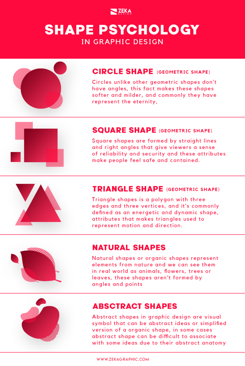
Shape theory:
When discussing shape theory. There are different kinds of shapes used in brand logos. GEOMETRIC- The dominos logo includes geometric shapes such as circles and squares. It is suitable for the brand because it represents the fact that it is an actual domino. The only thing I would change is to add a black outline to the whole shape and the shapes inside to make it look more like a domino. ORGANIC- The brand ‘BP’ uses green and yellow sunflower as its logo. This could relate to their company as its named after the Greek god of sun, making it nature related like oil. CIRCLE- For the Olympic logo it's suitable because the colours represent a sense of community, an ever-happening event and the rings show power (The power the winners hold from winning). SQUARE- For the YouTube logo they use a red square as the background of the word ‘tube’. This suits the brand because the red square represents their iconic play button. TRIANGLE- the usage of a triangle in the Dorito logo is suitable because the shape of an actual Dorito is a triangle as well, so it advertises it greatly. VERTICAL LINE- the usage of the lines in the Soundcloud logo is suitable because it's almost a representation of sound waves for the music on the app.
Typography:
Typography is the art and technique of arranging type to make written language legible, readable and visually appealing. It involves selecting typefaces, point sizes, line lengths, spacing which all contribute to the overall appearance and effectiveness of the text. Good typography enhances the communication of ideas and emotions, guiding the reader's eye and influencing their perception of the content. It plays a crucial role in the audience's engagement and understanding. A typeface is the overall design of a set of characters, which includes letters, numbers, and symbols. It represents the artistic style and visual experience of the text. For example, ‘San serif’ or ‘serif’ are both examples of typefaces. tracking- adjustment of space between characters. Leading- space between the text vertically. Kerning- space between individual letters/characters. A font refers to a specific style and size of a typeface. It is essentially made up of a specific weight and size. For example, ‘Arial regular 14pt’ would refer to a standard style of that typeface at a size of 14 points. Typography is used in a wide variety of things, including:
Print media: this includes books, magazines, newspapers, brochures and posters. It ensures the text is readable and visually appealing.
Digital media: websites, apps and digital advertisements use typography to guide readers through the content.
Branding: companies use typography in logos, marketing materials, and packaging to convey brand identity.
Serif typefaces have small decorative strokes of ‘serifs’ at the ends of their letterforms. These serifs can help guide the readers eye along lines of text, making them commonly used in print media like books and newspapers. On the other hand, San serif typefaces don't have the decorative strokes. The term ‘sans’ means without in French so sans serif literally means without serifs. They have a cleaner typeface and are more modern, making them popular in digital media and advertising. The 4 main typefaces are Serif: These typefaces feature small flicks at the end of the letters. Some people view them as traditional fonts as they are commonly used in print materials. Sans serif: This typeface does not have the decorative flicks. This then creates the effect that it is clean and minimalistic. Script: Script typefaces mimic handwriting and are often used for invitations and mainly formal documents. They look elegant and elegant with flowing letterforms. Decorative: This typeface is designed to attract attention and is often used for headlines, posters or advertisements. The typeface can vary to bubble writing or cartoon writing etc. A font family is a group of related typefaces that share a common design but varying specific features such as weight, style or width. Using a font family allows designers to maintain consistency while providing flexibility to typography for different design elements. An example of kerning is the brand 'YSL' uses kerning in their logo as the 'Y' and the 'S' are designed to be close together making the brand look sleeker with a sense of elegance. They could've used kerning to ensure the logo is not just a name but a symbol of high-end fashion and style. For leading, the M&S logo, leading is used to make it more clear between the words 'marks' and 'spencer'. The balanced amount of space between the lines gives a sense of aligning its image as a high-quality retailer. Finally for tracking, the AVON logo, they used tracking by pacing out each individual letter to make the word seem bigger. They could've done this to ensure clarity, making it easier for customers to read their brand name at first glance.
Visual Hierarchy:
What is visual hierarchy? Arranging elements/ symbols to show order of their importance. Things like menu icons, size, colour, repetition, contrast etc. This can make it easier for people to understand the main information and the less important information. I will use this in my FMP when focusing on the packaging of the product.

In this advert, it promotes that the company now does delivery and take out. They promoted this well because they used bold colours as the background but also a contrasting colour for the 'order, eat, enjoy!'. They used the colour red to enhance the fact they now do delivery. Another way they enhanced the fact they do delivery, is the font size for the word 'delivery' as it is much bigger than any other text. I also liked how they used their food product as if it's the telephone that you can ring and order on. For the text as a whole, they made it bold, so it stands out more than the logo and anything else, this makes it clearer for the audience to acknowledge the fact it's a promotional advert for a new thing coming to their business.
In this advert, it promotes a music gig that is happening. It uses visual hierarchy when the 'one night only text' is in big in the centre of the poster, showing that its important information due to the type size and how much room it takes on the ad. Another way it uses visual hierarchy is there's important information at the top of the advert, such as what dates it is happening and what band it is for. I can also see they have used tracking as well in this advert for the word 'extravaganza' to embrace how extravagant it will be. A final thing is, I like how they didn't just use a plain square as the background of the poster, but they used a ticket as if they're trying to get people to buy more tickets.

In this advert, it promotes a music gig that is happening. It uses visual hierarchy when the 'one night only text' is in big in the centre of the poster, showing that its important information due to the type size and how much room it takes on the ad. Another way it uses visual hierarchy is there's important information at the top of the advert, such as what dates it is happening and what band it is for. I can also see they have used tracking as well in this advert for the word 'extravaganza' to embrace how extravagant it will be. A final thing is, I like how they didn't just use a plain square as the background of the poster, but they used a ticket as if they're trying to get people to buy more tickets.
1. Size: The larger elements can draw more attention to the poster so it is a good thing to use size when designer thinks in visual hierarchy. For example, titles are bigger than sub titles as they show more information of the topic.
2. Colour: Bright colours are more eye catching meaning it can be strategic to use those bright colours to attract attention to important things.
3. Alignment: Without alignment, some things can look cluttered and unprofessional. Whereas if you do use it, it gives a more professional and organised.
Ethos, Pathos, Logos
Logos- logical appeal, logic to persuade audience such as facts and stats.
Ethos- appeal to credibility, convince the audience the audience that the creator of the message can be trusted, can be real people, experts or celebrities.
Pathos- emotional response in the audience, emotive videos from a persuasive technique.
Why and how are these effective? Logos is effective because it creates brand recognition and visual consistency, it also helps people get an idea of the brand and their professionalism. Ethos is effective because it can make a trust bond between the company. For example, if someone sees a well-known celebrity they look up to then they're going to trust it's a good brand. Pathos is effective because the audience gets sympathetic and if it's a donation ad, they're most likely to donate.

Audience Research
What are demographics and psychographics? Psychographics is known as market research using psychological variables. Considered factors such as personal preferences, sustainable conscious, and lifestyle choices. Demographics are characteristics used to define a group of people. It consists of things like age, gender, ethnicity. These are important to include whiten marketing research because it gives you an idea of what your target audience prefer, it can help you design your brand personality. It also gives you an idea of what your audience engage with and what's ideal for your brand.
When talking about demographics for my brand, I am aiming for an audience of teenage girls/women. I chose this age range as of the gap in the market for only teenage magazines, and I will be able to discuss more relatable topics in the magazine that will open up teenagers mindsets. There's no specific ethnicity that I would aim for because my brand is inclusive to all. Just because they're a different ethnicity it does not mean their preferences have to be different. For the psychographics I would be looking for girls that are interested in fashion and beauty products. It would boost my magazine if the psychographics were with the right target audience because I can engage with consumers correctly and help the algorithm.


Female Popularity and Dislikes

Generation X Popularity
Skills and Ability
Maths- Calculating Budget, Statistics
English- Analysing, Evaluating, Social Media Socialising.
British Values- Respect and tolerance, Rule of law, and Democracy
Soft Skills- communication, confidence, time management, and organisation
Hardware- Macs, Computer, iPhone
Software- Instagram, Photoshop, Premiere pro, illustrator

Inspirations

When talking about inspirations, I really like how some magazine brands style their models. It gives the reader a feel on how the tone is for the magazine or what they could be talking about. For example, if the model is wearing clothes with a summer colour palette, then I would link the edit of being a summer based magazine with topics that feature summery things. Like holidays and discounts. I will take this into consideration when designing my magazine covers as it will attract who picks the magazine up. I am inspired for my magazine brand to be as big as Vogue and Cosmopolitan, this motivates me throughout the whole final major project.
Historical Research
I decided to research the history between the production of magazines because I haven't heard much about the history about it, and because it gives me a sense of understanding about when, why, how etc. Magazines began in the 17th century with the first being Erbauliche Monaths-Unterredungen (Edifying Monthly Discussions), published in Germany 1663. The often publications spread across Europe, with the first general interest magazine being The Gentleman’s Magazine in London in 1731. However, in the mid to late 19th century magazines gained a massive increase in popularity from things related to the advances in the industrial era. “Soon, publishers realized that irregular publication schedules required too much time and energy. A gradual shift then occurred as publishers sought regular readers with specific interests. But the early magazine was unlike any other previous publication. It was not enough of a news source to be a newspaper, but it could not be considered pleasure reading either. Instead, early magazines occupied the middle ground between the two (Encyclopedia Britannica).” [OER.PRESSBOOKS.PUB, 2026].


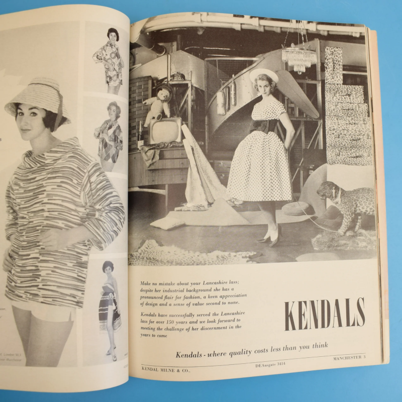
The pictures above are a vintage Vogue magazine from the 1960s. The magazine was an edit from mid-March, and it is full of adverts and ideas. For example, it has a page full off patterned material. This would give people, specifically women, ideas on house décor for wallpapers or ideas for what material the females could have for their dresses. This started giving other magazine brands topic ideas for what they could put in magazine, such as starting fashion magazines with décor ideas. I will be taking inspirations with this and include fashion ideas, interior design and similar topics as it will align well with my target audience.
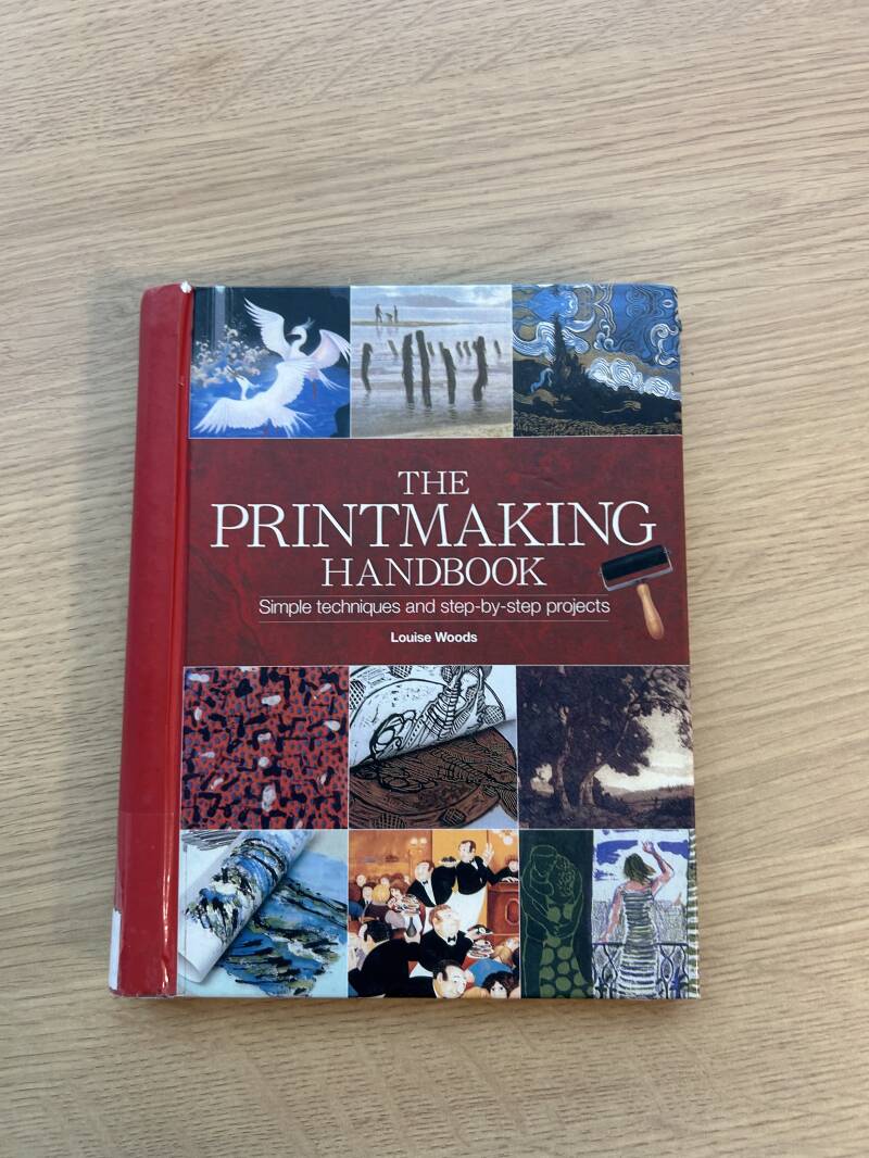
The book I will be using for part of my historical research is called ‘The Printmaking Handbook’ by Louise Woods. Using a book based around printmaking can help my research segment because it helps me identify how images were made, technical limits and layout design. The pages that I read were about etching. Etching was used in magazines before modern photography and digital printing became the main way of art. In the book, it says “To produce even the most basic etched impression you will need quite a wide range of materials and equipment, and it is essential to learn techniques under supervision in a safe and properly equipped studio.”. As a source, this tells me that to even think about doing the most ‘basic’ thing, it requires a lot of skill. It could’ve been seen as a rare job due to its requirements but also an important job as of what it has progressed to in today’s society.


Industry Professionals

One industry professional I will be researching about is Anna Wintour. Wintour is most known for being editor in chief of Vogue and she has been on her role since 1988. She’s been recognised for transforming publications by merging high end fashion with celebrity culture whilst working with other businesses to feature in the magazine. Wintour was born in Hampstead, London on November 3rd, 1949, being the daughter of Trego Baker and Charles Wintour who was the editor of the ‘Evening Standard’. She joined Vogue with the goal of modernizing the company and diverting them away from traditional fashion and more to a business oriented approach for women. I love her idea of this as in a stereotypical world, people associate business ethics with men and hardly ever women. I would love to use this sort of idea when making my magazine as I too want to make women feel empowered. “One of the ways that Dame Anna has kept Vogue a part of the conversation is by expanding the people she invited onto the cover. Since Madonna’s debut, Dame Anna has placed royalty, politicians, pop stars, writers and gymnasts on the
cover. ‘She definitely bridged fashion and entertainment as editor-in-chief of Vogue," says Odell. It wasn't always well received. When Dame Anna put Kanye West and Kim Kardashian on the cover in 2014, ‘it sparked so much debate’, says Kwei. ‘Nobody really wanted to dress [her] because she was a reality star.’ Looking at the almost mythological position the Kardashians have gone on to occupy, the cover spoke to Dame Anna's uncanny ability to anticipate culture – as well, arguably, as drive it.” [BBC.co.uk 2025]. Anna can be seen as an inspiration to other females because she is so legendary and prioritises empowering women, and that is definitely the feel I want to give in my magazine.
Another industry professional I looked at is Helen Gurley Brown. Helen was an American author editor and best known in the media for transforming Cosmopolitan into a symbol of female independence and sexual liberation. She helped reshape society’s attitude toward women’s ambition and self-expression. Helen was editor in chief at cosmopolitan during 1965-1997 and during that time she rebranded the magazine. “The first issue of Cosmopolitan under Helen’s leadership completely sold out; by its peak, the circulation had soared to over 3,500,000 copies per month, and yearly advertising sales grew to 857 pages per year. She would remain at the helm for 32 years. The first true Editor-in-Chief of the magazine, Helen made Cosmo into a global phenomenon. Under her leadership, the magazine expanded to 67 countries, pushing boundaries with its fearless coverage of taboo subjects and frank discussions of issues facing women across the world.” [thehgbfoundation.org 2026]. It also says, “Helen’s very first Cosmopolitan covered featured articles on birth control (the first magazine ever to do so) and what it was like to visit a psychiatrist. Future editions included articles about homosexuality among women, abortion, sexual politics, and how to manage anxiety attacks.”. As a woman myself I love this idea of Helen creating a safe space for women to feel normal and talk about topics you wouldn’t often find in a magazine. I want to do some pages on similar topics to really emphasise it is a safe space to be open when reading about it, by also following in Helens footsteps.

Market Research

This extract supports my idea for a teenage magazine as it shows the need for it. The stereotype for females to be identified as ‘emotional’ or ‘hormonal’ has become such a big thing it begins to actually make women think that they’re an issue. Most older women didn’t have the sources to look things up online because they didn’t have the media, instead they had books or newspapers or magazines. And in today’s society, media has become such a big thing to set false standards for women because they just get dragged down online, as if they don’t know any better to think bad about themselves. In the abstract it says, ‘teen girl magazines framed these to fit traditional middle class values.’ This backs up my point that young girls were built to fit standards and not built to create their own standards. In my magazine I would have topics that most teenage girls would be afraid to speak to their close female relatives about due to the personal level, but in the magazine, it would feel like a safe apace because they would know no one is judging them. The 4p's of marketing consist of product, place, price and promotion. When talking about product in journalism marketing, it is an important factor because it specifically designed and created to fulfil the readers wants and needs. It's almost seeming as a foundational due to how it impacts brand identity. However, this is based on how satisfied the customer is. The product creates the face of your brand, and it shows how your company acts professionally because of the front covers and what celebrities you involve etc. Moving onto place, this factors accessibility, brand image, and
convenience. Let's go into detail. When it comes to choosing a place to put, it becomes quite important. For my brand, I was thinking about putting advertising on the posters in cafes or online advertisement. However, if you were to put the advertisement in a men bathroom, you aren't really going to get the ideal target audience or any views. Same when thinking about a place to put the shop, its more ideal if you put it in a shopping district where there are other magazine companies too. Next is the price. The right pricing strategy becomes the glue to a business. It creates a sense of dependence whether the business can cover costs and generate profit at the same time. You should also take your competitors price range into consideration. This is because if they're more expensive than you, you're more likely to get more customers. If it was the other way round and you were more expensive, you'd get less customers. Finally, when discussing and creating the promotional products, it becomes essential as it raises awareness, generates interest and engages customers. Promotions help create awareness about the brand itself or just the product on its own, it’s not every day you see a teenage girl based brand on a billboard.
Accessibility Within Design
Accessibility within design is something that everyone can access. Something where it has availability for every one with different needs, showing equality.


This advertisement cover from Vogue wouldn’t be suitable for people on the spectrum. Why? because of the colours. From their perspective, the colours are too bright and distressing which could cause them to react in a way that is hard to control. It also has been written in plain English which makes it clearer for them to understand. However, the overall view could be overwhelming for the people struggling with autism due to how many patterns are going on in the masthead and the models clothing. You wouldn’t know where to look which then can lead to a sense of overwhelming things for them. On the magazine cover, it has many different text boxes saying different things. For example, one box could say ‘hot trends’ but another could have a quick switch to the topic and say something like ‘dramatic news’. Again, this could be very overwhelming for someone on the spectrum because their minds would be full of different things and then they wouldn’t know what to think. You could also talk about how they already feel enough pressure to ‘fit in’ and seeing a model with desirable genetical features could just increase anxiety or their self-doubt, for example vogue. Vogue focuses on appearance and societal standards that feel confusing.
Product Design and Branding
When making a magazine brand, it is important to look at things such as visual choices, demographics and colour schemes. This is due to the fact I am designing it to attract a specific group of readers and it’s important to get a message across about who it’s for and how it should feel. Let’s talk about visual choices, this could be a range of different things. For example, the photography style and how each style creates a feeling. Such as a close up face shot can create a sense of intimacy which would draw readers in. Or action shots can create senses of energy and excitement which again draws readers in. For my magazine I want to use full body fashion shots because it will fit the genre that my magazine will be, fashion and beauty. I hope to aspire teenage girls by the outfits the models wear and the expression on their faces etc. Moving on to talking about typography. The typography aspect is important because it sets the theme for the magazine. Such as using a serif font to give that classic, formal look to the magazine or using a San serif font to keep it clean and simple. Either way it effects the look of the whole magazine. And for my magazine brand, I want to use either a bold block font to keep it youthful and strong or use a serif typeface to be classic and look elegant. As a teenager myself, if something looks elegant it looks more desirable to have then I’m more likely to buy it because I’d want it. Then there is the model side to the visuals. Most magazine brands use influencers, models, or celebrities to try and boost their audience engagement. This technique is to use the celebrities in hopes that their fans would by the magazine simply because they are on the cover. However, for my magazine I want to keep it real, like a breath of fresh air. I would be using fellow teenage girls as models to get rid of standards and expectations of what girls look like, even though the models will probably have filler etc. Moving onto the demographics. Demographics are things like age, gender and interests. It’s important to know your brand demographics because it gives you a good idea on what specifications you need, such as colour preferences and age preferences. The ‘Time’ magazine focuses on adult interest in current events in today’s society like global issues. I have previously done my demographic research further above. Finally moving onto colour schemes. Colour schemes are important to look into because it creates emotional impacts. You could organise different colour palettes from the season you release the magazine edit, for example in spring I would personally use baby pink and lemon colours as the theme/colour palette. I would research colour preferences by using Joe Hallocks colour theory as he covered colours in marketing and gender preferences for colour. This would help me gain a good idea on what to use in production.
Sustainability Research

Prada beauty created this sustainability campaign to show they support the ocean conservation. The advertising campaign was created in 2024, featuring renowned actors and activist Emma Watson. I love the use of Emma being the model for this campaign for a few reasons. One reason being that she has such a large platform and fanbase that if they see her on a poster, they’re more likely to click and read about it just because of her. Another reason is, she has many beliefs and stands up for what she thinks is right and wrong, for instance pollution in the ocean. The first thing I noticed in this advertising campaign is how they’ve used the Prada logo as a recycling logo. I love this and I think it is very smart to show people where the brand stands and where their beliefs are at. After conducting some research, I found that Prada has become a sustainable brand as they now offer endless “recyclability without compromising quality.” [Schonmagazine.com 2024]. Sustainability it something I definitely want to offer in my magazine brand as it is such a pivotal part of society today. I could do this by using recycled paper that is certified it comes from forests, such as the Forest Stewardship Council. I also found that vegetable based inks are a thing meaning that it will be less harmful to environment and it will be easier to recycle. I could also come up with some creative OOH advertisements and some social media posts to promote the idea of being a sustainable brand. It could be something
like a catchy tagline as the main title of the advertisement or a good editing skill showcasing the issues of global warming but also informing viewers of the issues too. What is greenwashing? Greenwashing is where brands almost 'brainwash' their consumers into thinking they are a sustainable brand. They do this to try get a better brand personality and make them look like a good brand overall for being ecofriendly. However, most brands have been caught out for doing this making them loose consumer amount and a drop in sales. As a source of primary research, I had a class talk with the head of sustainability at Barnsley college, Sasha Beswick. Sasha oversees making Barnsley college a more sustainable place in the world. She had a talk with us about her previous workplaces greenwashing which she wasn't on board with, so she left. She also spoke to us about how I could make a difference with my FMP, and why being sustainable is important. One by one we all asked a question about what we could do in our FMPs to make our companies sustainable. The question I asked is how I could communicate the importance of sustainability. She answered with things like 'making sure it's authentic and not copying other social media posts'.
Extra Analytics
Long term brand loyalty- When business audiences feel understood on a deeper level, they are more likely to become loyal customers. The brands that align with their audience’s identity, beliefs and values create a community of loyal advocates rather than just one time customers. I could create brand loyalty by featuring audience polls in the magazine that readers could interact with making the magazine an enjoyable experience. I would also create a social media platform, one that I could communicate to the buyers with to gain their opinions.
Language and cultural sensitivity- Knowing demographic details ensures content is culturally sensitive and uses languages that is accessible to the audience. For example, regional audiences may prefer content that acknowledges their cultural identity or speaks in their local dialect. For example, in the area I’m from ‘Yorkshire’ we have our own slang. Instead of cup of tea we would most likely say ‘cuppa’. Using this on an advertisement will most likely get the brand some engagement from people from Yorkshire, it will boost the audience statistics.
Questionnaire
As a part of my primary research, I conducted a questionnaire with my peers, friends, and family to get a wide range of results. I asked people with an age range of 18-40+, two different genders of female and male and made their answers anonymous. This was so It would be a fair result without being biased. Let's take a look at the results.
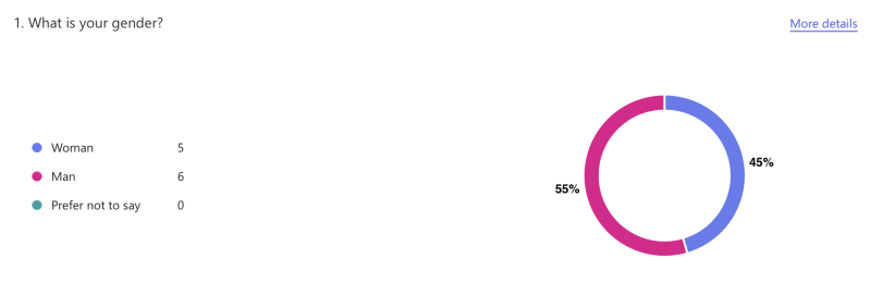
For the first question I asked 'What is your gender'. The results were Women- 5 and Man-6. This tells me that more men than women took my surgery, which could have created an issue as my magazine is mainly based at women. However, even though there were more men than women who took the questionnaire, I still took their opinions on board with my research.

This next question was important for me to see what the questionnaire takers thought about printed magazines. Adding in the digital magazine was a trick question, to see if they would pick the new 'normal' in today's society. As for the results, it was a tie. It was 50/50. This showed me that some people are following today's new normal with digital magazines and wouldn't want to have a physical copy of a printed magazine. It makes me feel motivated to change peoples minds and make them want to exercise their brains by picking up a physical copy and reading, not just scrolling. It enhances my idea of bringing back the physical prints.

For my third question, I wanted to ask about what topics they find eye catching. This was simply because I wanted to get a good overview on what topics people find the most enticing to see what I could use in my own magazine. After looking at the results it became clear that celebrity gossip Is the least interesting topic, which surprised me being honest because it's what you see in the average magazine. Sports and health and fitness tied with 5 votes meaning people like reading about it, which has given me ideas on what I could talk about and how. And finally, the winner was fashion and beauty, which is ironic because that will be the main feature of my magazine.

For the fourth question, I asked 'What magazines have you heard of?'. This was mainly to see what magazine companies I should take inspiration from, and how I could use their ways to be popular to make my magazine popular. Looking at the statistics, 67% answered Vogue. I did expect this because of the big reputation that Vogue carries, and how recognisable it is.

The fifth question, I asked 'What stores do you see magazines in?". This was to assist my research in where I would stock the magazine. This is an important part because you don't want them placed in a shop that doesn't have good audience rater, otherwise my sales rate would be low. 50% of people answered supermarkets, this tells me that looking at shops like Tesco or Morrisons would help my magazine become popular.

For the final question, I asked 'would you pick up a teen magazine?'. 7 people said no, 5 people said yes. The people that said no, I reckon are that used to seeing everything digitally now they wouldn't bat an eye at a magazine. Teen based magazines are also rare to find so for the people who said no, they might of never experienced reading a teen magazine hence their answer. For the people who said yes, they have motivated me to make sure this project is the best it could be.
.
Final Research Review
Q: How has the research impacted the development of your FEP
A: It has increased my knowledge of publication in general, giving me an advantage when it comes to production. I have also gained time management skills due to having to achieve deadlines to stay on track with the timetable I gave myself.
Q: Has your confidence increased? Do you feel confident about production?
A: Honestly I would say my confidence has increased because I conducted thorough research, helping me gain knowledge. It has helped me understand the technical terms when it comes to the magazine industry.
Q: What new skills/ research have you gained/ developed throughout the research section, and how will this help you?
A: A new skill I have developed throughout my research is prioritisation. These can be things like saying I need to do my proposal sheet more than I need to upgrade my writing for a section. This will help me get the important work pieces done.
Q: Could you have done anything differently? If so, what, how and why?
A: I could have done it all in a different order, rather than doing easy smaller tasks first. This way I would have done more writing as I wouldn't have been tired of writing constantly.
Create Your Own Website With Webador