Design Board

To begin my pre-production, I began to look at designing a board that includes logo variations, typefaces and colour palettes. I began by placing the name of my brand at the top of the board just because it remains clear throughout the whole board. I chose to use a Serif typeface because I want the magazine to be a luxury item for teenage girls to look forward to getting. After doing research, I found that “Serif fonts are the classic and trustworthy fonts of the family. They are often associated with tradition, reliability, and respect. The little “feet” at the ends of the letters give these fonts a classic, formal look, making them popular in print items like newspapers, books, and studies. If you’re aiming to convey authority and stability, a serif font might be your best bet.” [Form.agency 2026]. When talking about reliability and respect, these are key aspects of my brand that I want my audience to feel about the magazine brand as a whole which is why I used this specific typeface. Using David Airey as some research, he says “A successful design may meet the goals of the design brief, but an enviable mark with the potential to become iconic will capture a brands essence through simplicity, relevance, and distinction.” [Davidairey.com 2005]. This has helped me be satisfied and create my logo as because it’s a magazine brand, you can’t do much designing when it comes to the logo parts. So, I kept it simple because then it can be recognisable but also can be used across many platforms of media, like billboards to business cards. Why is it relevant though? Each logo
for each different brand with looks different, and they don’t need to speak for the company too. For a magazine brand, it just needs to say the name of the brand overall. Finally talking about being distinctive, I made it unique by selecting the typeface that has a different line in the ‘A’. This could make it recognisable because it’s not a usual thing you see in other logos. It was hard to discuss what fonts and colours I would use because it all depends on the images I use etc, so for now I kept a quite neutral colour palette, just the basics. For the typography, I just used the main font I used for my logo ‘Cesso’ and another one I possibly would use.
Concept Sketches


For my concept sketches, I drew out an idea of what the magazine would look like, including the masthead and other things that incorporate to the layout of the magazine. Instead of jumping straight onto designing, I wanted to sketch so that I wouldn’t waste time of production. I also want to use sustainability within my project, so sketching out gave me access to where I could incorporate sustainability. I felt creating a clear brand identity with organised and aesthetic covers will give the brand a clean effect making it a lot more appealing to the target audience.
Logo Generation
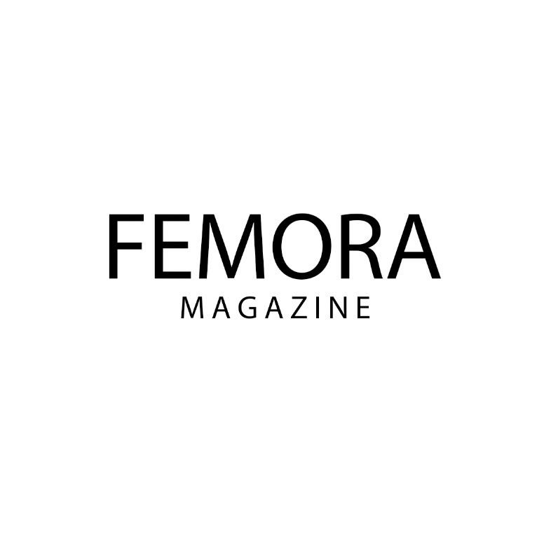
After doing some research on David Airey, his key points to make a good logo consist of keeping it simple, making it relevant, and aiming for distinction. I took these factors into consideration when making the logo. I used tracking in the word 'magazine' to try and demonstrate my design skills and highlight my knowledge in a typography section. I have made it relevant by using a San Serif font. This is relevant in today's society because it is clear and easy to read, for example, if you were to see it on a billboard that you were driving by. The font is simple but striking on its' own. Finally, when Airey talks about aiming for a distinction he said "Distinction means separation within the market. A strong trademark will have a unique quality or treatment that, after a period of use, can be directly linked to the business it identifies without being mistaken for a competitor." I've used this because it's a unique name that I haven't seen on the market before, but with an appeal to an International consumer. Although, I did not choose this logo due to the typeface and how it is used throughout a lot of companies logos.

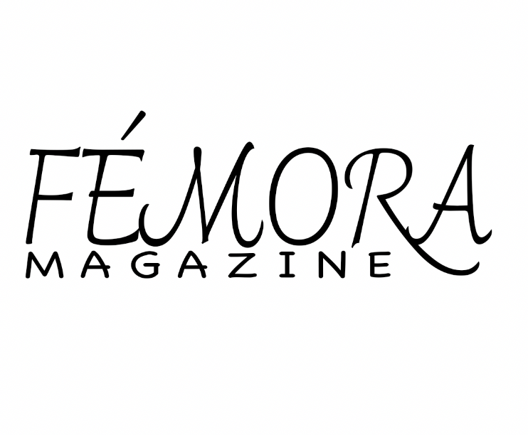
For this logo design, I wanted to use a Serif typeface to make it look luxurious and elegant. I used the typeface 'Cesso'. One thing I liked about the typeface is how the dash in the letter A is slant, I think it adds originality onto the logo as a whole. Again I used tracking in the same word as the first one, 'magazine'. However this time I sized it out so it was like a square frame, keeping it looking more put together and professional. In this logo design I'm going to talk about the reasons why I used the colour black. It is best to look at Joe Hallock's colour theory as it can back up my research and reasons why I will or won't use certain colours. According to his research, one of the colours that looks the most luxurious is black, this won by 42%. A colour I avoided using is orange. Hallock did some research on the most cheap looking colour and orange got voted the most and had 26% overall, second was yellow with 22%, and third was brown with 13%. Overall, I love this logo idea as I think it looks professional and it would draw possible consumers in, as it looks like something they'd want to buy because it could be seen as a desirable item to have as a teenage girl.
For the final logo idea, I wanted to experiment using a font face Im don't often use. The typeface was called "Charmonman" and it belongs in the cursive font family. After doing some research, I found, "As the name suggests, display or decorative fonts are just that. They are fun, casual, unique letter shapes designed to capture your attention, not for functionality. They can be serif or sans serif, while some styles include pictorial or graphic elements (like the Disney or NASA logo)." [vev.design 2026]. Because my target audience is aimed at teenage girls, this typeface would be ideal because it is a playful typeface which can draw the right audience into buying it.
Create Your Own Website With Webador