Production Log
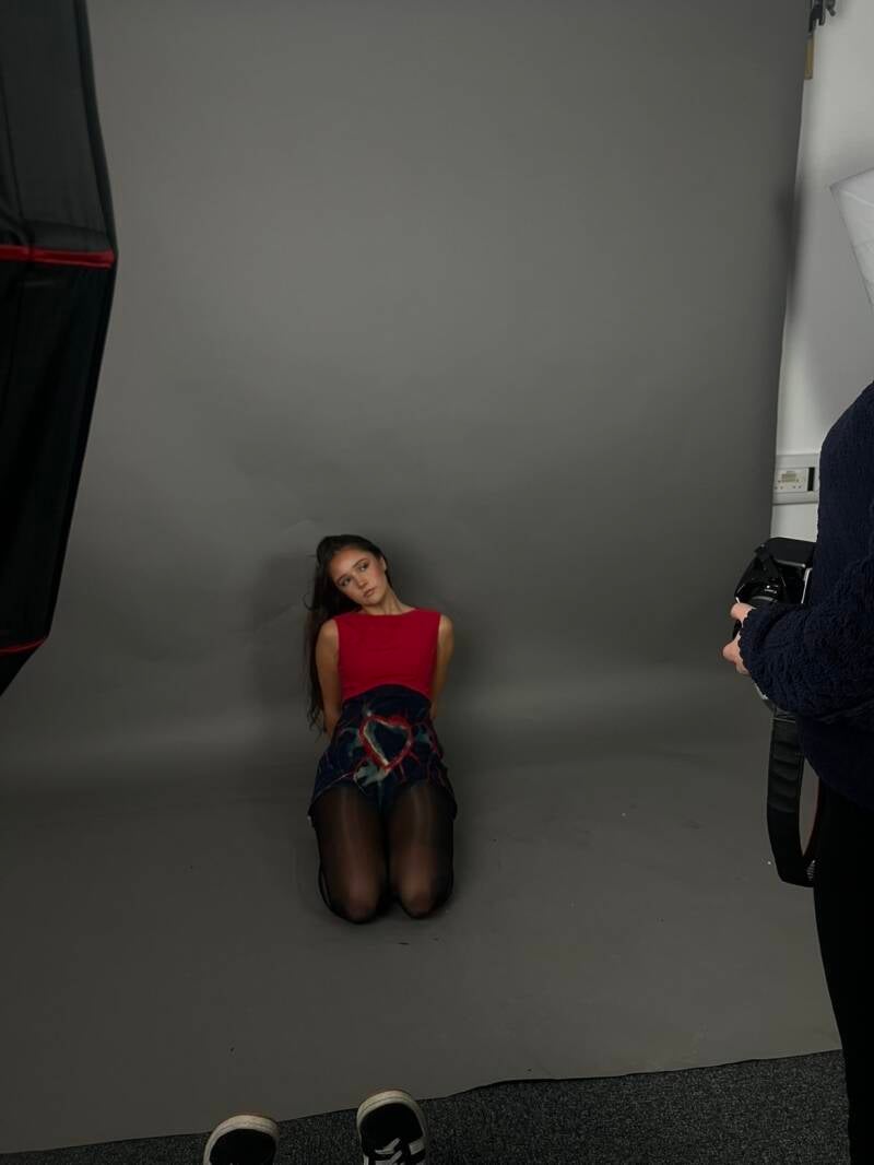


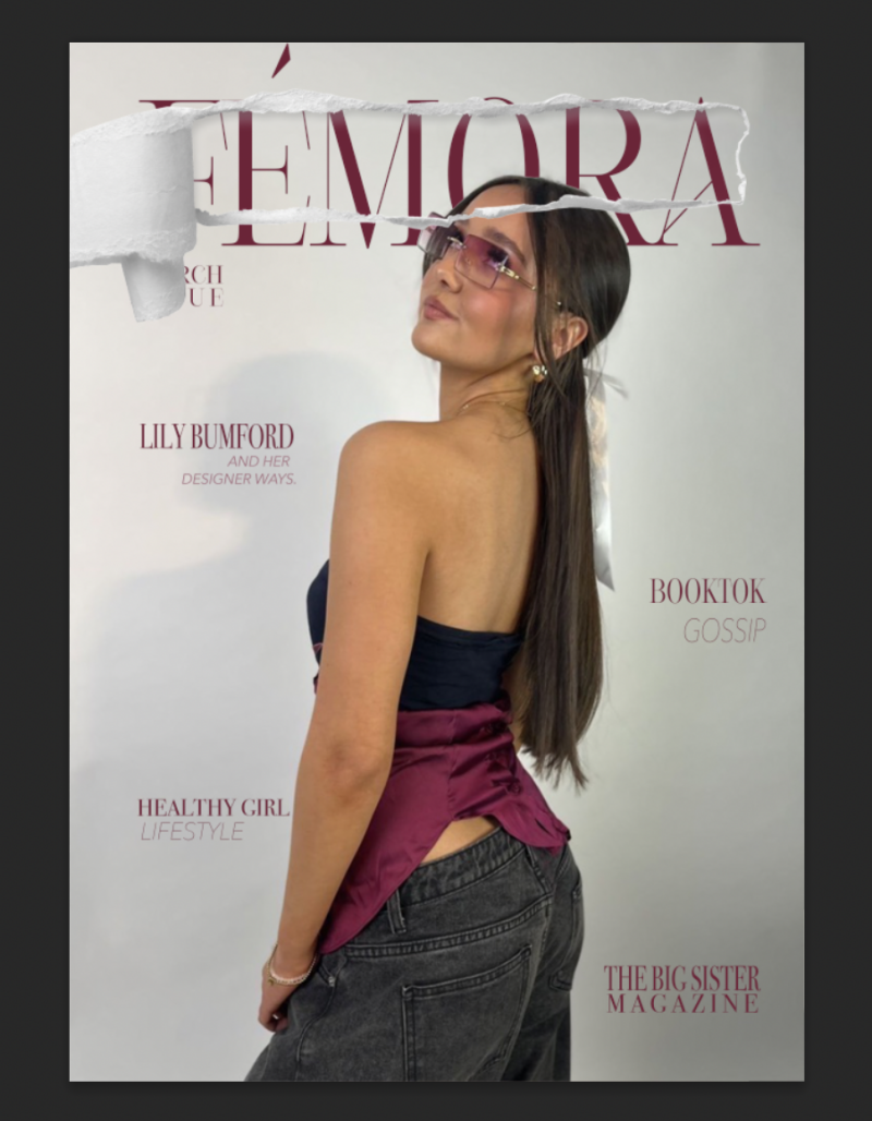
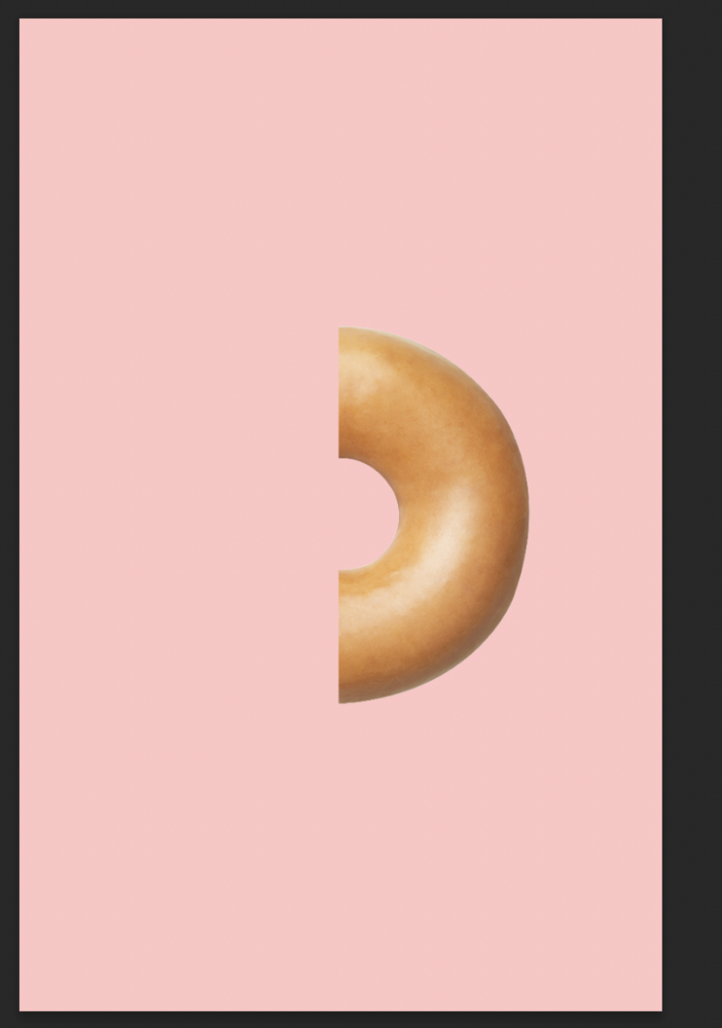
These were examples of some cover ideas just so I know what kind of style or vibe I want to go for with the magazine. I used my friend Lily to model for my magazine covers as she is really into fashion and I thought she would be perfect to use as a model. She gives off such a positive vibe and that is exactly what I want my magazine to give off too. These aren't my final outcomes, but it again gave me an idea of which photos I want to use etc. I’m looking into the Aida model so it can help me improve my knowledge of design. The AIDA model for example, the Burgundy based cover, the model is looking up at the brand name which means the audience will follow the eye gaze to it and pay attention whilst also paying interest in what they are looking at. I messed around with what cover-lines to have and where to put them, I tried looking at with and without some but also keeping the topics relevant.
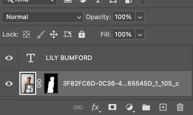
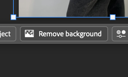
To achieve the look of the model being Infront of the text, I used the original photo and duplicated it again but pressed remove background to obviously remove the background. This allowed me to just have the model with no background, giving me the freedom to experiment where I would place her.
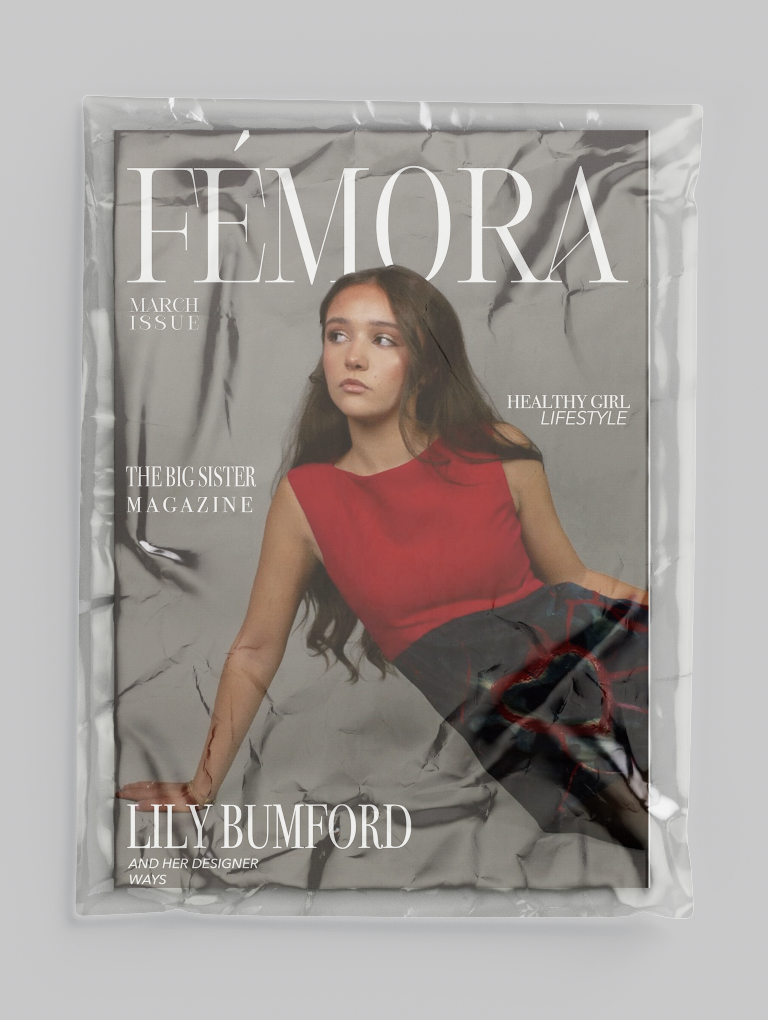
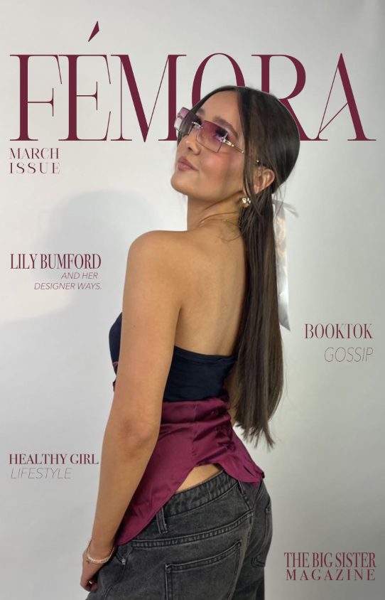
For the first magazine cover, it is a more daker aesthetic to the eye. I used the text behind an object tool as I wanted it to look more advanced and professional. I used colour mapping to match the clothes the model is wearing to match the colour of the text. However, I didn’t like how dark it looked, and it didn’t like the overall look. I felt like it took away with what the aesthetic was with the magazine overall. I used Inspiration from Vogue by having the monthly issue underneath the masthead because I think it adds to it and would be a good way for collectors to figure out which edit to collect, also helps people keep up to date with which magazine to buy with the more recent topics inside. This cover focuses on the fashion aspect of how I want femora to be, it gives an idea on what topics the magazine covers. The idea of using my friend Lily, who is a teenager, reinforces the idea that it is aimed at teenage girls for an audience. It also gets rid of the unrealistic standards that most magazine company’s set with their models. They’re all unhealthily skinny or full of fillers, which isn’t a good example on what teenage girls should be growing up aspiring to be like.

This was the second cover I designed for the magazine cover. I didn’t end up choosing this cover due to the colours and the highlights of the background not aligning together. Because of the light tone of the pink colour, and the background being light, you can’t read or see the writing itself. I kept the same layout as the first magazine cover because I was happy with the overall appearance and how neat it looked. Keeping the masthead at the top on the cover because it will be in a big size and centred, meaning it would be the first place the consumers eye will linger to. I used pink to try match the pink highlights that is seen in her top. This was to maintain the aesthetic of the cover. Again, the idea of using my friend Lily, who is a teenager, reinforces the idea that it is aimed at teenage girls for an audience. It also gets rid of the unrealistic standards that most magazine company’s set with their models. They’re all unhealthily skinny or full of fillers, which isn’t a good example on what teenage girls should be growing up aspiring to be like.
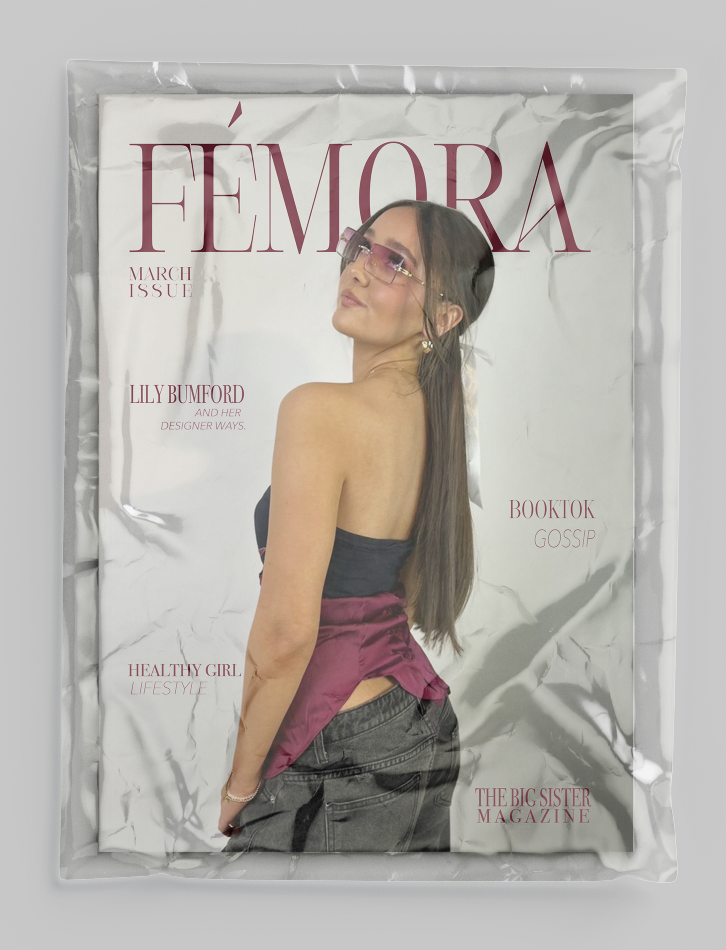
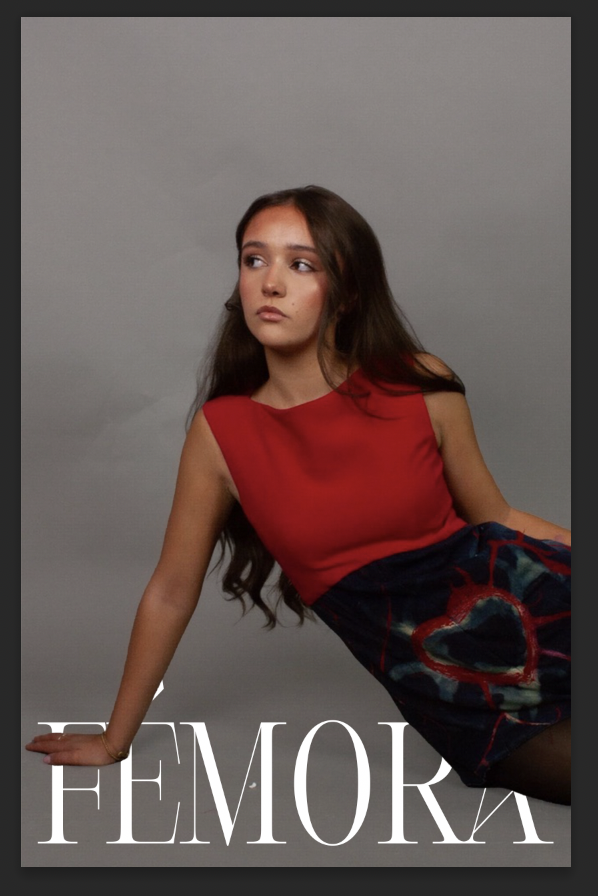
This is the last cover I designed and kept for my top three. I decided to go with this cover for many reasons, one reason being it aligns with the aida model. The aida model is attention, interest, desire and action. The model is looking up at the magazine title which I count as the attraction because it draws them in and leads them in being interested in what she is looking at. As they look at what the model is looking that, they begin to want the magazine after being interested in it and then the action would be buying the magazine. That became a big selling point for me when picking the covers. I again matched the colours of the masthead and others to highlight of the models top; this is to match the aesthetic right to make it look neat and organised. I also feel like the model aligns with my brand ethos as she is a teenager herself and doesn’t set any unrealistic stereotypes about teenagers. She almost creates a safe space for teenagers to just be.
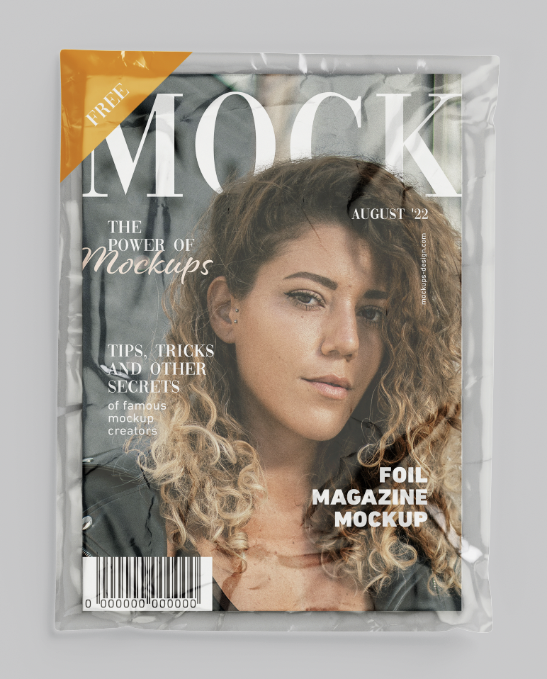


When designing a magazine, I knew that mockups would help my vision come to life. It would give me an idea of what the magazine would look like after printing it out. I downloaded a free mock up from [mockuptree.com 2026], that was the front of a magazine cover but also textured like a real magazine. It helped me know if I liked the cover or had any things that I wanted to change. One thing I didn’t like about it in the mock up was that the tone of the text was made a lot lighter, making it harder for anyone to read. A lot similar with the photo used for the cover, it was made a lot lighter. I know it wouldn’t come out like this if it got printed, however it did make me consider some changes such as changing the photo I used and the text of the colour. One thing I did like was how the layout was, after this I continued using the same layout of the masthead and smaller titles just because I liked how it looked overall.
InDesign Layout


After conducting research, I found that the best software to use to help produce my magazine is InDesign. Due to it being a part of adobes creative cloud suite, I have worked on this software before in college, giving me an advantage as I know how to work it. When creating the page structure, I added in 12 pages as of now just to see how I work with them and how I fill more, if I need more then I can just add some extra pages, and vice versa if I need to delete some. I also put on the option facing pages, so then it would actually look like a magazine when it gets printed out. As for the document size, I used the size ‘Tabloid’ as I was unsure which size would be best. I didn’t want A4 because I didn’t want it to be small but at the same time, I didn’t want it to be too big. The dimensions I used are 27.94cm for width, 43.18cm for the height.
Billboard Production


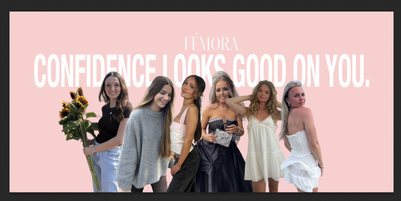
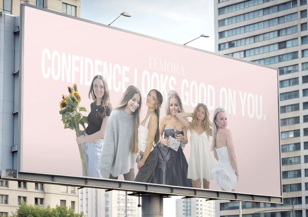
When designing this billboard, I wanted to embrace teenage girls looking confident all in one billboard. I chose to use this pastel/light pink colour as the background because according to colour theory, the colour pink represents admiration and compassion. Which is the exact meaning of this billboard. I used photos of my friends with their consent, to show how confident teenage girls are nowadays, happy without having any pressure from society’s expectations.
The Idea Behind
My idea when it came to creating this billboard, was so people (specifically parents) would drive past and see what strong teenage girls I used on the board to create an empowering advertisement. I came up with the slogan ‘confidence looks good on you’ because I wanted to inspire and eye catch the parents so they might see that media nowadays isn’t all negative. This could lead into an increase in sales if parents agree with the magazine.
Teaser Advert


The Idea Behind
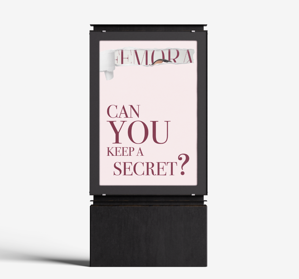
What is a teaser advert? Well, in my opinion I think a teaser advert is where it's an attention grabbing, short and snappy promotion that pulls in consumers making them excited without revealing what the teaser advert is about. I created my teaser advert about the launch of the magazine brand. I added a paper tear and cut out the part so you could see the magazine cover behind it, behind the tear. I wanted to use this idea because of the tear effect that aligns with how a magazine page would look if it was ripped. I used pink as the background colour because “The ‘pink tax’ describes the premium women often pay for products marketed specifically to them.” [verywellmind.com]. Although I don’t agree with the pink tax, I used this colour to ensure that females knew it was targeted at them as they are my target audience. I wrote ‘can you keep a secret?’ on the advertisement but I ensured to make the word ‘you’ bigger than the rest. This makes the consumer feel like they’ve been personally invited into the advertisement. It connects the advertisement to them. I used a dark red colour for the text as I felt it would give off a love type energy because of colour phycology. I did keep it simple and didn’t want to overflow it with designs because I wanted the main focus to be on the paper tear that reveals the magazine title.
Contents Page


Gradient Technique
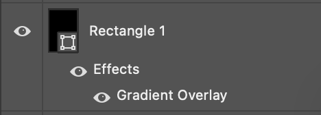
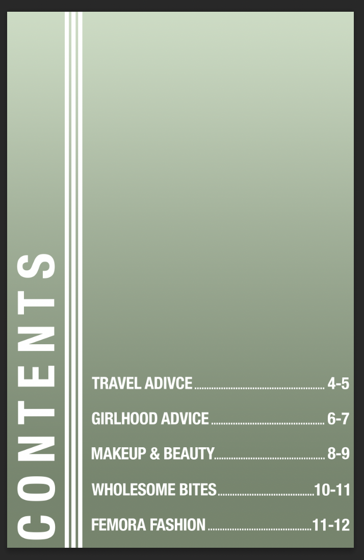
I used the gradient to prevent the text colour clashing with the dress colour. I added a black rectangle and selected the effect of the gradient. I wanted the gradient to be going from the top to the bottom as that's where the text is placed. I adjusted the opacity of the gradient so that it looked not too dark but noticeable that it was there.
Page Writeup
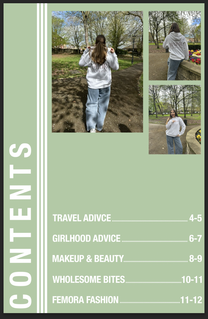
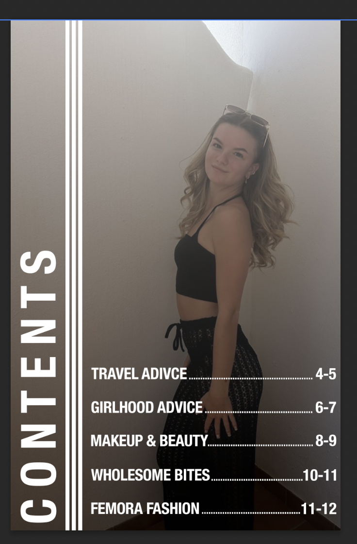
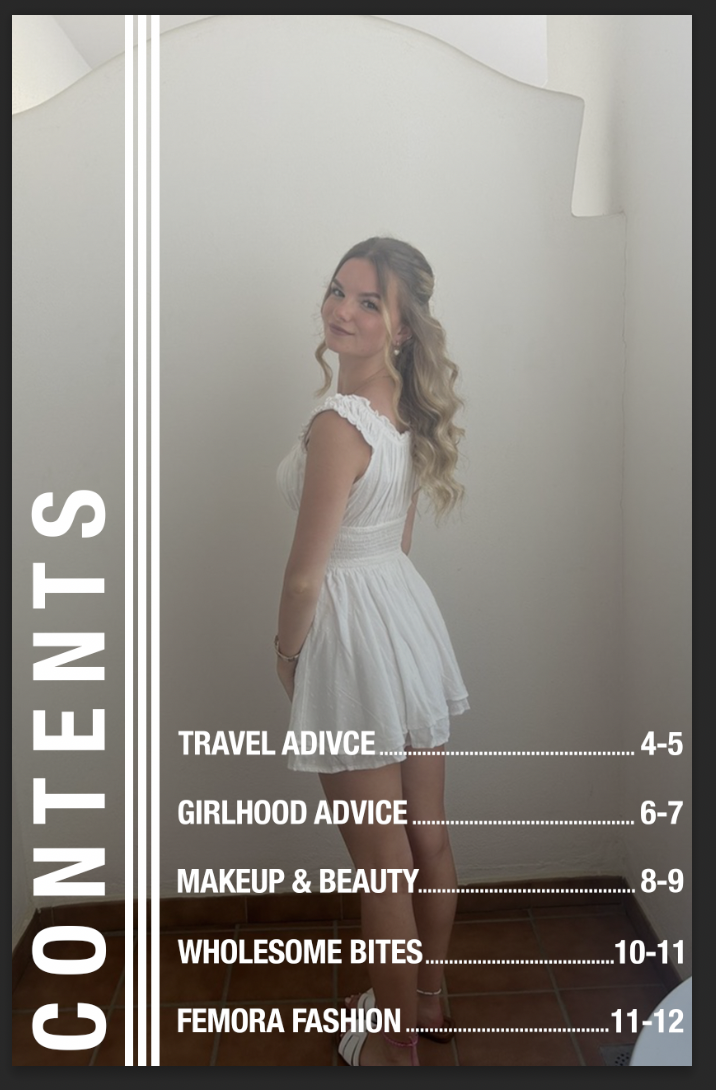
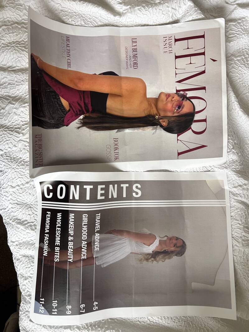
On this page, I designed a contents page. This was so the readers had an idea of what the other paged in the magazine would be like, they could have a look and judge on first glance if they think the magazine is for them. The target audience for this page are for the people who aren’t sure if they want to commit to buying something without looking at what the topics are inside.
When originally designing this, I went with a solid colour for the background. I chose a light sage green due to the colour phycology behind it. “Sage green can bring a feeling of refined serenity to interior spaces and is often a good choice for brands looking for a green that inspires quiet confidence and trust.” [Quillbot.com, 2025]. I want the readers to open the magazine and one of the first things that they see would be a trustful sense due to the page. I added some images of a model wearing the Femora hoodie, to promote the merch again as one of the first things that they see. It could make them want to buy it and think ‘ooh this magazine does merch’. Once images were in place, I used white text to add the page titles and the page numbers, so it made it easier for the readers to navigate through the magazine. I put the page titles and then followed them by lines of dots so the reader’s eye could follow through and see what the page numbers were. When adding the text, I used the typeface ‘Helvetica nue’ as it is readable and it is quite a bold typeface, making it hard to miss. I wanted to use tracking with the word ‘contents’ so it didn’t feel as squished all in the bottom corner. This also gives it a better look to the eye as it looks more clean.
However, after adding all the text it just didn’t feel right. It felt too solid and blocky, and it wasn’t giving me the vibe of a magazine. After some consideration I looked through the photos I put into an album that I wanted to use in my magazine, and I found two photos of my friend. I put each photo as the background and asked for peer’s opinions on which they thought was better, we all concluded that the white dress was better. However, the white dressed clashed with the bright white text on the page. So, to resolve this I added a gradient of white to black just to add some shade towards the end of the page where the white text was placed. I did this by adding a black rectangle to cover the page, clicked effects and selected the gradient effect. I adjusted the opacity of the effect, so it was just dark enough the dress and text didn’t clash anymore.
What worked well was how I changed my mind during the design process and not after I designed it. I’m glad I asked for peer opinion as it helped me reach the overall product with the page, matching it to the magazine aesthetic. What I would improve is possibly zoom in on the image a tiny bit more, just to make the girl stand out more as she looks quite small on quite a big page.
Overall, I’m really happy with how this looks as I feel it fits right with the magazine and gives the readers a glimpse of the overall aesthetic.
Double Page Design

Design Technique
When looking at this design technique, it is called the type-mask tool. This is where you mask the text and add an image as an overlay, causing the text to be filled by the photo instead of being filled by a solid colour. I learnt this technique in the first year so I wanted to use it again in this project to see if I could still figure out how to do it. I think it adds a cool effect to the pages, and it looks interesting.
Polaroid Information
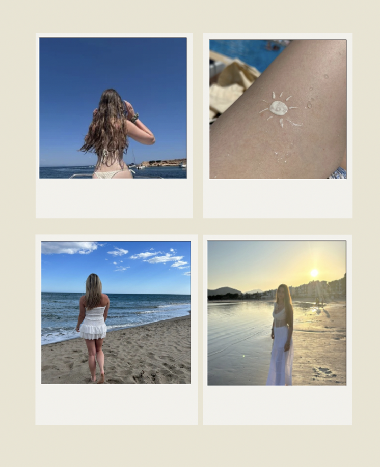
When you go on holidays, photos are such a big thing for teenage girls. We get excited about posting in on social media or just wanting the memories for keeps. I wanted to incorporate this feature in the magazine to really embrace it can be a relatable magazine for teenagers. I didn’t want to use some random photos of girls on holiday because I knew I couldn’t really feel connected to my designs. Instead, I asked my friends for permission to use their holiday photos, and I also used my own photos. A lot of girls get told because they post on social media, they do it for attention. However, in most cases it’s just a way to share their memories with friends or it can be an easy way to keep the photos. I want to show girls it’s okay by doing that.

Page Writeup
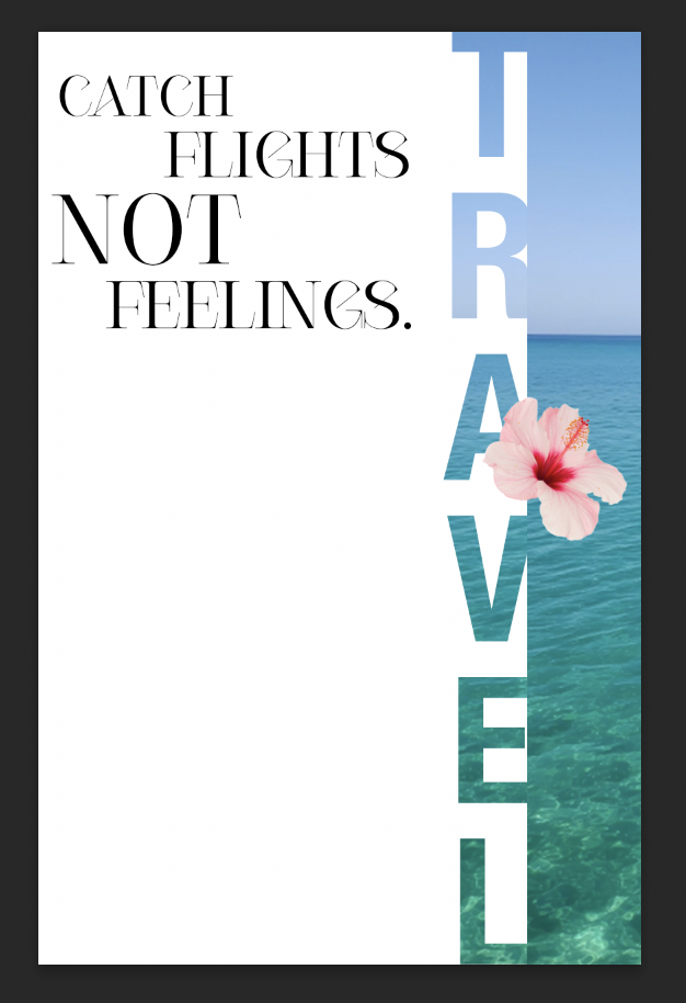
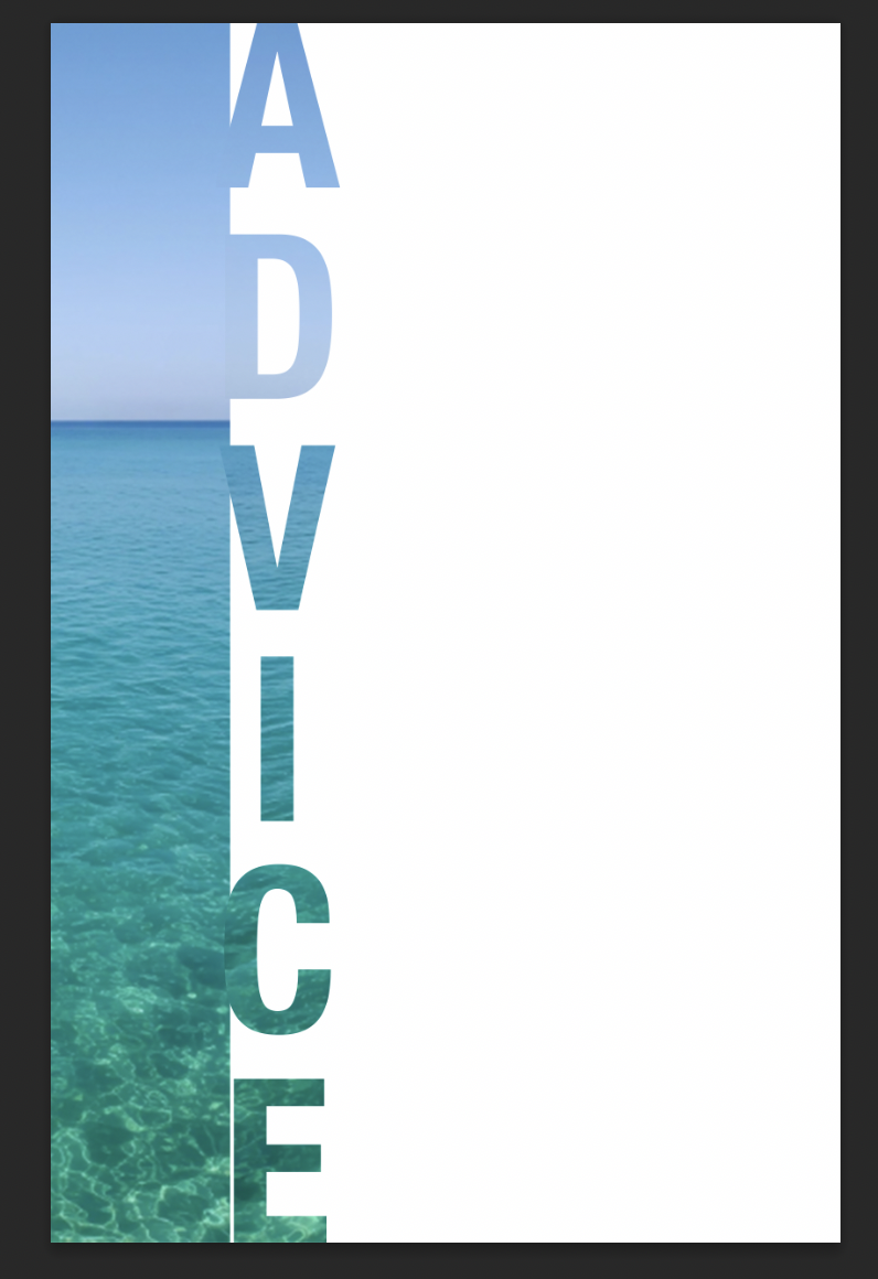
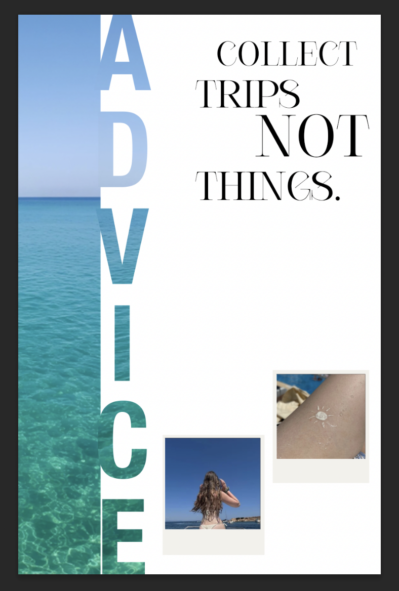
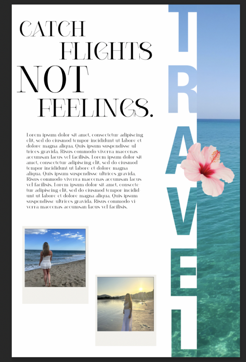
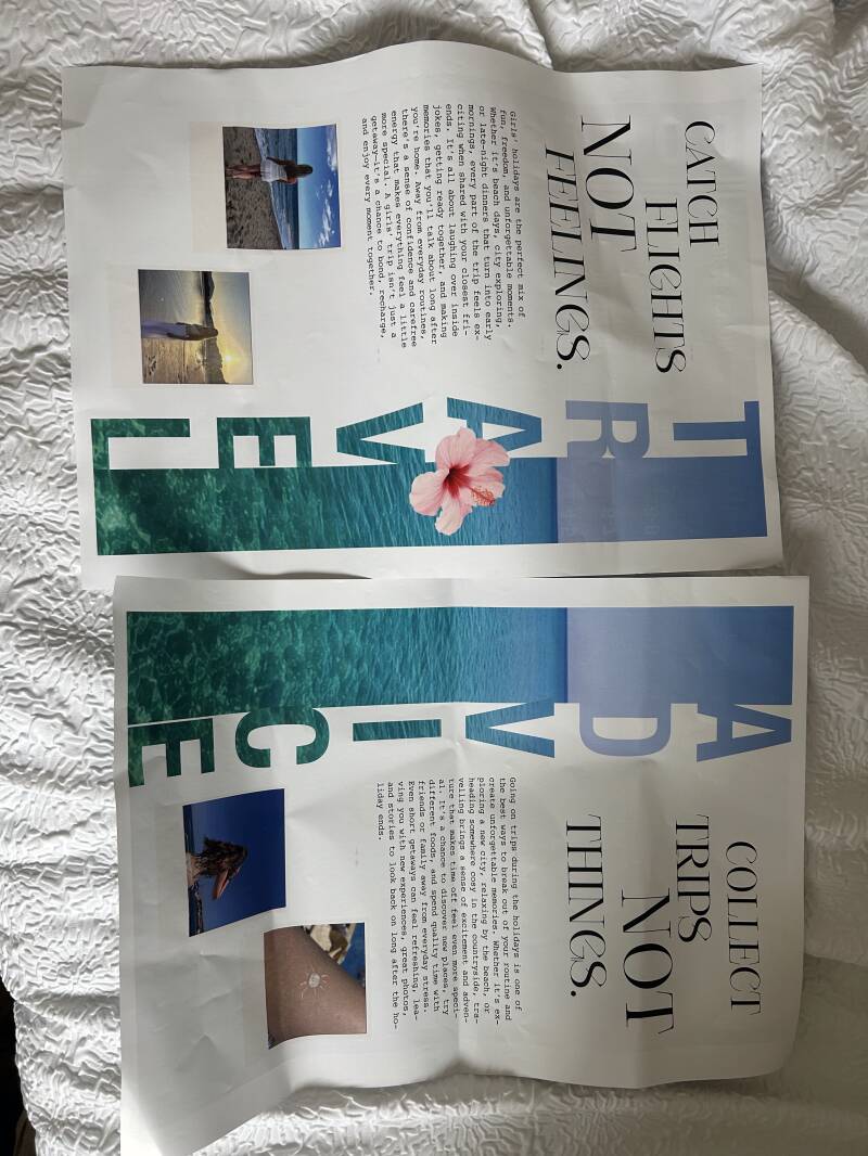
For this page, I designed a double page about travelling. I used a famous title like ‘catch flights not feelings’ on one side and then on the other side I came up with ‘collect trips, not things’ to match the same catchy title on both pages. I went in knowing I wanted to do something related to the topic of travelling. Being a teenager, all you think about is growing up, and with the benefit of growing up girl’s holidays become a topic on the mind. Girl’s holidays with your friends are so romanticised on social media in today’s society making it a big thing to want to do. The target audience for these two pages are teenage girls who might be working on planning a holiday between friends, or family or even if they want to do solo travelling.
One key visual element on the pages I would definitely say the text that has been filled with the image. When looking at this design technique, it is called the type-mask tool. This is where you mask the text and add an image as an overlay, causing the text to be filled by the photo instead of being filled by a solid colour. I learnt this technique in the first year so I wanted to use it again in this project to see if I could still figure out how to do it. I think it adds a cool effect to the pages, and it looks more professional. Another key visual element on the pages is the imagery. For the imagery on the page, I used my own photos and turned them into little polaroid on Canva. Canva has already installed mock ups where you drag the photos inside and it automatically fills the mock up. It is not as advanced in comparison to downloading one off the internet and opening it in Photoshop. However, I chose to use Canva simply to save time which gives me more time to do other designs. I used a royalty free image of the ocean to really give the aesthetic of travelling.
I followed the AIDA model when designing the two pages. The AIDA model consists of four different things. Attention, interest, desire and action. When discussing the attention part, my idea was to pull the readers in by noticing the bright pop of colour from the photo of the sea that I used. Due to it being in the centre of the two pages, their attention not only gets pulled to the middle, but also is automatically drawn to it. “Three explanations were explored for the finding that people prefer the middle option rather than the extremes when choosing from an array of similar options. In Study 1, 68% chose the middle item from a set of three highlighters and three surveys, whereas 32% chose an item from either end, p < .0001.” [pubmed.com 2000]. Now talking about the interest side, I focused on the titles. I wanted the titles to be very much the largest thing on the pages, simply to draw the readers in and make them interested by what the rest of the pages could be about. Moving on to talking about desire. When the readers see how much girly holidays are romanticised, it will give them a feeling of wanting to enjoy the very same thing, a sense of desire. They could want to ask their friends or family or even show them the page to explain why the sudden urge to have a fun holiday. Lastly there is action, relating back to what I have previously said. They might go ahead and book the holiday or again show the pages to their friends. The AIDA model is important to follow because it is structured stages that can help the phycology of marketing my magazine.
As for the layout of my magazine, let’s start with discussing the titles. The titles have been purposely made to be the biggest text on the pages because it would be the first thing that the readers see, grabbing their attention. Moving further down the magazine, we can see the information paragraphs and images. After doing my research, I found that images are an important factor. Why? Well, they grab the possible consumer’s interest based on the things in the image itself. For instance, if the image has something to do with football, then the target audience would most likely be for people interested in football, leading to them buying the magazine. It’s almost like images have to persuade people to buy the magazine.
For the colour on the images on the pages, they include a range of blues as the primary colour. According to colour theory, “Blue tends to evoke feelings of calmness and relaxation, often described as peaceful, tranquil, secure, and orderly.” [verywellmind.com 2026] Those words align perfectly with our brand ethos; we want teenage girls to feel like the magazine is peaceful whilst still being realistic. It isn’t full of negative drama in society. Now for the typefaces that I used. I primarily used ‘Courier’ for most of the text. This typeface is a part of the serif typeface family and is known for the history of being printed in most magazines as giving the typewriter effect. For the masthead I used the typeface, ‘Cesso’. In my opinion, that gives the title the ‘wow factor’ look of what vibe the magazine brings. Due to the size, it grabs consumers attention whilst they walk past the shelf.
What worked well was the photo I chose for the cover. I purposely chose that specific photo as the photo id of the ocean, giving the holiday aesthetic That aligns with the AIDA model as it grabs the attention of consumers. For example, “Where could we go with the ocean being there?”. What didn’t work well was that some text doesn’t align exactly next to the image. However, it is an easy fix as I can redesign the pages. I would improve on the layout as because it was my first time designing something like this, I felt the layout was a bit scattered. I would do it differently next time by looking at other magazine layouts and take some inspiration.
To conclude, I would say I met my goal as it does look good without looking unrealistic. One goal was to achieve time management skills, and I did this by working at home and college to complete pages.
Beauty Page Design
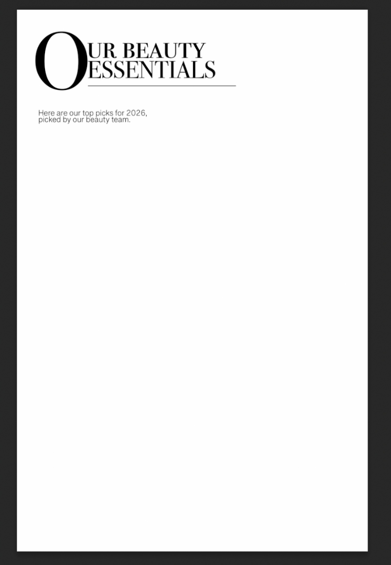


Typography
For the typography of these pages, I chose a Serif typeface and a San Serif typeface. I chose the Serif typeface for the titles to really make them stand out from the other text that would be on the magazine pages. It also highlights their importance because of how bold they are. I used a San serif typeface for the generic writing as I believe this is a clear typeface to read with no problems. I think they both look well matched together too, making the magazine look well put together.
Promoted Brands
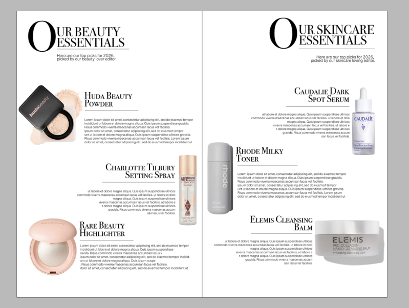
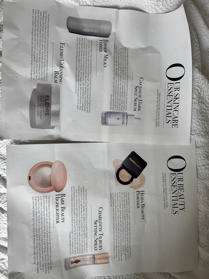
In my magazine I used these brands to show the best beauty products that the ‘beauty’ designer (myself), would recommend for teenage girls to progress their makeup routine with. Huda beauty, Rare Beauty, Charlotte Tilbury were the brands I used. I put glossier on but I eventually deleted it of my design.

Skincare Page Design
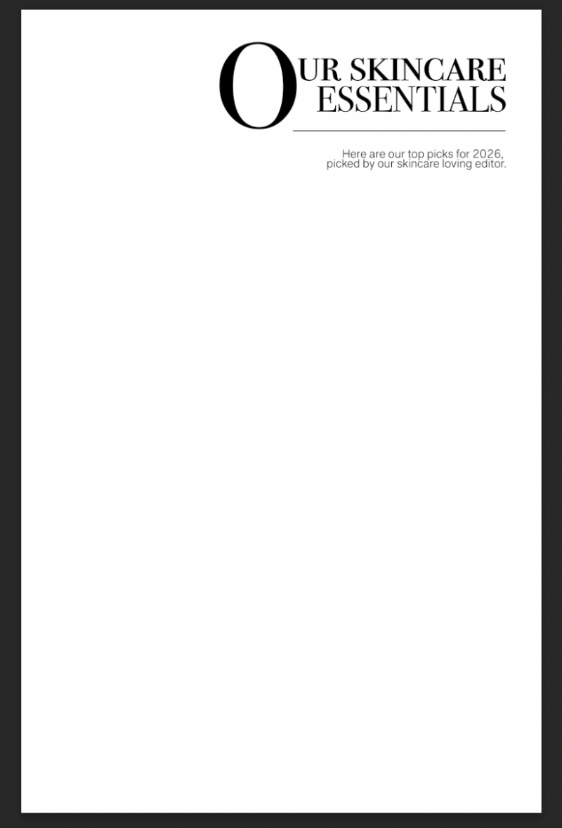


Typography
For the typography of these pages, I chose a Serif typeface and a San Serif typeface. I chose the Serif typeface for the titles to really make them stand out from the other text that would be on the magazine pages. It also highlights their importance because of how bold they are. I used a San serif typeface for the generic writing as I believe this is a clear typeface to read with no problems. I think they both look well matched together too, making the magazine look well put together.
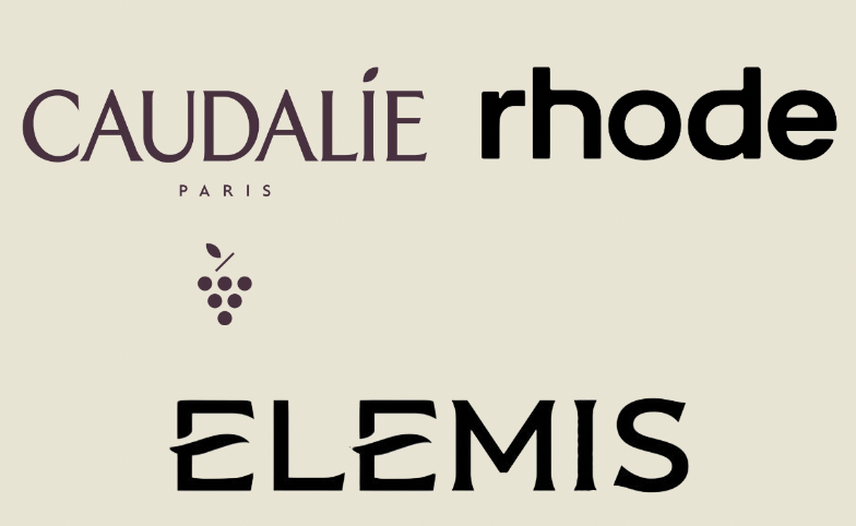
Promoted Brands
In my magazine I used these brands to show the best beauty products that the ‘skincare’ designer (myself), would recommend for teenage girls to progress their skincare routine with. Things that aren’t too heavy for adolescence skin. Caudalie, Rhode Beauty, Elemis were the brands I used.
Pages Writeup
Across these two pages, I designed an informative spread that can help teenage girls grow confidence when using skincare and makeup. When building a skincare routine, it is so important you know your skin type, and how harsh the skincare products could be. As someone who has previously burnt their face by a harsh skincare product, I try advocate for the importance of knowing things as much as I can. When building a makeup routine, it is important to know what products work well with your skin. With such fragile skin as a teenager that could be prone to acne breakouts, knowing what products irritate your skin is part of the process. The purpose of the pages is to expand teenage girls’ knowledge of things like this, embracing the idea of being ‘the big sister’ magazine. Not having anyone to help you can be hard so I thought if there is a page that can help those who aren’t fortunate to get the help, then it would work well. The target audience for these pages link to what I just said. It ideally is for those who need the help of someone guiding them in the right direction when it comes to skincare and makeup. However, anyone can follow the guidance.
The key feature of this page is the actual products themselves. The imagery’s aim is to attract the attentions reader if they were to flick through the magazine before buying. For instance, we all would flick through a magazine before buying just to see if it is actually worth it. If the consumer were to see the imagery of trendy products, it can catch their attention and pull them towards the idea of actually buying the magazine. Another key feature is the big O at the beginning of both titles. I was inspired by the history of literature using the design term of ‘Drop Cap’. What is drop cap? Drop cap is where the first letter of the sentence or word, drops below the normal text line whilst increasing in size, giving It a dramatic effect. For the typefaces, I used ‘Bondi 72 Smallcaps’ for the titles. This font is a part of the serif typeface family. The phycology of this typeface says, “The popularity comes from the elegant “serifs” that give this font style its unique name. It’s a classic typeface with years of tradition and usage among the formal institutes and academic circles due to its conservative nature and respectable appearance.” [designmodo.com, 2026]. I loved the classical look I got when using this on the pages because I felt it made it look more professional. The other font I used was ‘Grantha Sangam MN’. I mainly used this font for the basic writing, the paragraphs and any subtitles. I felt the font was quite clear which makes it easier for the reader to actually read it.
For the layout of the two pages, I didn’t plan anything out as I felt it would just be better if I just went with it. One thing that did stay the same was the alignment of the titles being on the left hand side. Even on the right page, the text has a left alignment. I placed each product differently whilst ensuring I had the space to write some paragraphs that could persuade the reader to purchase. The key visual elements of these pages are definitely the products. The products were selected based of research from what things teenagers struggle with. For example, the dark circle serum can tackle tired, dark eyebags which teenagers can get from lack of sleep due to things like poor diet, electronic time or just stress from education.
This page does not have a particular colour scheme because I felt that due to it being an informative page, I didn’t want any colours or bright things being distractions. I kept it simple with the only colours being Black and white. Let’s talk colour theory. From my knowledge, white resembles the sense of peace and cleanliness. This is exactly the vibe I want for these pages. Why? Well, the pages are about starting a new skincare and makeup routine, and skincare links to cleanliness. Now for the colour black, this means feelings of luxury. Again, this is what I want readers to feel because the products on the page are luxury items that they are going to want to buy.
What worked well was the subtitles and the titles on the page. I feel like it pulled it all together giving a professional effect. They both explain to the readers what the pages are about whilst looking aesthetically pleasing, matching the theme of the magazine. What didn’t work well was the alignment of the title on the right page. I wanted it to match but if I were to flip the text to put the O on a right alignment, it wouldn’t look right but would only look messy. I could have changed this by placing the text on the left anyway to match the other title text on the other page. I would improve on trying to get brands to collab with the magazine and using these pages to promote their products. This will make the magazine more trusting to teenage girls if they see the products they see other people using on social media.
In conclusion, I met my goal for these pages as I knew I wanted to have a beauty and skincare page to help teenage girls create a routine. I would add some colours if I were to do it again as it is my least favourite page in the magazine. However, I am happy with the result of the purpose of the pages.
Girlhood Advice Page
Healthy Eating Ideas Page
The aim of this page was to help the readers who may struggle about having a relationship with food. The page was purposely made simple due to the fact I didn't want to overwhelm any of the teenagers by overflowing the page with loads of food ideas. If they struggle with their eating then seeing so much food at once could be a difficulty for them. Instead, I added some simple foods that are easy to make at home without it taking a while that they get put off making it.


Typography
For the typography of these pages, I chose a Serif typeface and a San Serif typeface. I chose the Serif typeface for the titles to really make them stand out from the other text that would be on the magazine pages. It also highlights their importance because of how bold they are. I used a San serif typeface for the generic writing as I believe this is a clear typeface to read with no problems. I think they both look well matched together too, making the magazine look well put together.
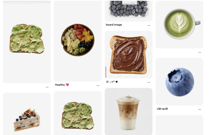
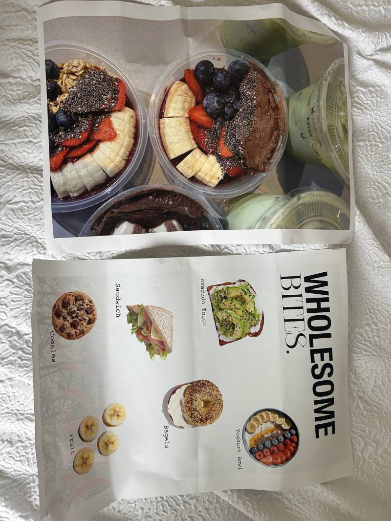
For the images I used on the page, I searched up 'Healthy food inso bird eye view' to try get a basic image of food ideas I could use. I have referenced them all in my bibliography. They give the clean girl aesthetic which is the vibe I want for my magazine because that specific aesthetic style is on trend.

Page Writeup
For this section of the magazine, I designed healthy food ideas that teenagers might find easier to make than normal foods. I put different images of little snacks or foods to give. The purpose of these pages was to inspire teenagers to push out to try new easy foods that are healthier. When being adolescence, it is simply just easier to throw a pizza in the oven that could be ready in 10-15 minutes. However, I thought about food options that could be made from things you could find in the cupboards. The target audience for this page are for people who struggle to cook or struggle eating larger portions.
One of the key features of the pages is the big image on the left side. This is my own image from when I got iced matcha and acai bowl with my friends. I felt it fit the aesthetic and the theme of the food images; they are also trending a lot in today’s social media. On the other side of the pages, that was where I placed the actual food ideas and most design things. I went into this page design knowing I didn’t want to overflow the page with loads of text or any extra things. This was because at first look, if people see something with loads of writing, then they are most likely to scrip the page. Especially because a lot of teenagers struggle with eating, I didn’t want them to skip this page as it could be informative.
For the layout of the page, I placed both of the titles towards the top of the page on the left alignment. Studies say that consumers first look at the top left corner of a page, “Web users spend 80% of their time viewing the left half of the page and 20% viewing the right half. Adhering to design conventions will help maximize users’ efficiency and company profits.” [nngroup.com 2026] This research gives me the knowledge of guidance when it comes to designing things to grab attention. I then placed the images of the food/snacks across the page randomly and then rearranged them based on the size of them or how many things are included. After setting out the layout, I quickly labelled each food or snack item with its name so that the readers new what they were thinking of eating. Just in case they wated to research a quick recipe or something along those lines.
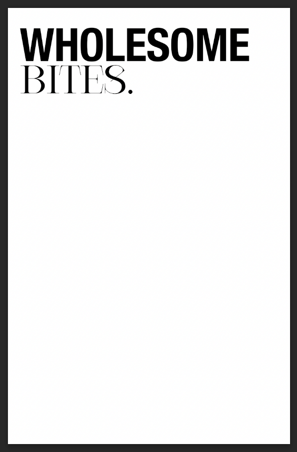
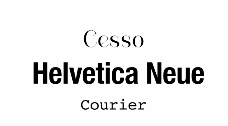
Let’s go into further depth on things like why I chose certain fonts or images. For the title, I used three different typefaces. One typeface is called ‘Helvetica Neue’, and I used that for the top half of the title to really emphasise the fact the food page was ‘wholesome’. Due to the boldness of the typeface, it draws the reader in from all the slimmer imagery or other typefaces on the page which is the exact reaction we want. Helvetica Neue is a part of the San serif font family which has a target audience of youthful people, as it is easier to read than the other font families. The other typeface I used was ‘Cesso’. This typeface is a part of the Serif font family. I used this font because it paired well with the bolder text on the top, they both tie each other together. For the last typeface, I used this one for the labels when naming the food images. I chose ‘Courier’ as it is small, readable and clear. I chose these specific images from Pinterest by searching ‘birds eye view foods’ as it gave a good overview on what the foods include or even just to make them look appetising from a better angle. I would say that they are personal preferences that I, a teenager, find easy to make or just have at home.
What worked well was the big image on the left page. I love how this looks next to the other age with the information on because it just gives it the real magazine aesthetic. When you flip through a magazine, they often have full image pages to create a visual break. I knew I wanted to use this idea, and I have carried it all throughout the whole of the magazine. What didn’t work well was when I tried adding small paragraphs below the images to explain how they could create the food item. This was due to the page beginning to look really over cluttered and unprofessional, leading me to just have the titles of the food items. If the audience liked and followed the page, then it could fix relationships with food for some who struggle, or it could just genuinely help people eat when they feel as if they have nothing in the house. Something that id do differently is rearrange the layout of the page with the images and text on so I could fit some small paragraphs that include recipes or the ingredients. One thing that I would improve on, was I could’ve made it into a double spread instead of one singular page. I would’ve added more food inspiration and sectioned it into different categories so that they have more options, maybe even vegan or gluten free options. I would definitely do that if I were to redesign or even if I had the time to redesign it.
To conclude, I would say I met my goal but only just as it didn’t go the way I would’ve wanted it to. Initially, going in to it I knew I wanted something related to food ideas so now I’ve designed something along those lines I can tick it off the list I created of page ideas.
Typography
For the typography of this page, I used two different typefaces, both from two different font family. One typeface I used is called ‘Courier’ and that is a part of the monospaced slab serif typeface. I used this typeface for the simpler text to make it more readable. For the other typeface I used ‘Cesso’, and I used this for the main titles. This typeface is a part of the serif font family which aligns with why I use it often for titles as in the writing industry it is historically used often.
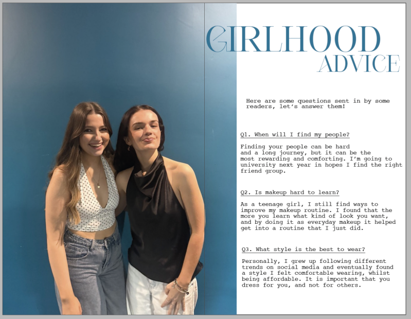
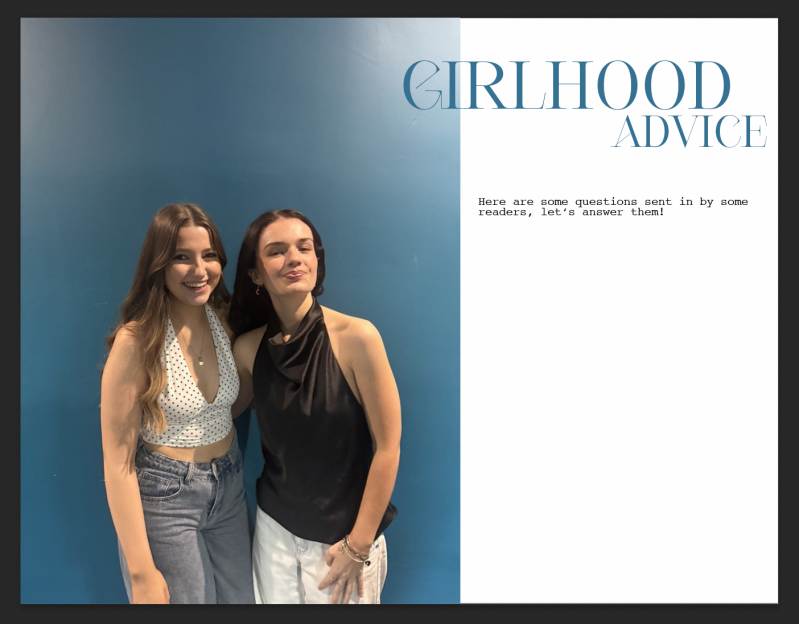
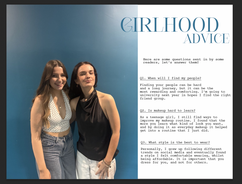
Page Writeup
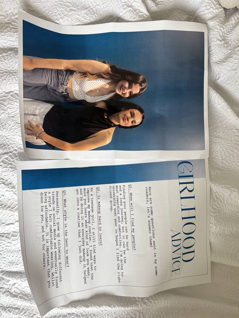
For this page I dedicated it to the role of girlhood. Girlhood has quite an impact on a teenage girl’s life because it could be a really nice experience with it, or some girls have a difficult experience due to drama, or friends in general. I created the idea of having the readers ‘send in’ questions for us to answer for reasons like not having the support around them or feeling uncomfortable asking the people they have around them just incas they ‘don’t relate’. The purpose of the of this page was to relax the readers into thinking about normal situations happen to everyone and it is actually normal. The target audience are for those who feel like they can’t ask these questions to people they know personally in case they get embarrassed or made uncomfortable about relatable situations.
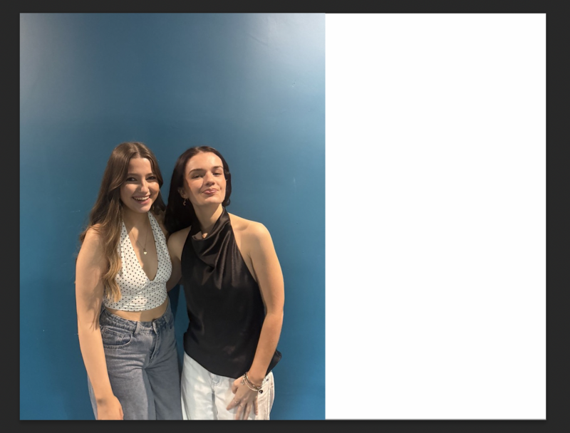
One key feature of the pages is the big photo that I used across one page and a small section on the other page. The image that I used is a photo of me and my friend laughing together, giving the audience a way to connect to our emotions in the photo, when thinking about girlhood as a topic. According to @dunnedwards.com, “As with most colours in colour theory, what the colour blue means depends on context—it carries both positive and negative connections. With a sense of calm, relaxation, trust, loyalty, and authority, the positive highlights convey honesty, commitment, serenity, and peace.” [dunnedwards.com 2025]. I specifically chose this photo due to it having a blue colour background, and that it comes with meanings that align with our brand ethos. For example, as from the reference above it says that the colour blue can resemble different emotions such as trust and loyalty. Those emotions are two important factors when it comes to your friends and ‘girlhood’, you want friends who you can trust with your secrets whilst also being loyal to you, always being there for you when you need each other. Not having a best friend is hard because you feel as if you’re the ‘floater’ friend, where you have friends but not a best friend. Finding your person can definitely help shape your experiences with school, university and more. Another key feature on the page is the title ‘girlhood advice’ in big writing to draw the reader’s attention to it. If I saw a big title that said advice I would definitely stop flicking through and juts have a quick look. I matched the colour of the text to the background colour on the image to pull it all together and make it look aesthetically pleasing to the eye.
For the layout, I looked into layouts of other magazines and found a similar pattern across different magazines about how they have their pictures covering a whole page whilst fitting on to the other page. I had a small search to see whether there is a name for this method and discovered it is called partial double-page spread. I have used this across most of the magazine as I believe it gives it a professional look, meaning that consumers are likely to take the brand seriously if it has that professional look to it. I then had the title in a bigger text size to the other text on the page so it could do its purpose of being a title and entice people to stop and look at the page. Below that is a small subtitle that just gives the readers a small overview on what the page is about, giving it that bit of extra information the title wouldn’t give. For example, people wouldn’t know that readers can send in their questions for this section as the title just said ‘girlhood advice’ whereas the subtitle is more informative.
Moving on to talking about why. So why did I chose the fonts I used? For the title, I used the typeface ‘Cesso’. This typeface is a part of the serif font family meaning that it has quite the royal look. I have continued to use this typeface around the whole magazine due to how I like the look of it as the main text of the pages. I think it looks really classy whilst appealing to those who might be reading, giving it the vibe that it is something that could be classed as a luxury. For the other text on the pages, I used ‘Courier’. Courier is a monospaced slab serif typeface that has a typewriter appearance to it. I wanted to switch up the usual font I used for just the writing, so I used courier to give it the classical magazine vibe, with the typewriter aesthetic. However, on reflection, some people would find it difficult to read due to the point size of the text.
What worked well was the whole idea of this page. In my pitch, I knew I wanted to create a safe space for girls to ask any questions they felt awkward about without feeling like they were to be judged. I liked how I designed it and how it turned out with using personal images, and just how I layout the questions and answers. What didn’t work well was the typeface I used for the normal text. I used a specific font where it is readable to some and unreadable for the others. I didn’t realise this until after I designed and uploaded it to the magazine layout, my peers commented on it making me realise. I would say the pages can be effective to the readers who don’t have anyone to talk to about personal topics, it creates a safe space for the reader to feel at ease and comfortable. What I’d do differently next time is create a fake email or QR code and put it somewhere on the page so that readers know where they could send their questions to.
Overall, I would say I met my goal of the purpose for the pages by executing it out good, but I would just design it differently next time, maybe with more detail. I would try adding more colour rather than just using the same colour for the whole page. Possible more pinks and yellows.
Merch Pages


Typography
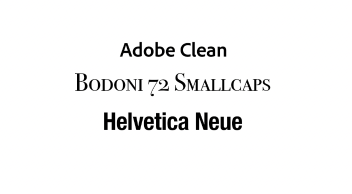
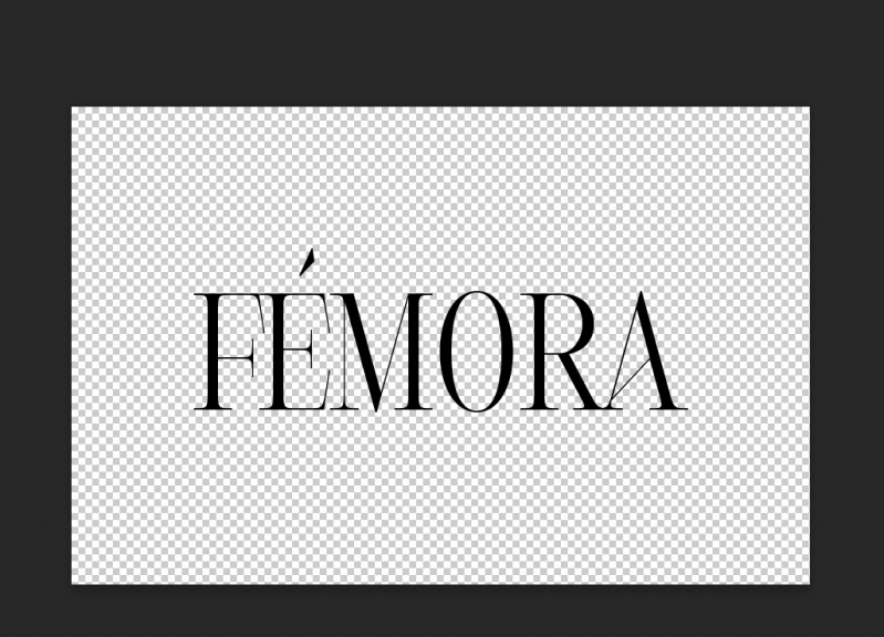
For the typography, I chose three typefaces. I used ‘Adobe clean’ for the writing text on the page because it was a simple and easily readable font. I then used ‘Bodoni 72 Smallcaps’ for the big title. This was because it has the dramatic and eye grabbing effect that a title needs to pull readers in. Finally, I used ‘Helvetica Nue’ for the small Femora text on the side of the title. This was just to add to the title making it look better. However, I didn’t want to use the original Femora typeface because putting two serif fonts together on a design doesn’t look right, it was also too thin and wasn’t visible.

Imagery
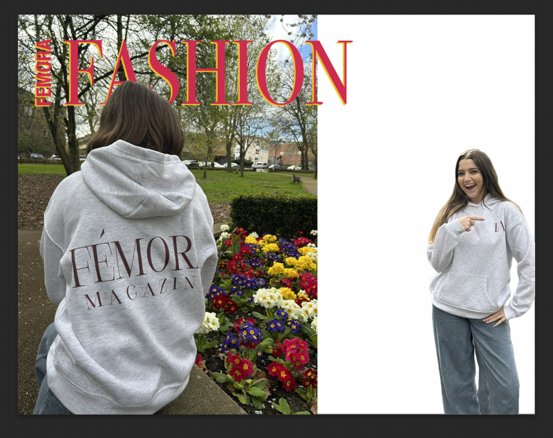
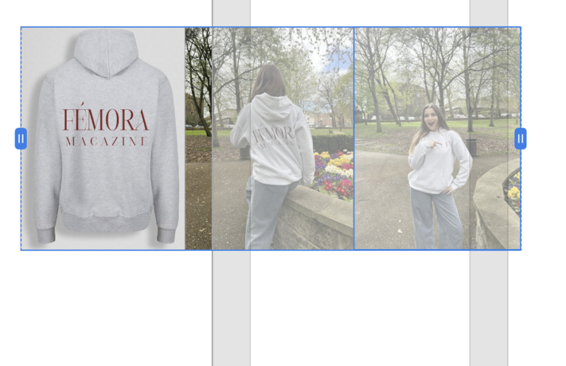
The images that I used were my own photos. I used myself as the model and wore the hoodie I printed on. Me and my classmates when to the park next to college to take all the photos and out of them all I chose these two photos as they both showcase the front and the back of the hoodie. Due to that factor, I felt it was a good way to promote the hoodie as the audience can see the front and the back of the hoodie.
Page Writeup
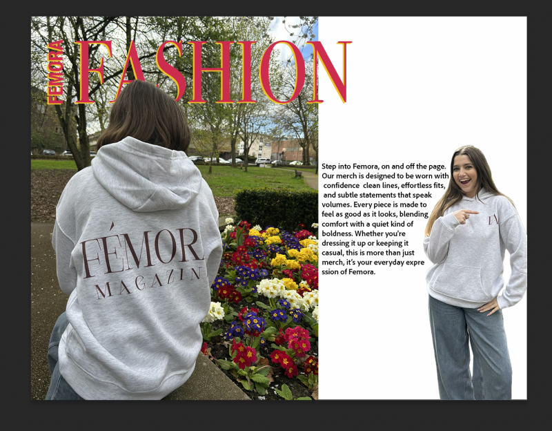
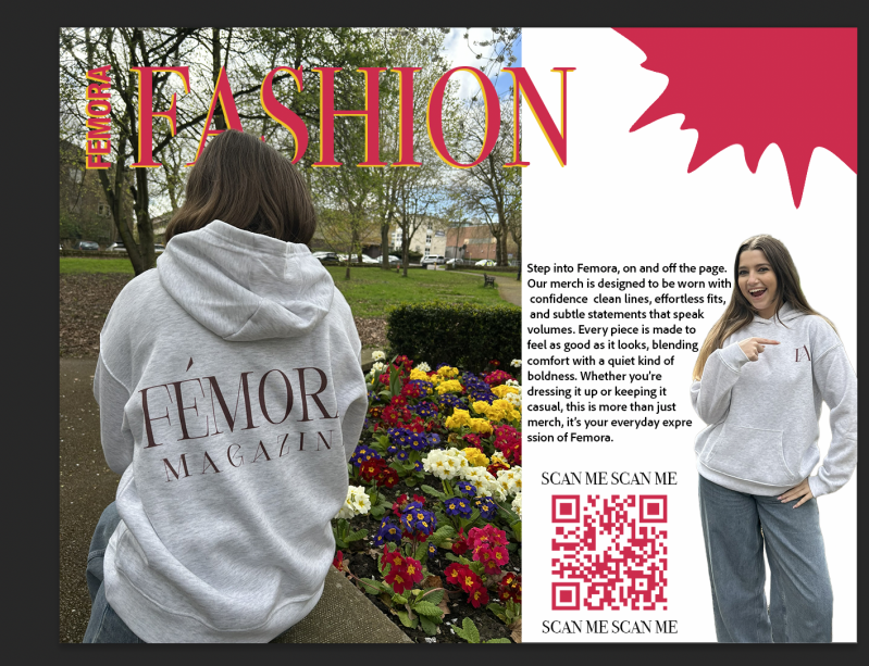
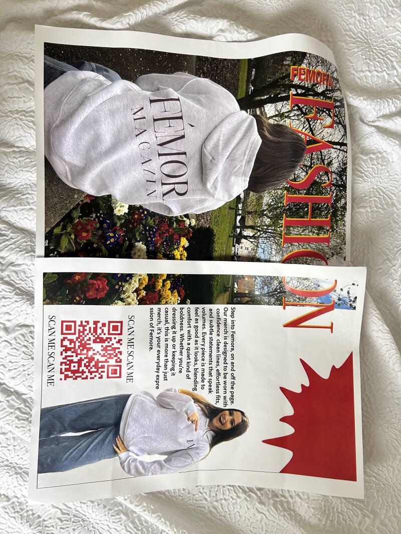
For this page, I designed a double page to promote the hoodie I designed for the ‘merch’ of the magazine. I wanted to have a separate page for the merch so that the readers could focus on the hoodies rather than drifting their focus to another topic it was on a shared page with another advert or design. The target audience for this page are people who are interested in fashion or who want to support the magazine by purchasing the hoodie. The purpose of the hoodie was to promote the magazine company as a whole. When people wear branded things, others would always wonder what the company was or where it’s from.
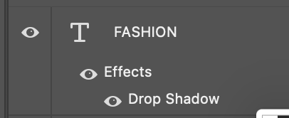
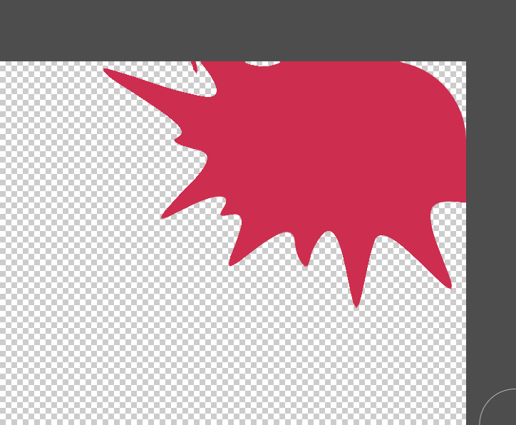
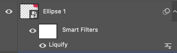
One key feature of this page is the big text that says ‘Fashion’. This text has a bright pink colour used for the primary colour. I used the colour hot pink as it is quite a bright and eye grabbing colour, I also think it goes well with the bright flowers in the background too. I used the drop shadow tool technique on this part of text, and I used a bright yellow colour to make the pink pop even more. Another key feature is the photo of the model pointing at the small logo on the hoodie. This follows the AIDA model in many ways. For attention, the readers would look at what the model is pointing at and then it sparks their interest into thinking ‘what is it she’s pointing at?’. Then desire comes in by the reader wanting to buy the hoodie, because it becomes a desirable item from how the model is wearing it, seeing It on others makes consumers question if they would look good in it. For action, it would be purchasing the hoodie. I would create a website for this s that the buyer finds it easy to just buy the item, without having to check through social media first. The QR code on the page was for the matter as I felt that they would find it easier as technology has become such a big thing for teenagers in today’s society, it would be easy for them to take their phones out and scan the QR code so it can take them directly to the website to purchase. One last key element on the page is the shape that I created in the top corner. I felt like the top corner of the magazine felt really empty and it didn’t look right, so I used a normal circle and use the liquify tool to create my own shape. The liquify tool in simpler terms is a technique where you can pull and stretch out shapes however you want. You just select an area of the shape and drag it, creating the unusual shape.
For the layout, I chose to use a technique called ‘Runaround text’. This technique is where the text can be seen to almost contour the image, shape or object it is seen around. For example, on the magazine page you can see the text is warped around the model wearing the hoodie. The text around it is relevant due to the topic is about the merch. I used a double page again for this whilst putting the image over on the other side to make the image be the main focus of the pages. This is so the hoodie can get the attention of the reader, making them want to buy it which can lead to promotion of the magazine brand. I added the magazine name as a smaller title next to the big ‘fashion’ title, so that if the reader were to show their friends or leave the magazine out then they would know what brand the merch actually comes from. However, on reflection I would change something about it because it isn’t that clear as the background clashes with the two bright colours of the text.
I used the typeface ‘Bodoni 72 Smallcaps’ for the bold title. This specific typeface is a part of the serif font family. The serif font family has a variant of different typefaces; however, I wanted this specific one as I have used it throughout my magazine as a whole. I like how it gives it an appealing look, like it can be a luxury. Another typeface I used was ‘Adobe Clean’ for the text that warps around the image of the model. I used thus font as it is easier to read, and because it is used on the main text it is important that readers could actually read it. “Fonts influence how easily readers consume your content. Poor font choices can lead to eye strain, slow reading, and even frustration. Great typography, on the other hand, enhances comprehension and gives your book a polished, professional feel.” [friensens.com 2026]. As for the image positions, I knew I wanted a cutout of the model pointing to the hoodie because I knew I could work with the AIDA model with it. I definitely think it worked well because it draws attention.
What worked well was warping the text around the image of the model pointing. I love how it came out in the result; however, I would try make it a bit cleaner next time. I feel as if it has advanced my work look on the page. Another thing that went well was the colour palette for the page remained the same. I like how the bright colours in the shape or the text match with the imagery of the flowers in the background of the bigger image. On the other hand, you could argue it makes the hoodie look less colourful and duller. I would improve this by playing about with the saturation of the image with the hoodie on, seeing if I could really show the contrast of the hoodie being brighter. But I would have to be careful because if I did this then some customers would think its misleading as the hoodie text wouldn’t be that bright.
I did meet my goals of this whole page because as soon as I had an idea about making a hoodie, I couldn’t wait to make the merch page as I could have fun with it. I enjoyed doing a photoshoot with my friends to take these pictures which I’m glad we did so it can look more realistic.
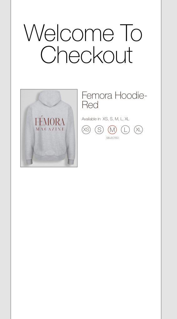
Hoodie Merchandise

When on the mockup, this is what I can see on the side. This allows me to see where I need to click to get my design on.

The part where I have circled is where I click on, then It takes me to a blank canvas.
The is the blank canvas, where I put my text in. I have to save it first by pressing command + C, so it can update on the mockup

When designing clothes it is important you have ideas on how you want the clothes to look. I first decided to design a hoodie as I took inspiration from vogue, as they sell merch. I found a mockup on the mockup tree website that I could play around with to see what outcome id have for the hoodie design. I went with a grey colour for the actual hoodie as it meant it was easier to see the text from afar without any clashes. However, after speaking with my teacher when discussing printing he suggested not to use white colour text as it would be hard to show up and see from afar. After that conversation, I agreed to change the colour (as you can see from the photos below) to a nice deep red colour, that matches the text colour of the front cover of the magazine.
Process Of Printing
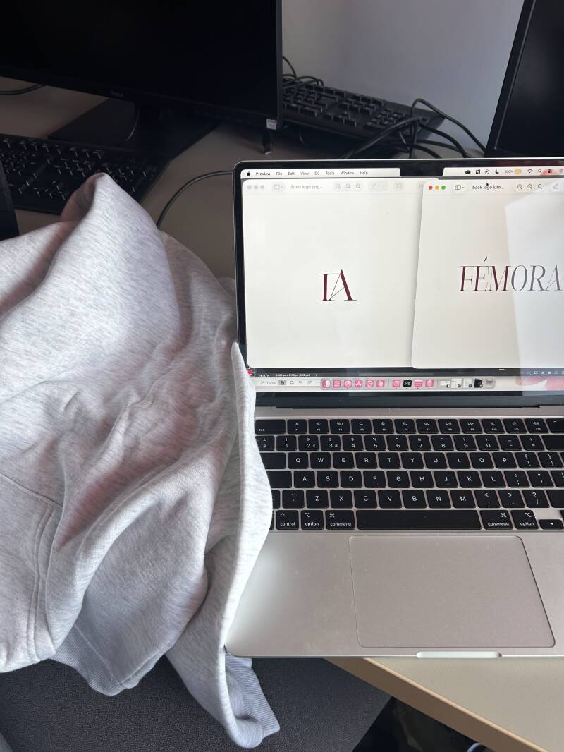
For the first step, I had to add the text that I wanted printing onto a transparent background on photoshop, then exporting it as a PNG document.
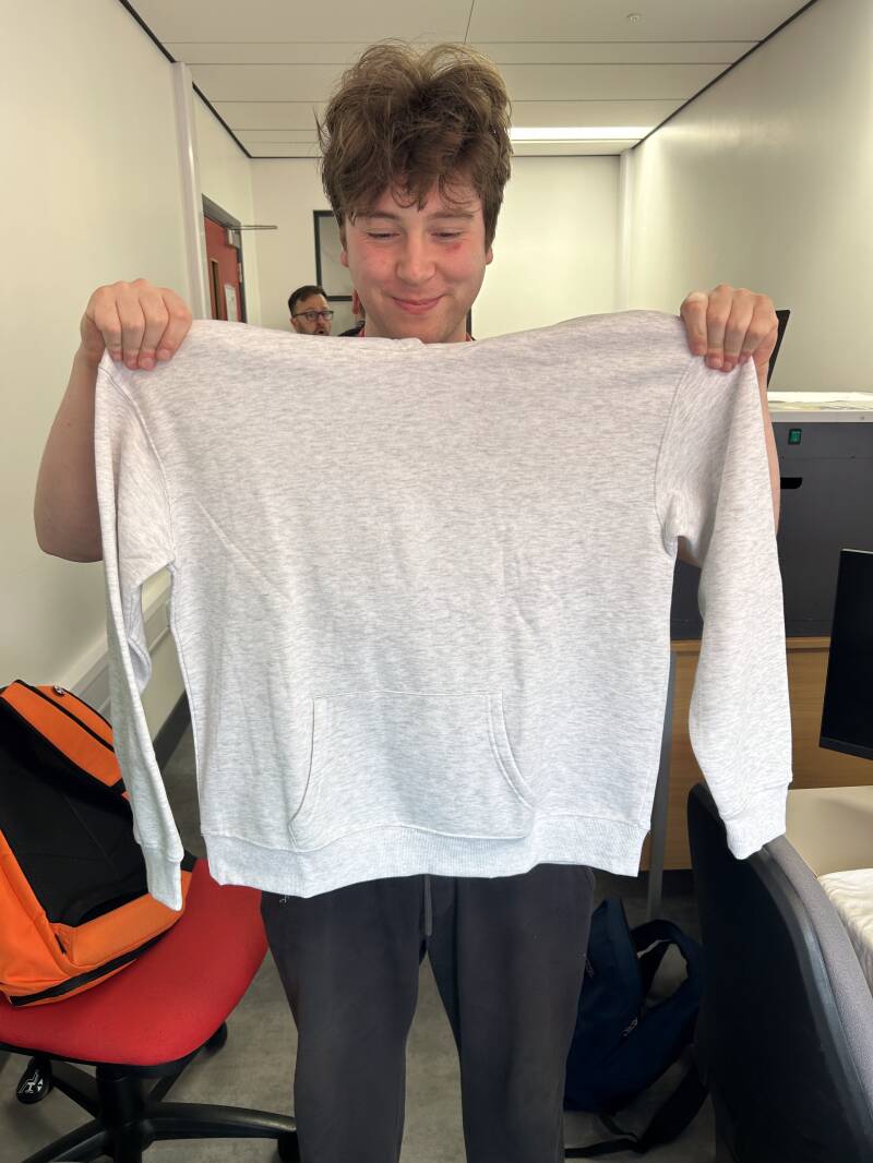
This is a before photo of the hoodie I chose. I chose a light grey as I knew it would work well with other colours for the text that would get printed on.
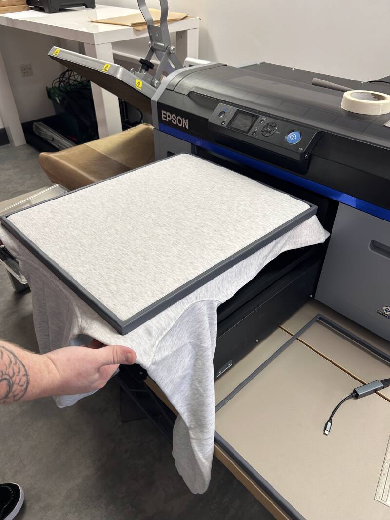
As it is a technical machine, I had assistance of my teacher. Here he is flattening out the jumper and securing the area so it is completely flat.
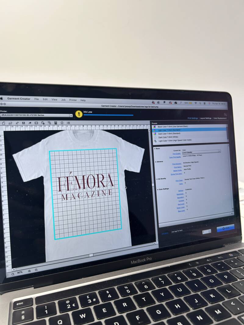
In this photo, this is the software where I could decide how big or small I wanted the text. I could also decide where I wanted to place the text, to the side or central.

This is the process of the machine printing it. It almost is like a small spray can in a little needle.

This process took 5 minutes due to the text not being that detailed.
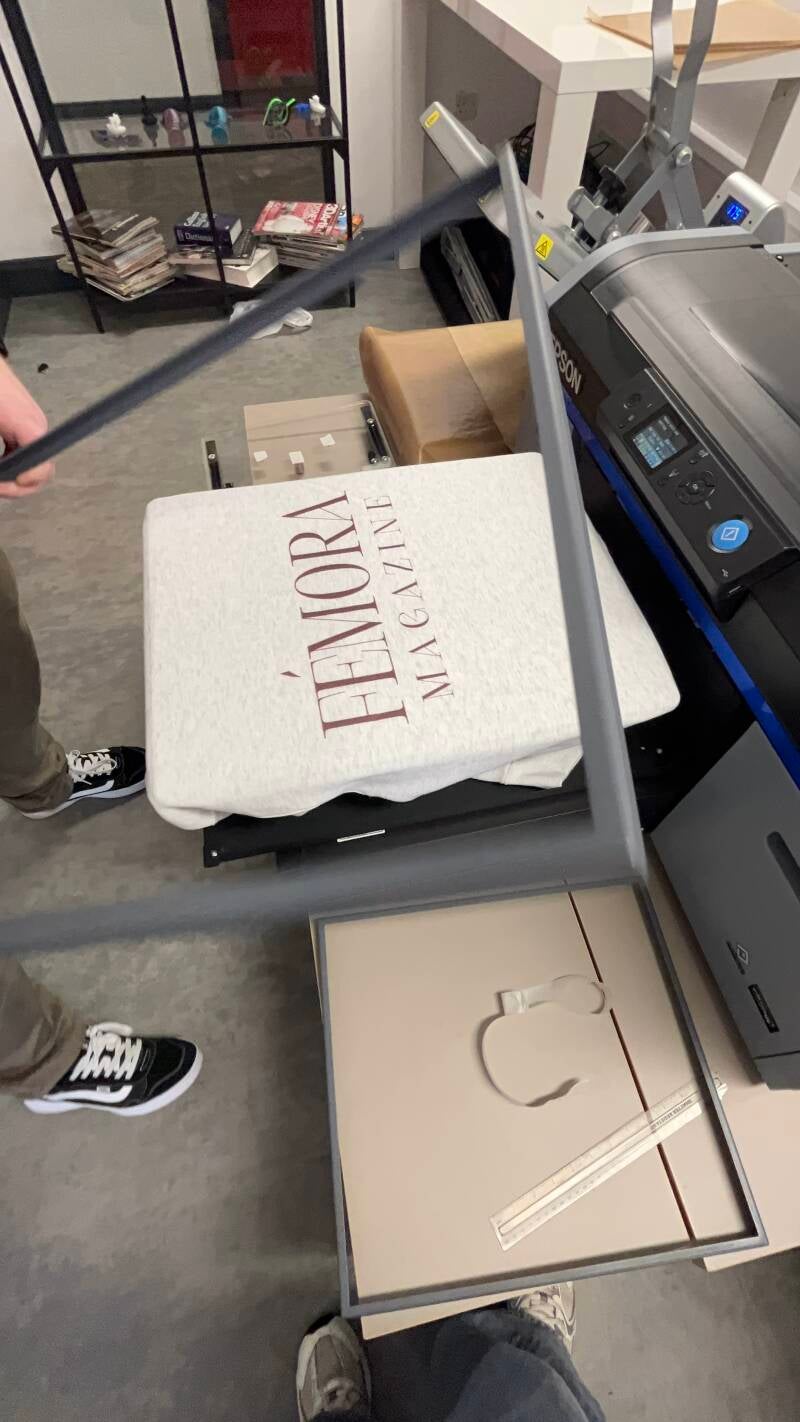
Once printing was finished, we removed the frame that stabilised the hoodie. I then got the first view on how it looked once it was printed.
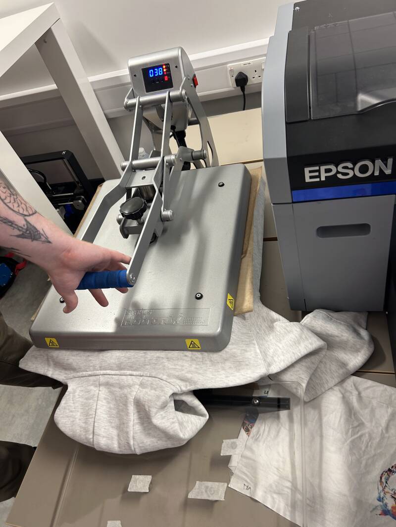
Moving fast, we then had to put it under an iron press. At 180 degrees we pressed down the shirt, ensuring the printing remains on the hoodie without peeling.

Then we moved on to the front side, again repeating the step where I decided on the placement and the size.
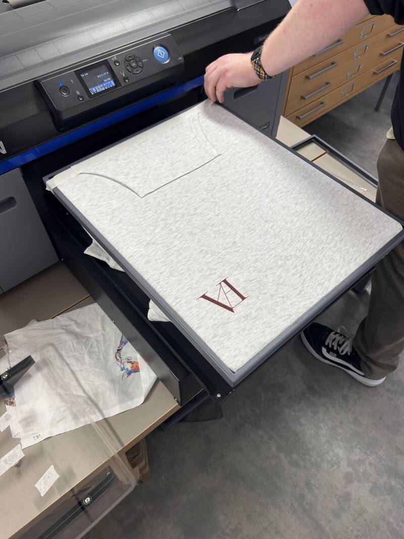
This was the result after printing the front logo. This was a small logo I designed at the start of the project which came useful for this idea.
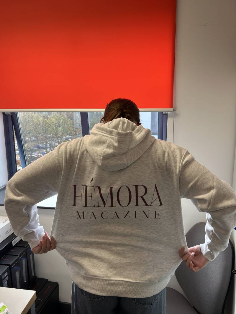
This is the final result, before taking more professional photos.
Advert Pages


Layers
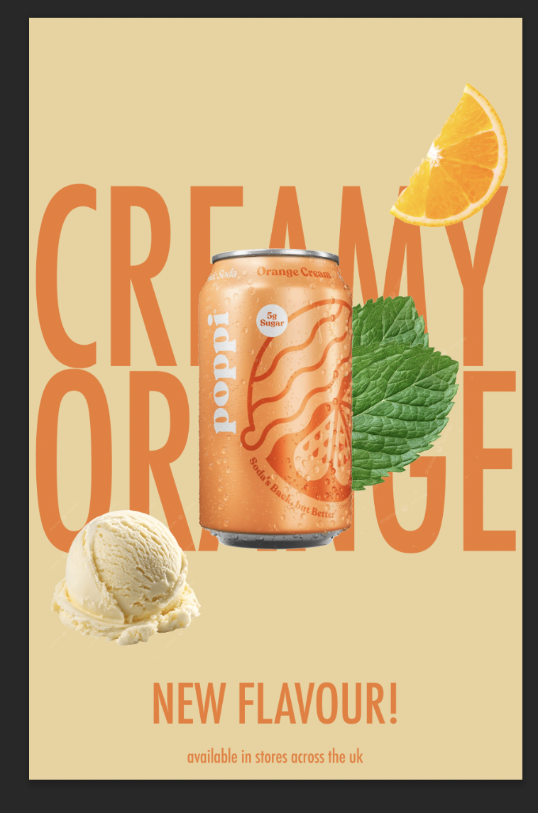
This is an image of the layering, showing I put the text behind the image. This uses a technique called text behind an object, which is frequently used a lot in marketing designs. I used this technique to give a more clean effect to really showcase the can.
Page Writeup
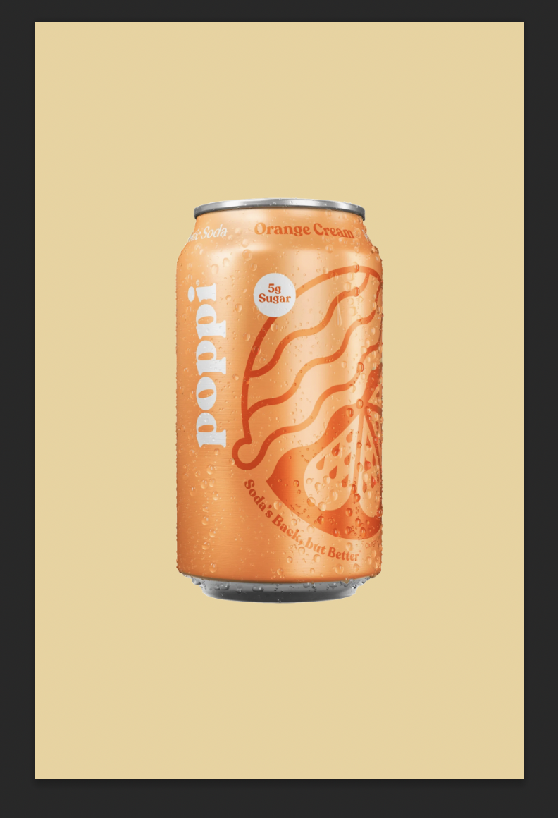
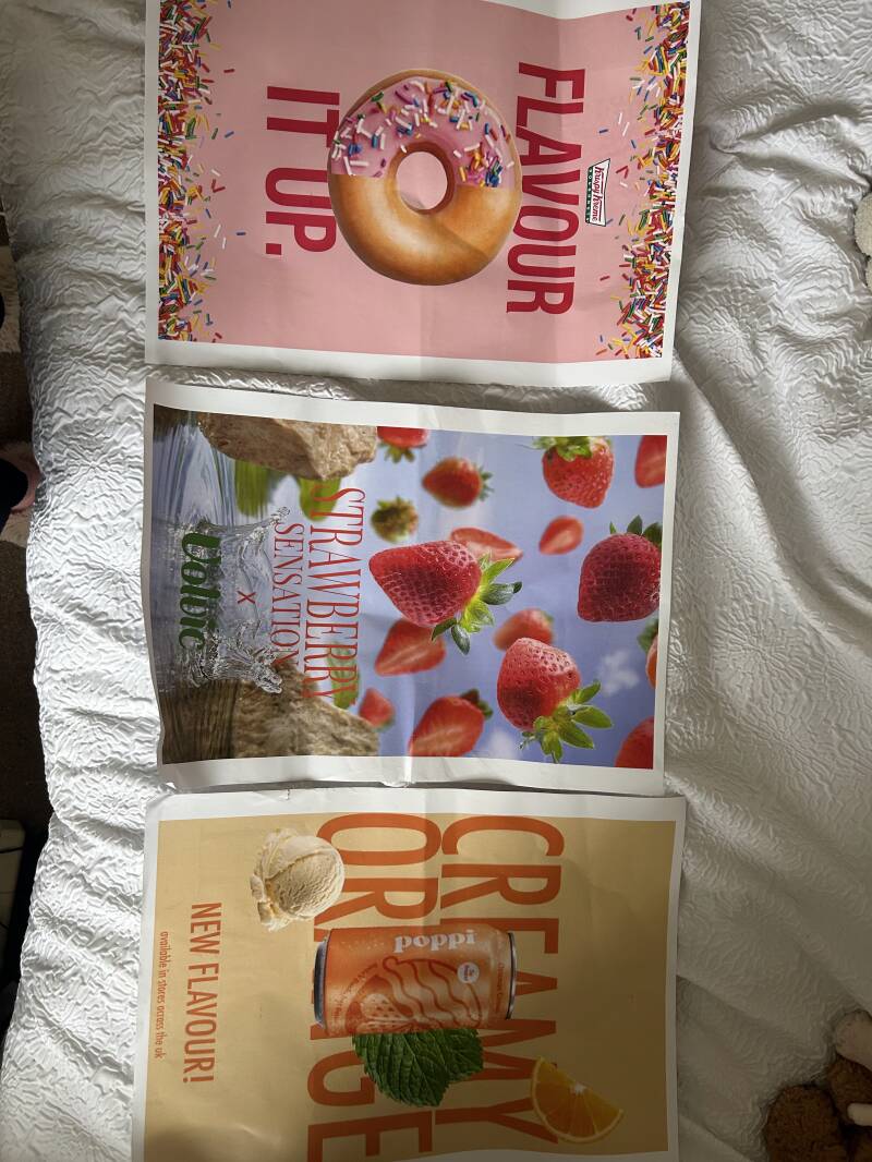
For this advert, I designed an advert for a drink created by the brand Poppi. Poppi is an American based ‘soda’ brand that has gone viral on social media. Recently they have released flavours more globally and, in the UK, they now sell two flavours in Tescos. I made this advert about a new flavour that would be coming to stores. The target audience for this brand are people who follow trends on social media or just like the brand Poppi already. The advert will get them to interact with the brand more, meaning that the brand will want us to collaborate more by using their adverts if our customers boost their sales, and due to the magazine target audience being teenagers, it is likely. For the colours, I wanted to stick to a similar colour palette that the can had. It had a range of different shades and combinations of orange. For the background colour I chose a colour that was almost a light yellow and orange if they were a colour together. I knew I wated to choose a light colour for the background because I wanted to use a dark shade of orange for the text, to emphasises the words written. For the images, I used the Poppi can image with the flavour of orange cream. I chose this specific can flavour because a lot of colours work with different shades of orange, like greens, beiges etc. To add some extra images, I used a mint leaf but only to reinforce the fact its orange flavour, I wanted to make it look like the small lead that sits on the stem of an orange. Another image I used was a scoop of vanilla ice cream and an orange slice, to again reinforce the idea of the flavour of drink. I wanted to add images of the flavours because if you look on most adverts you will find that. This is called ingredient imagery, communicating the flavours to the audience through imagery. I used the font ‘Futura’ in Condensed Medium for the text behind the image. I used a technique called text behind an object to create the effect of the image of the can standing out. Initially you’d notice the can at first glimpse and then you would look and read the text behind it. I would use this advert on bus stop billboards or social media. Why? Well, these marketing platforms attract the ideal target audience for the advert itself. As I said before, the target audience are teenagers. And teenagers are more likely to catch the bus, or scroll on social media.
Advert Page 2
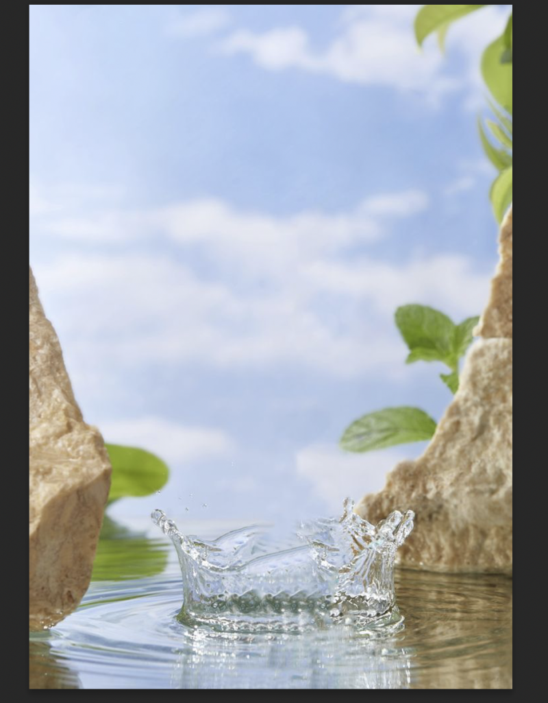


After finding the background photo, I used the generative AI tool that photoshop provides. To get the strawberries, I used the prompt 'strawberries falling from the sky'. This then generated the strawberries, I knew I wanted them falling from the sky because of the water splash that already came with background I used.
Advert Writeup
For this advert, I wanted to promote a flavour of water from the brand Volvic. Volvic is a water company that sells various flavours of water. The purpose of this advert was just to get more publication back to the first flavoured water that Volvic produced. They produced the strawberry flavour in the early 2000s making it the first one into their flavoured water market. As that specific market developed, I feel as if people don’t really reach for the strawberry flavoured water anymore, so I wanted to create an advert that was simple but also reminded people of why it was the most popular flavour at one point. The target audience aligns well with my target audience, as it is important that teenagers drink water rather than drinking fizzy pop majority of the time. If the teenagers see the advert whilst looking through the magazine, they could start to desire wanting a drink or just wanting to try the water. For the background, I found it originally from Pinterest but did some research and found it originated from Freepik. I searched up ‘Plain empty background’ because I knew I wanted to create something realistic and finding this background with the water splash meant I could use my creativity and use any product I wanted to advertise. I came up with the idea of messing around with the generative ai tool that photoshop provides, I started off by generating random things but then realised most adverts use fruit imagery to represent the flavours in the product. I used the Volvic logo at the bottom so when the reader scans the page, they can see a dark green logo on a page full of mainly red colours. It also just tells the reader what brand the advert is for, boosting the brand out more. For the typeface, I used ‘Playfair Display’. This is a serif typeface meaning it is a part of the serif font family. I wanted to use this font as I felt like it makes the advert look like a luxury. However, on reflection I feel like this typeface doesn’t actually suit the advert. Instead, I would use a thick and bolder font, like Helvetica Nue. I would put this advert up on social media, like Instagram due to their audiences being the right type for the advert. It is mainly teenagers or young adult people that use Instagram so it will definitely push it towards the right target audience. Another place I would put this advert is on a billboard for passengers to see when they drive by, the falling strawberries could catch their attention and make them look at it with more thought, leading to them learning that the ‘best’ flavour is back.
Advert 3


When I added everything, it felt really plain and it was missing something. I had the idea to use the generative ai tool on photoshop to generate falling sprinkles. I wanted to really embrace the point of the advert, so having flavour falling from both sides will almost trap their eyes to look at the advert.
Advert Writeup
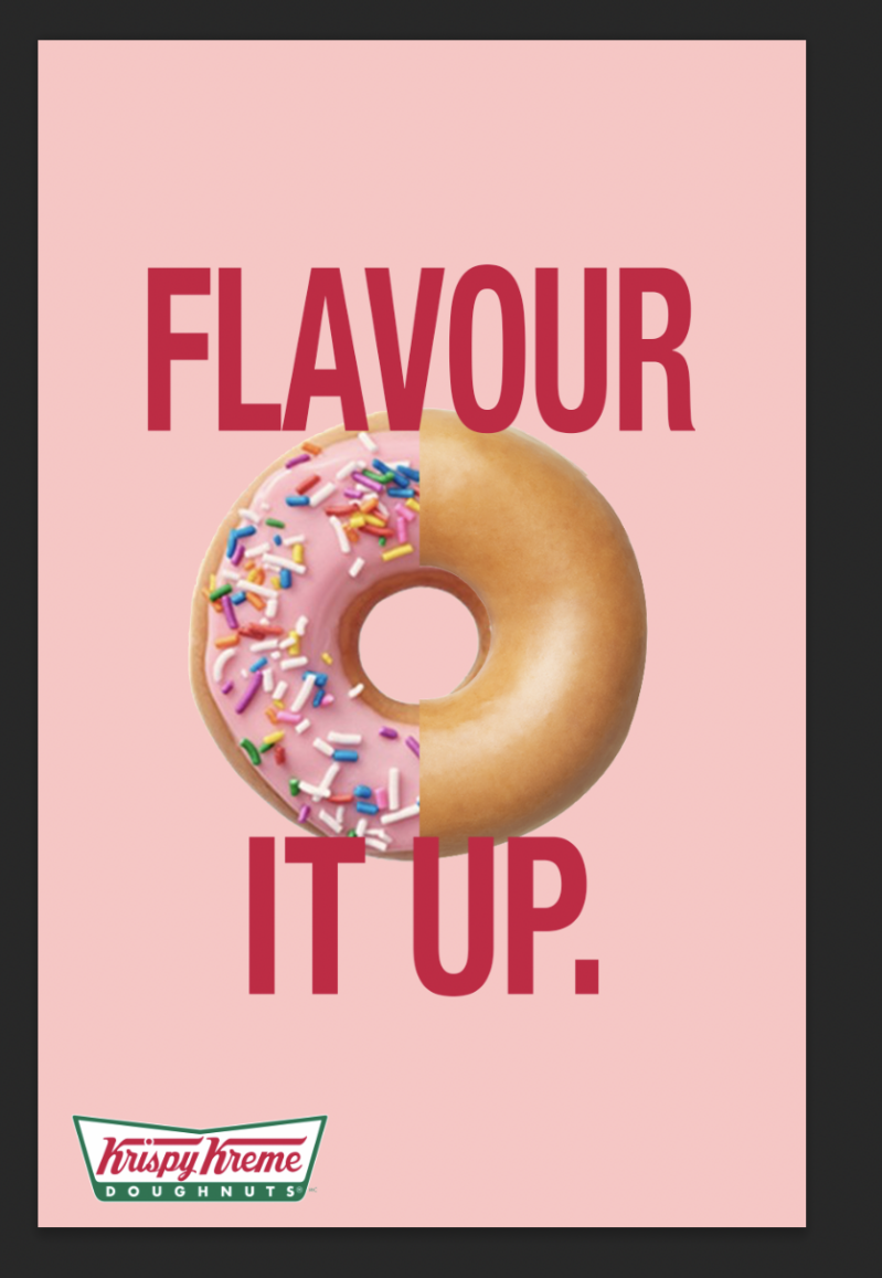
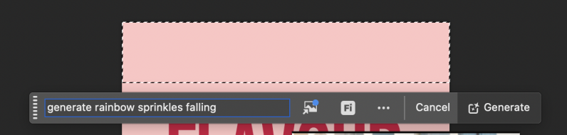
For this advert, I created a poster that promotes changing up your normal order by adding flavour for Krispy Kreme Donuts. This is just a way for people to explore the brands donut flavoured rather than sticking with the original glazed donut. With the original glazed being their best seller, 48% of people have named it their favourite so this advert was targeted to them. I knew I wanted to use the strawberry sprinkle donut because then I could use a bigger colour pallet as the sprinkles open up different colours for me to use throughout the design process of the advert. The target audience for this advert is or those who order the glazed donut more than any other flavours, almost like to persuade them that they are missing out and should try the other flavours leading them to more income gross. I started by using a soft pink background to try match the pink icing on the sprinkled donut. I used pink because it was an alternative colour for red and instead of using red for the background, I used it for the text ‘flavour it up’. Using it for the text also shows the brand alignment because it can be seen as Krispy Kreme’s signature red in their logo for their text. After this, I did half and half of a sprinkled donut and an original glazed one. This was the main purpose of the advert hence it being in the centre, it implies what the advert is about just at first glance making people who walk past wonder ‘why is there a half and half donut?”. Then I used the generative ai tool that is included in photoshops software to generate rainbow sprinkles falling for either side of the frame. For the text I used the typeface Helvetica Nue. This typeface is one of my favourite fonts to use when it comes to advert designs because of how readable it is, even if you stretch it then it will still be readable. I used put the text behind the donut, so the purpose of the advert was still shown, but also, I made sure the text was big enough that it was still grabbing the attention of those who walk by. I didn’t want to try and remake the Krispy Kreme logo, so I placed an image of the logo on top of the text, just so people knew what brand the advert was for as there are a lot of donut companies. I would put this advert up on social media, like Instagram due to their audiences being the right type for the advert. It is mainly teenagers or young adult people that use Instagram so it will definitely push it towards the right target audience.
Practice Print Out
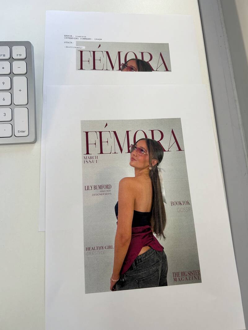
Whilst printing the pages out, we had problems with the college printers as some were slower than others, then eventually found that some had a fault where they would say its printed all pages but only print one. Or at one point it only printed out a quarter of the front cover and said it was done. We resolved this by a member of staff using their log in and a different printer which eventually printed them all out fully. I wanted them all printed so I could see if needed to change the resolution of the images, or if any changes needed to made.


I wanted to print out each magazine pages just to see if there were any mistakes relating to things like on resolution, any unclean cuts or editing issues. However, the original size of the magazine is different to the size that we printed it out. I purposely did this because I felt if it was bigger, it would be easier for me to spot to any mistakes made when designing. For example, for the can of pop advert on photoshop you can’t tell how good or bad the quality is until it actually gets printed out. After it got printed out, I found many mistakes such as the resolution making the quality of the image bad, it makes it really pixelated. I plan to do another practice print after fixing the mistakes, with the actual format of the magazine that it was originally meant to be. I aligned the magazine pages on my bed so I could see them side by side to observe and see if I needed to add any design elements in or just fix any mistakes.
App Production
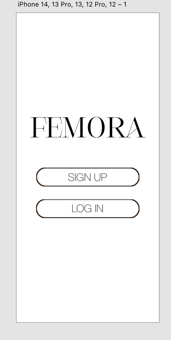
For the home page of the app I just wanted to keep it simple so it didn't overwhelm the app user, making it easier for them to guide through.
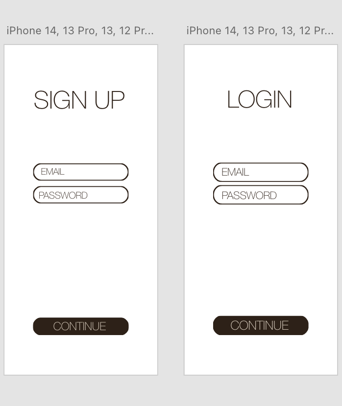
The two images above are what the sign up page and the log in page looks like. They are both similar but I just wanted to have the options of signing up or logging in
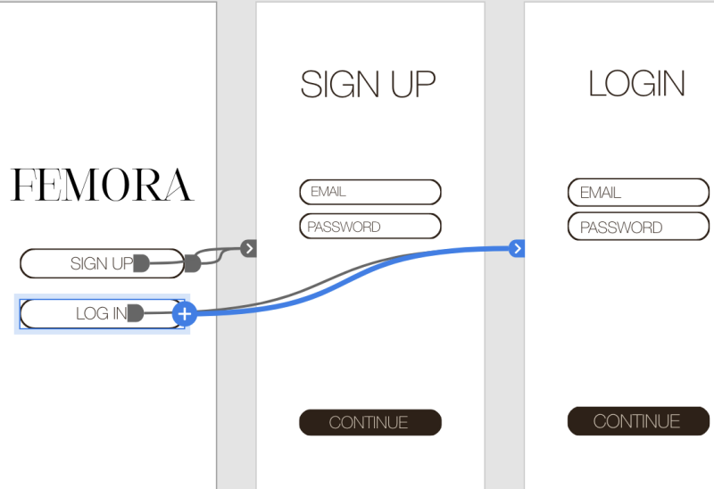
On the Xd software, I learnt that to actually link the buttons together to make it functional, you have to go onto the prototypes tab and click onto the part you want to make functional. After this it comes up with a small circle on the side and you drag it to the slide/page you want it connecting to.
This is an example of a mock I used on the app to fill the catalogue to make it look more realistic, instead of just having one item of clothing on.
This is the sidebar on Xd, it has options to adjust the opacity of the shape or item that is selected, same with rounding it off. I used this for the rounded shapes as the icon buttons.
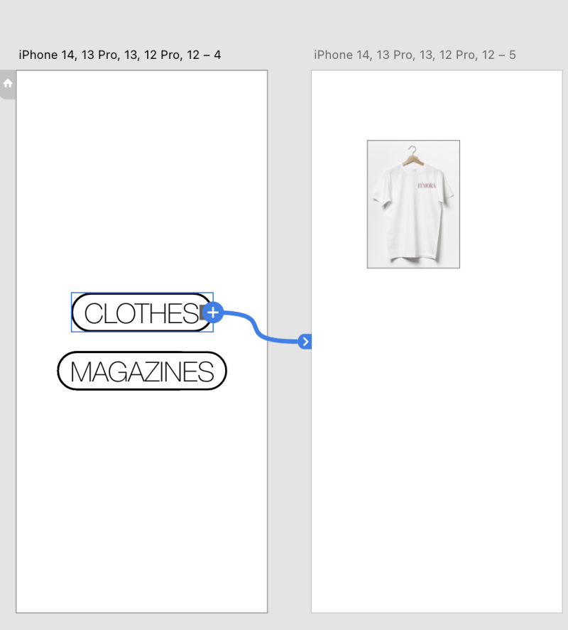
As the button was for clothes, I connected the text to the page that would be for the clothing section.
Again, this is an example of the hoodies what would be on the app.
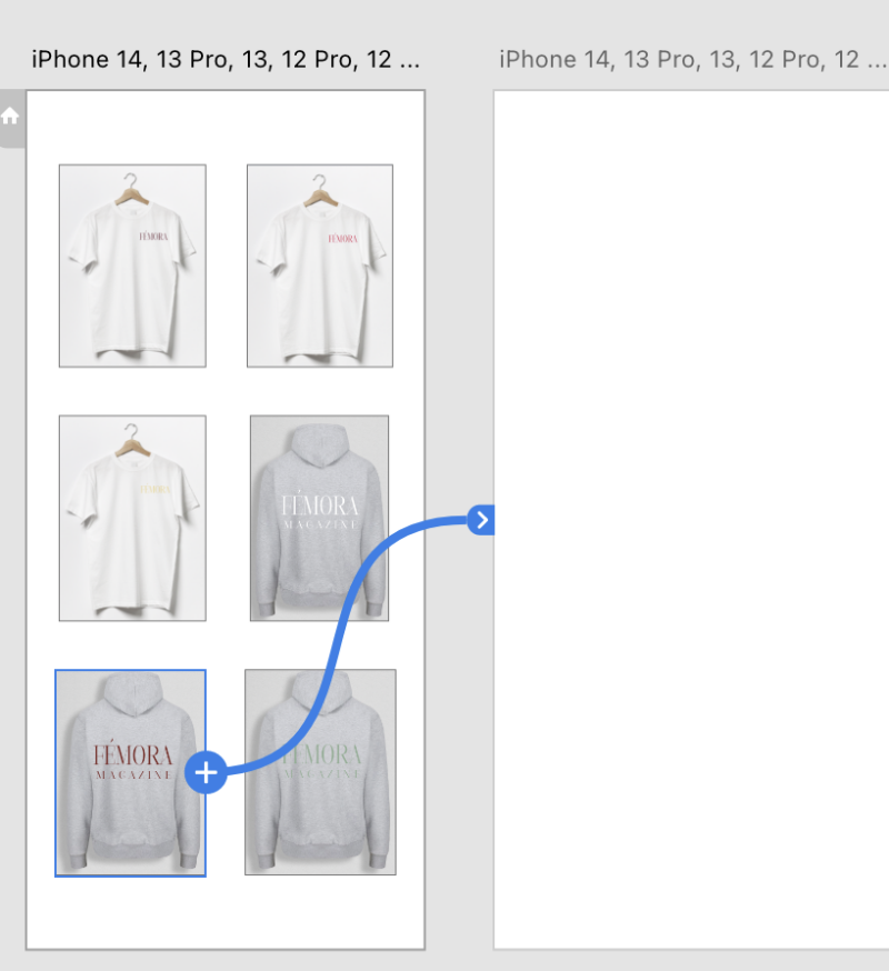
This was a progress screenshot, to show how I used other clothing design options to fill up the page on the app.
For the main hoodie that created, I added this feature where if you swiped on the image of the hoodie itself, it would swipe and show you other pictures of someone modelling it so they know what they are buying. I did this by putting all three images together, holding shift and clicking the icon below.


This is what the catalog looks like including prices.
For this part, I wanted to create a realistic effect by selecting the sizes before placing in the basket. For this I added circular outlines and placed the sizes inside.
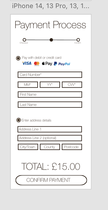
For the payment process, I tried recreating a very realistic version of an actual payment page. I added most banks that are used and all the small details.
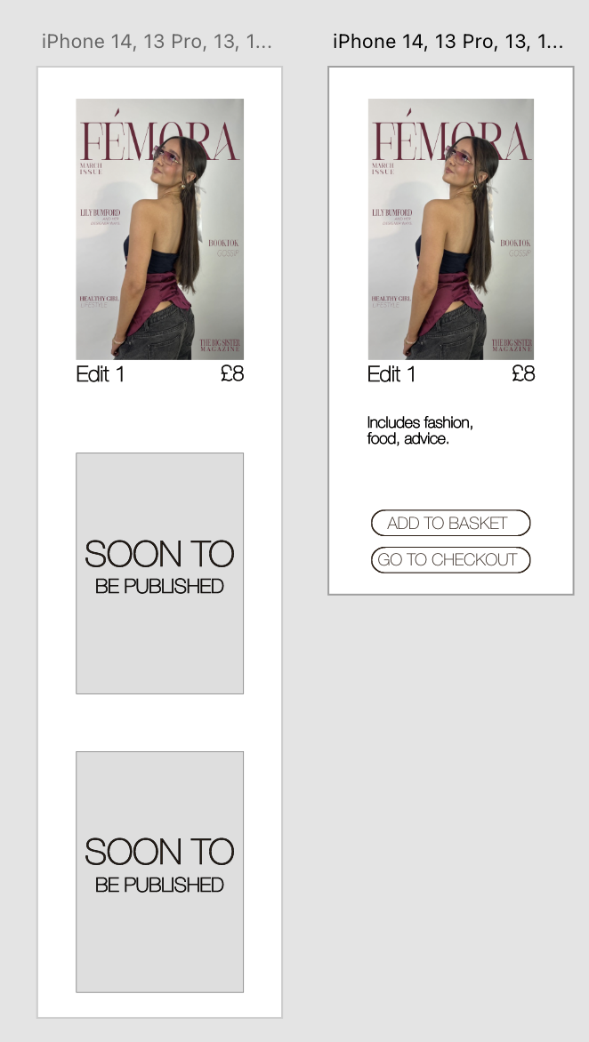
These pages are the magazine selling pages. As I have only designed one magazine, I said that the edits were soon to be published as I felt like it would not look as good if it was just an empty page with one magazine.
App Walkthrough
On the video beside, it walks through the app. Showing you the experience that the app users would have, I made it easier to navigate through so that the users could just get straight to the point with what they wanted to buy, not distracted by all pop ups or adverts.
Social Media- Instagram


Drop Shadow Technique
I originally used just the yellow colour for the text, however due to the brightness of the colour it clashed with the bright colour with the image background. I went around this by using the drop shadow technique. I added the drop shadow to the text in a darker versioned colour of the original colour to highlight
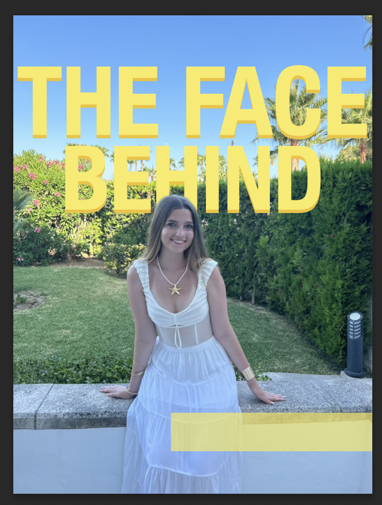
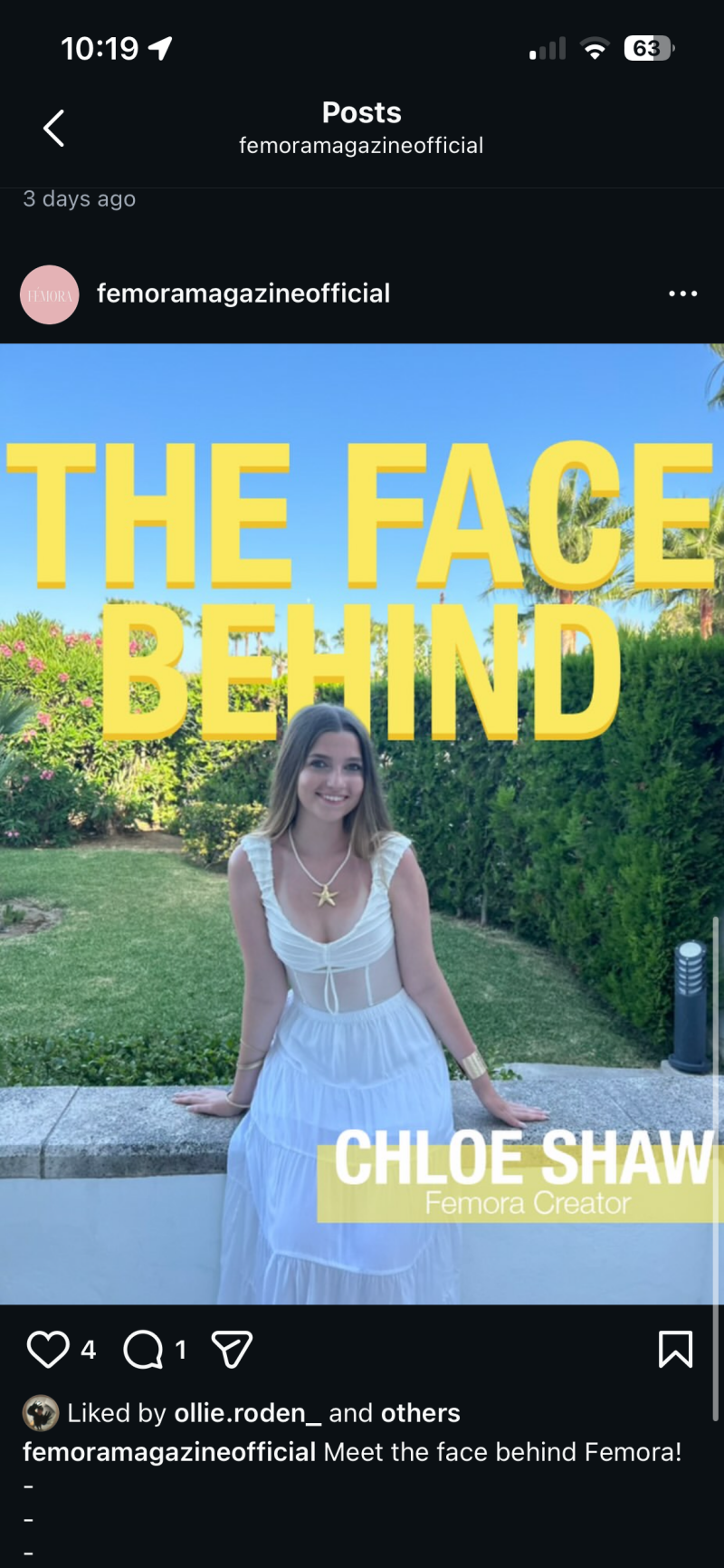
For the first Instagram post, I wanted to show the followers of the brand the face behind. This is so the consumers can build that relationship with a sense of trust, meaning that they are more likely to want to buy something from us. When creating brand loyalty, it helps to increase any revenue from the magazine or the hoodie merch, but it also encourages a safe space for people on our social media. The aim was for our social media presence to be welcoming and a positive vibe for them, making them feel comfortable in following us. I also wanted to give them a good idea of who created the brand so they could look into things like the creator’s morals to see if they also align with our brand ethos. It makes them feel comfortable supporting a company if they know who they are, it doesn’t look as good if you have no idea who owns something because you then begin to question if you actually should be supporting the brand. I used the colour yellow for the primary colour of this page because of the meaning of the. colour to phycology. “It sits between orange and green on the colour wheel. Being associated with the sun, it stands for optimism, joy, enlightenment, but also for caution, duplicity, cowardice, betrayal. Colours that relate to yellow are yellow-green and orange.” These are the feelings I want viewers to feel when they see our brand or our social media because when we convey positive emotions, we hope that our readers/consumers also feel this.


Size range
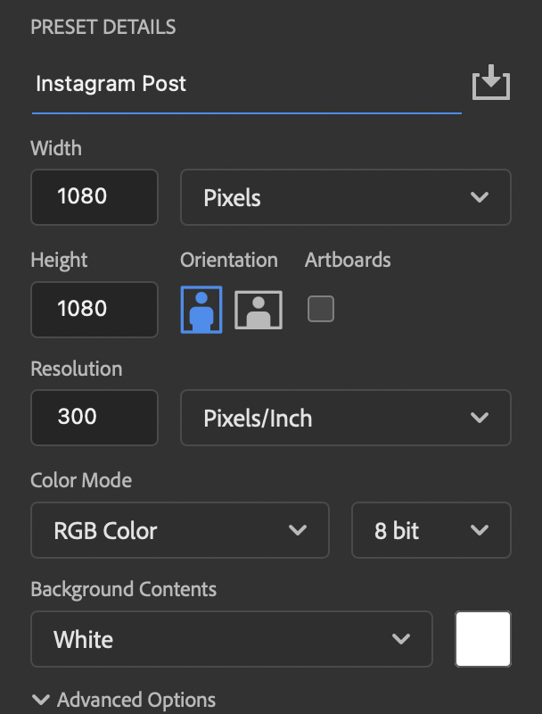
When you make an instagram post, it's very important that you get the size ratio correct. This is because if you do it too small, your designs wouldn't fit correctly and would be stretches it just wouldn't fit correctly, which could then lead to the viewers thinking it is partially unprofessional. The screenshot to the left is the wrong ratio as instagram updated their post sizes not that long ago.
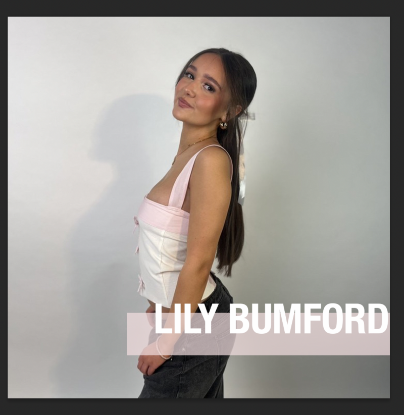
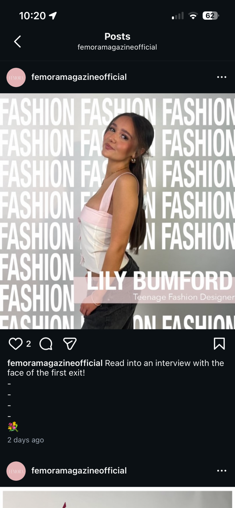
For the second Instagram post, I wanted to showcase the model and fashion designer. I felt like it would be good to have a post that tells our teenage readers that they can do things like being a fashion designer even at their age. I wanted to almost inspire them to get thinking about their futures and think to themselves what do they want to do in life, having a post that shows people their age has already achieved something like designing their own tops. I used a photo of the model from one of the magazines covers I was going to use originally, and I love the small feature of pink on her top, so I decided to use that as a highlight colour for the page for the box that has her name in it. I used Helvetica nue in bold for her name as I really wanted to show who she was etc. As the post is about her fashion, I used text in the background saying the word ‘Fashion’ to really imply that the post Is based on fashion, I chose the colour white as it’s a bright colour and can be eye-catching to those who are scrolling.
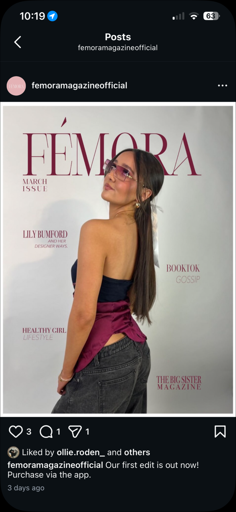
For the third Instagram post, I used it as an announcement post to let people know that the first edit of the magazine Is officially out. I just used the front cover of the magazine for the post as I didn’t want to do loads of designing and take away from the fact it’s about the magazine.
Instagram Account
The reason why I wanted to create a social media account as a part of my project was because of my target audience and the audience that can be created on social media. Instagram has a wide range of age variants within their app, but teenagers are more drawn to that specific app in comparison to any other social media platforms. The average age for Instagram users is 13-17years old which is the correct demographic for my brand, meaning it is the best way to promote the brand.
How I Planned
Whilst in the process of production, I kept making lists throughout so I knew what I needed to do on certain days. It made it easier for me to focus on my soft skills like time management because I didn't waste any time as I knew what I needed to do and what I had left to do.
Production Reflection
Overall, the production was successful because I really pushed myself to try new things for this project. I showed off my knowledge of design software and actual skills when I did multiple different ways of using my brand. The three ways were actually printing out the magazine, designed a hoodie for the merch and designing an app to have a functional way to buy the magazine and merch. For example, I had only just learnt how to use the Xd software before this, so I knew I wanted to use it in the production factor. I showed off my knowledge of design software and actual skills when I did multiple different ways of using my brand. One of the strongest parts of the production process was creating the hoodie. I really enjoyed learning about the process of printing on clothing items, learning about where to place it etc. One challenged I faced was the amount of writing I pushed myself to do. I believe really explaining the process and why you’ve done something is a crucial part of this whole production. I knew I wanted to do loads of writing I just found it difficult to remain the same standard throughout. Throughout the project, I improved my planning skills. I wrote little lists so I could keep updated with my work pace, ensuring I didn’t forget anything.
Create Your Own Website With Webador