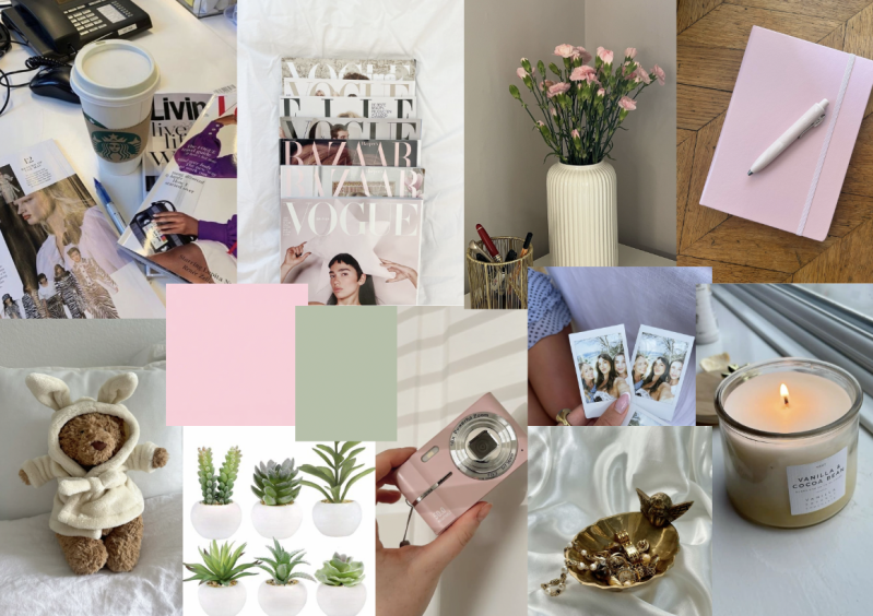
To get inspiration for my presentation designs, I decided to create a mood board to help me develop an overall aesthetic. I focused on items I want to bring in to add to the presentation, such as the digital camera. As my product is a magazine, it categorises itself in the print and media genre, linking with the digital camera as it produces things like media content. For the colour scheme, I chose two colours that are light pink and green. These colours show two different things that align together perfectly. For example, Pink has the psychology of resembling feelings of love and femininity. Whereas green has the psychology of growth and offers a calming effect. Both colour meanings align with what I want this presentation to give off to those who come in. I also decided on bringing in decor that gives off the same vibes as my magazine does, as it's a health, beauty and lifestyle magazine, a lot of decor can work with it.
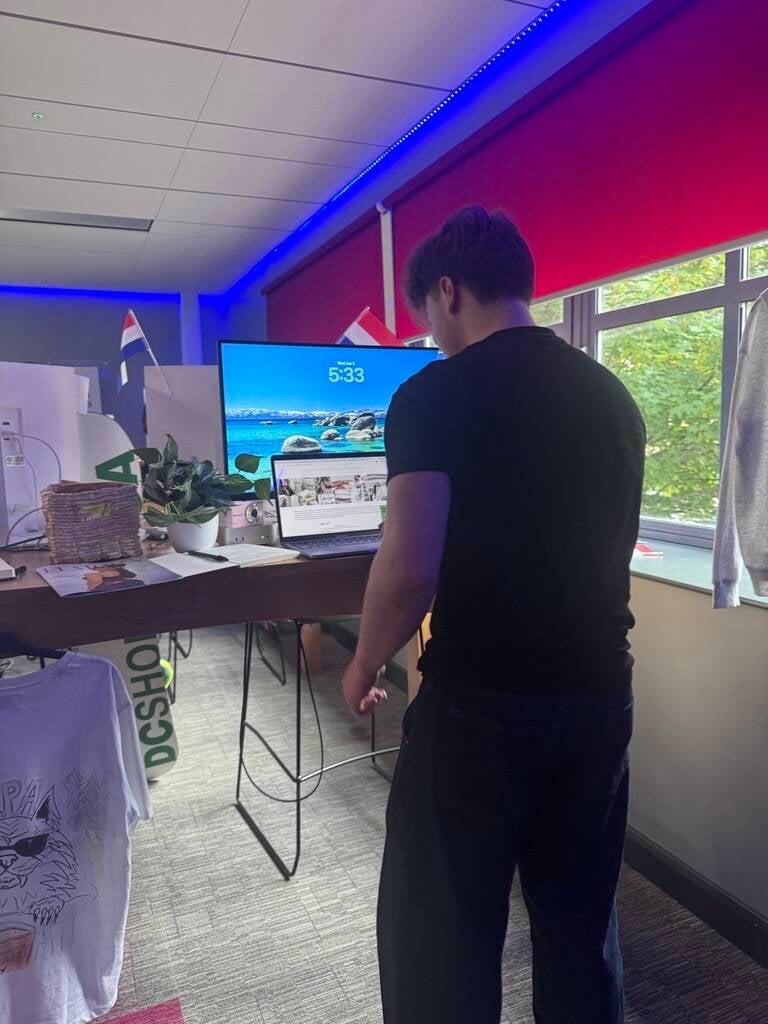
I have decided to locate the presentation in the college room TG05 on my Mac desktop. I came to this decision because it gives me enough room to have multiple things, and it wouldn't be cramped up in comparison to how it would be in other classrooms. Whilst thinking it would be a nice, meaningful thing to finish my college years off in the same classroom I started in.
The ideal audience to view my work would be people who are interested in fashion or beauty. This would work because as they are interested in the same topics as their interests, it will boost the brand's algorithm as the more interaction, the more consumers. I also think that if they have friends who are interested in the same thing, they could promote the brand to them if they're interested.
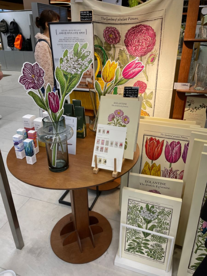


When I look at these exhibitions, they instantly grab my eye, and that is exactly what I want for my showcase project. But why? Well, these exhibitions are full of eye-catching colours such as pink, yellow and green. All three work well together, but also look aesthetic together. Having a brand aesthetic is such an important thing to carry out for your brand throughout the whole journey, as it entices consumers to become a supporter, but also shows them that they can trust the brand, as it keeps a consistent aesthetic everywhere. I love the usage of the greenery too on the stand to the right. I think it creates a natural and earthy vibe, which is something I want to do for my showcase because it matches the vibe I aim to achieve. Overall, these are really inspirational as it looks aesthetic overall but also make it clear what the brand actually is based of their decoration and printed things.
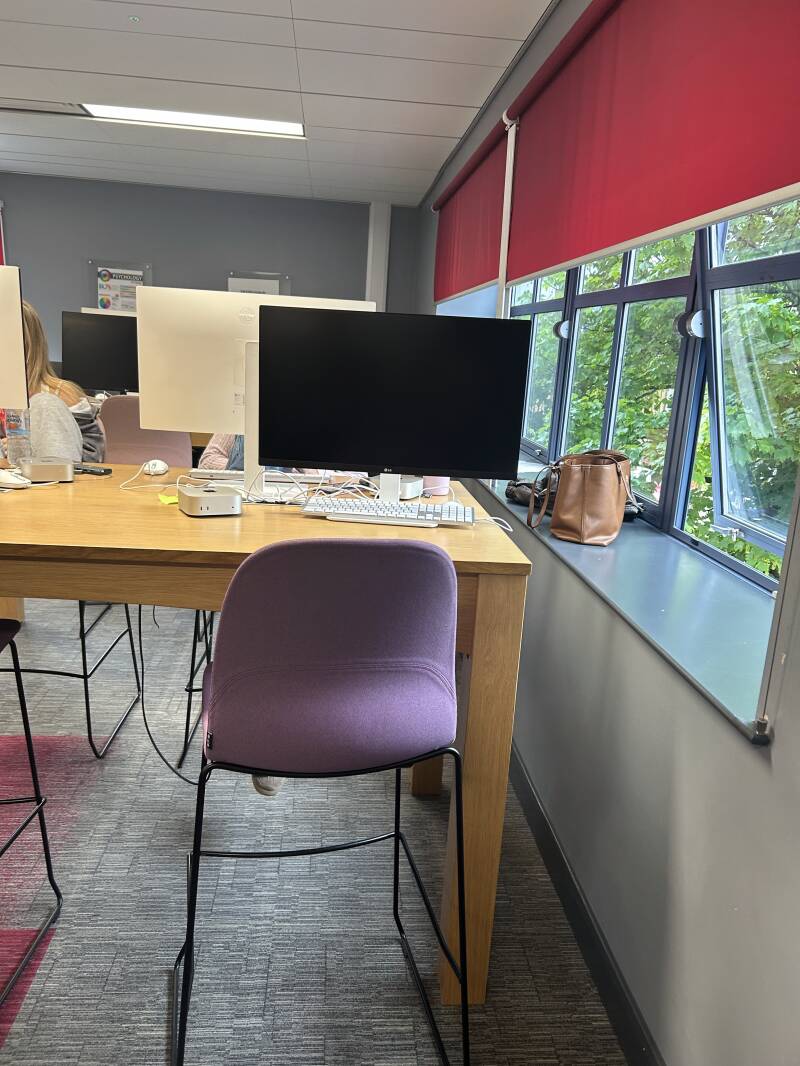
This is the place I have chosen to do my showcase on. I have taken photos of the empty space so that I could have a look at what decor to add and try things out on photoshop. This is so that I have a plan and don't waste time getting annoyed if it doesn't look how I want it to. I will try out different styles of decor just to see what would work best, keeping in mind I will l have my Mac screen with my project website on.

Finished Product
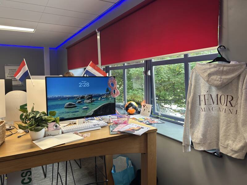
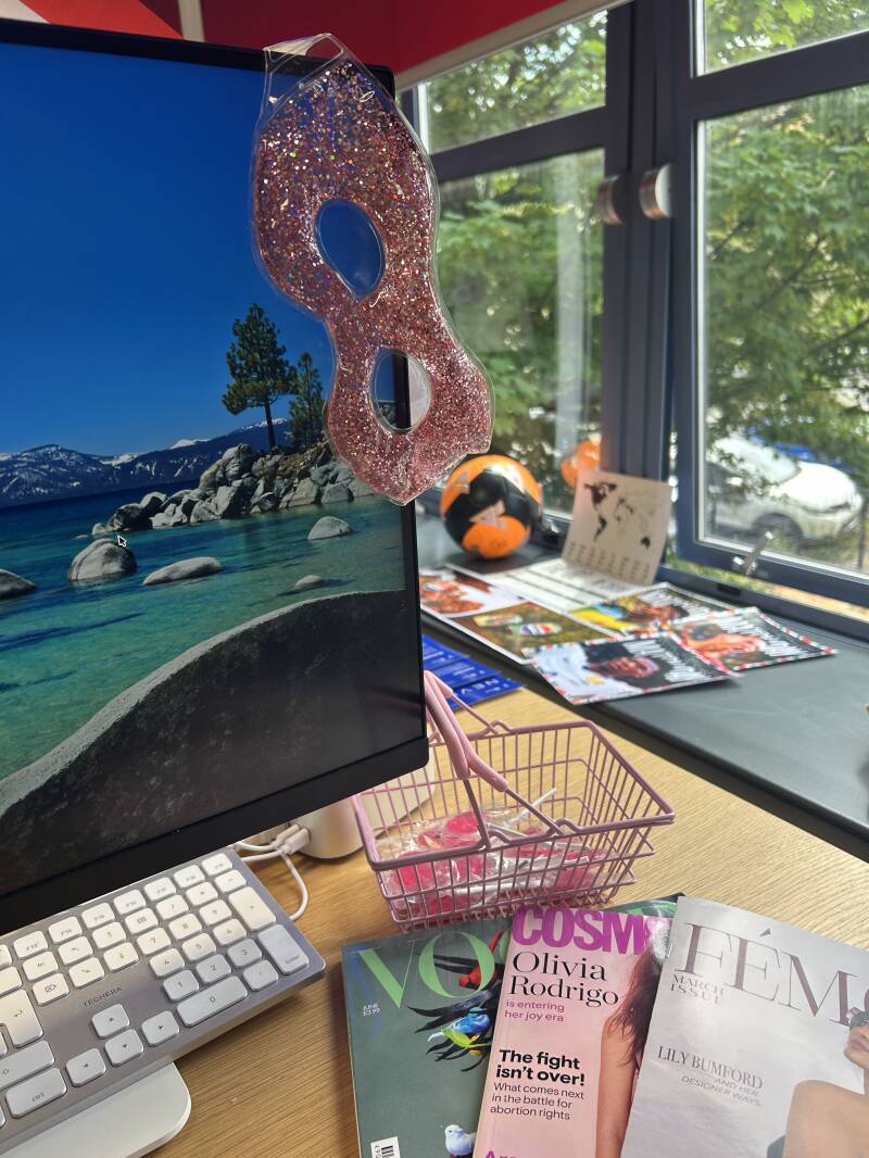
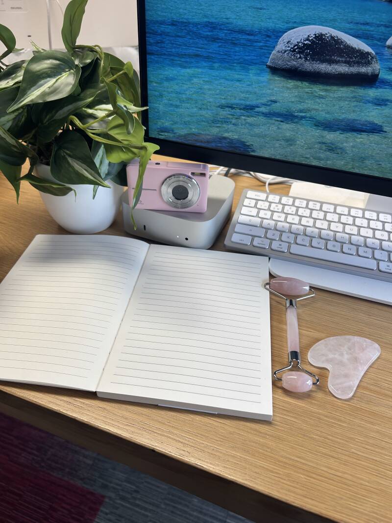
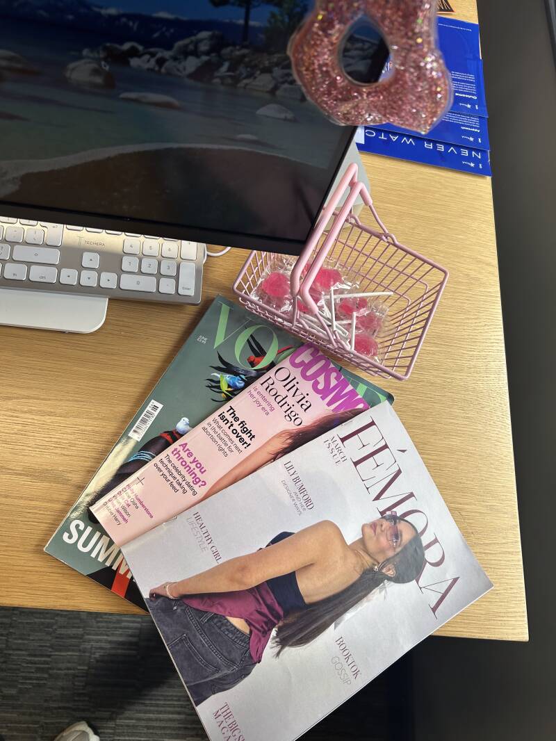
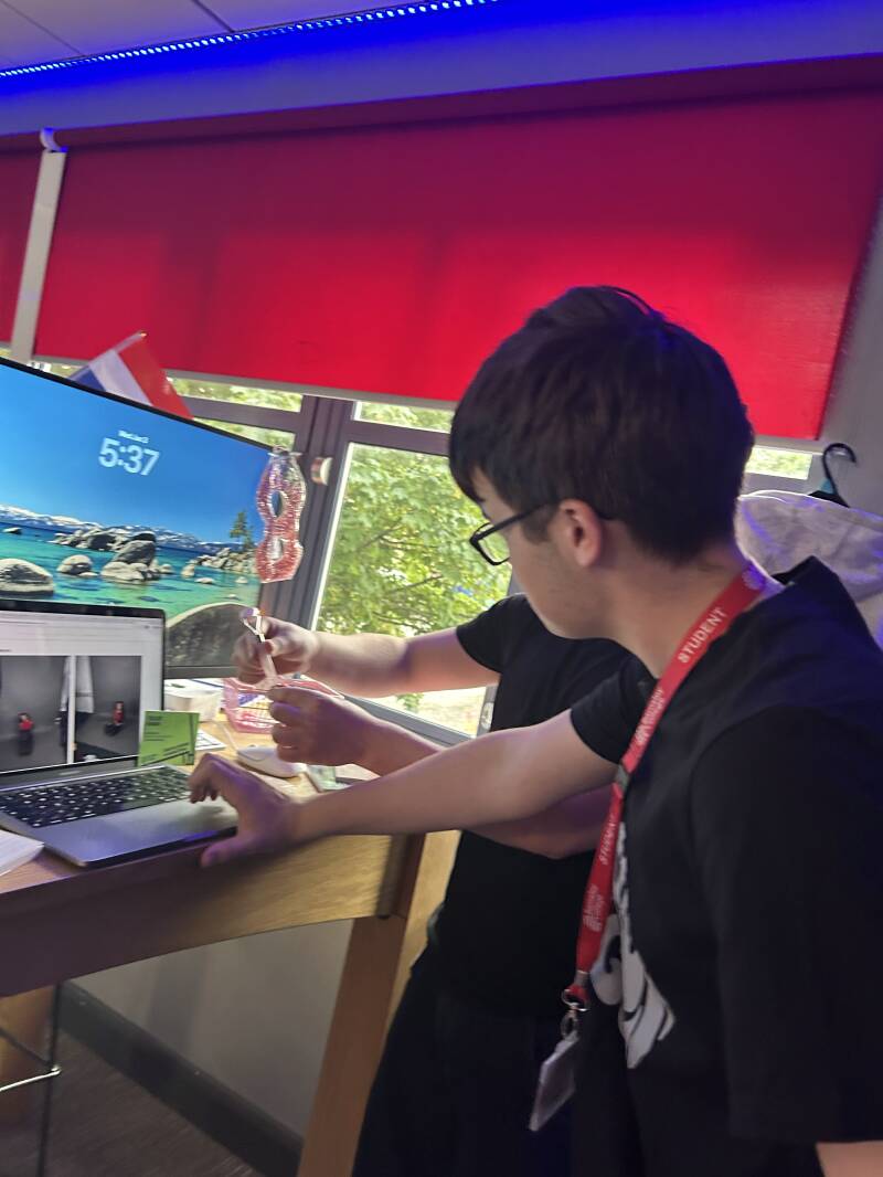
This is my final presentation for my FEP. I brought and purchased some props that align with the aesthetic that I wanted to have for the presentation, things like other magazines to have so that mine could be laid on top, showing the viewers which one to pick up. I wanted to give like an office vibe, but a creative style of office. I brought in a digital camera to add to the print and magazine vibe and left a notebook so people could leave feedback. As seen in my mood board, I wanted to give out a pink aesthetic, giving it a teenage girl touch to it so it can relate to my brand, this helped me as when I was planning on what to buy, then I had an initial idea so I could stay on theme and not waste any money to use for this. I added in some smaller props like skincare tools as in my magazine
Showcase Night Friends and Family
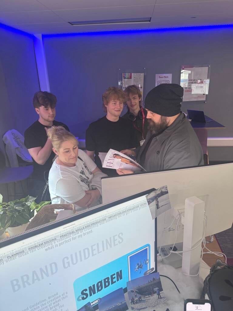
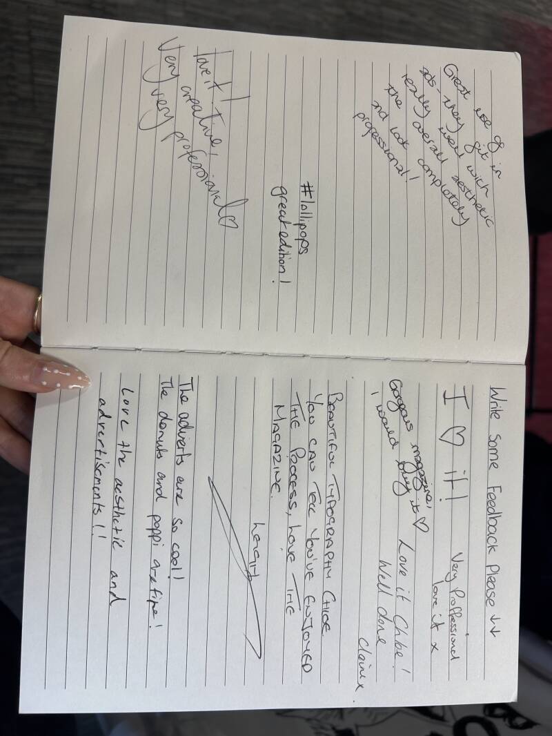
Overall, I'm really happy with the feedback I got for my showcase, as I felt nervous for people to see my work. It has definitely boosted my confidence seeing all the positive feedback and hearing what people have said about it. What I liked about my display was the magazine area where I brought in two other magazines. I purposely placed my magazine on the top to kinda tell the audience that Femora is the magazine that they should pick them, to draw them in.
Create Your Own Website With Webador